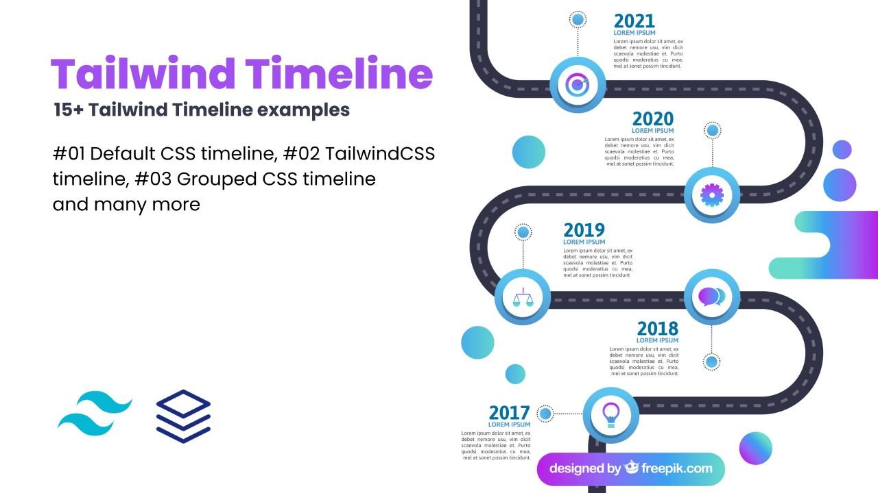
Hello guys in this tutorial i have added 15+ Tailwind timeline examples which are available on Codepen and other resources.
Best Collection of Tailwind Timeline bar examples
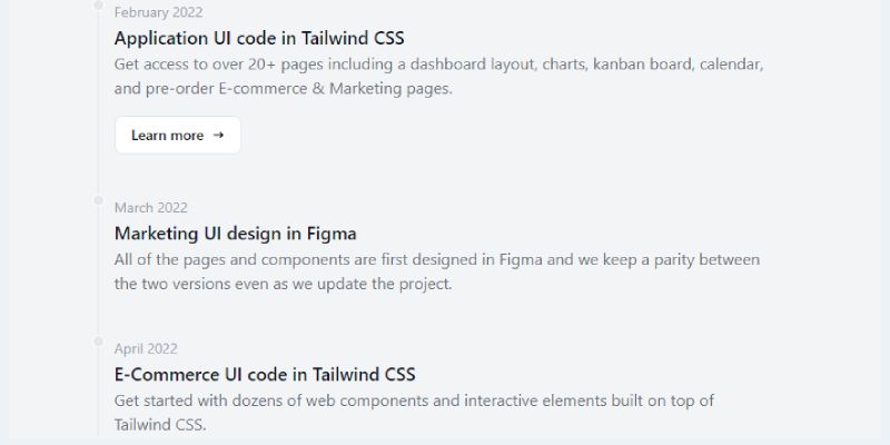
#01 Default CSS timeline

Default CSS timeline, which was developed by flowbite. Moreover, you can customize it according to your wish and need.
<ol class="relative border-l border-gray-200 dark:border-gray-700">
<li class="mb-10 ml-4">
<div class="absolute w-3 h-3 bg-gray-200 rounded-full mt-1.5 -left-1.5 border border-white dark:border-gray-900 dark:bg-gray-700"></div>
<time class="mb-1 text-sm font-normal leading-none text-gray-400 dark:text-gray-500">February 2022</time>
<h3 class="text-lg font-semibold text-gray-900 dark:text-white">Application UI code in Tailwind CSS</h3>
<p class="mb-4 text-base font-normal text-gray-500 dark:text-gray-400">Get access to over 20+ pages including a dashboard layout, charts, kanban board, calendar, and pre-order E-commerce & Marketing pages.</p>
<a href="#" class="inline-flex items-center py-2 px-4 text-sm font-medium text-gray-900 bg-white rounded-lg border border-gray-200 hover:bg-gray-100 hover:text-blue-700 focus:z-10 focus:ring-4 focus:outline-none focus:ring-gray-200 focus:text-blue-700 dark:bg-gray-800 dark:text-gray-400 dark:border-gray-600 dark:hover:text-white dark:hover:bg-gray-700 dark:focus:ring-gray-700">Learn more <svg class="ml-2 w-3 h-3" fill="currentColor" viewBox="0 0 20 20" xmlns="http://www.w3.org/2000/svg"><path fill-rule="evenodd" d="M12.293 5.293a1 1 0 011.414 0l4 4a1 1 0 010 1.414l-4 4a1 1 0 01-1.414-1.414L14.586 11H3a1 1 0 110-2h11.586l-2.293-2.293a1 1 0 010-1.414z" clip-rule="evenodd"></path></svg></a>
</li>
<li class="mb-10 ml-4">
<div class="absolute w-3 h-3 bg-gray-200 rounded-full mt-1.5 -left-1.5 border border-white dark:border-gray-900 dark:bg-gray-700"></div>
<time class="mb-1 text-sm font-normal leading-none text-gray-400 dark:text-gray-500">March 2022</time>
<h3 class="text-lg font-semibold text-gray-900 dark:text-white">Marketing UI design in Figma</h3>
<p class="text-base font-normal text-gray-500 dark:text-gray-400">All of the pages and components are first designed in Figma and we keep a parity between the two versions even as we update the project.</p>
</li>
<li class="ml-4">
<div class="absolute w-3 h-3 bg-gray-200 rounded-full mt-1.5 -left-1.5 border border-white dark:border-gray-900 dark:bg-gray-700"></div>
<time class="mb-1 text-sm font-normal leading-none text-gray-400 dark:text-gray-500">April 2022</time>
<h3 class="text-lg font-semibold text-gray-900 dark:text-white">E-Commerce UI code in Tailwind CSS</h3>
<p class="text-base font-normal text-gray-500 dark:text-gray-400">Get started with dozens of web components and interactive elements built on top of Tailwind CSS.</p>
</li>
</ol>| Author: | flowbite |
| Made with: | HTML & Tailwind CSS |
| Demo Link: | Source Code / Demo |
| Tags: | Default CSS timeline |
#02 TailwindCSS timeline
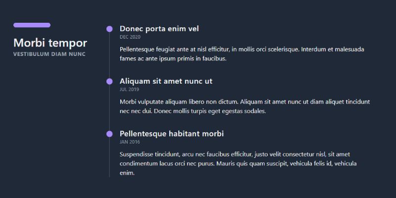
TailwindCSS timeline, which was developed by mambaui. Moreover, you can customize it according to your wish and need.
<section class="dark:bg-gray-800 dark:text-gray-100">
	<div class="container max-w-5xl px-4 py-12 mx-auto">
		<div class="grid gap-4 mx-4 sm:grid-cols-12">
			<div class="col-span-12 sm:col-span-3">
				<div class="text-center sm:text-left mb-14 before:block before:w-24 before:h-3 before:mb-5 before:rounded-md before:mx-auto sm:before:mx-0 before:dark:bg-violet-400">
					<h3 class="text-3xl font-semibold">Morbi tempor</h3>
					<span class="text-sm font-bold tracking-wider uppercase dark:text-gray-400">Vestibulum diam nunc</span>
				</div>
			</div>
			<div class="relative col-span-12 px-4 space-y-6 sm:col-span-9">
				<div class="col-span-12 space-y-12 relative px-4 sm:col-span-8 sm:space-y-8 sm:before:absolute sm:before:top-2 sm:before:bottom-0 sm:before:w-0.5 sm:before:-left-3 before:dark:bg-gray-700">
					<div class="flex flex-col sm:relative sm:before:absolute sm:before:top-2 sm:before:w-4 sm:before:h-4 sm:before:rounded-full sm:before:left-[-35px] sm:before:z-[1] before:dark:bg-violet-400">
						<h3 class="text-xl font-semibold tracking-wide">Donec porta enim vel </h3>
						<time class="text-xs tracking-wide uppercase dark:text-gray-400">Dec 2020</time>
						<p class="mt-3">Pellentesque feugiat ante at nisl efficitur, in mollis orci scelerisque. Interdum et malesuada fames ac ante ipsum primis in faucibus.</p>
					</div>
					<div class="flex flex-col sm:relative sm:before:absolute sm:before:top-2 sm:before:w-4 sm:before:h-4 sm:before:rounded-full sm:before:left-[-35px] sm:before:z-[1] before:dark:bg-violet-400">
						<h3 class="text-xl font-semibold tracking-wide">Aliquam sit amet nunc ut</h3>
						<time class="text-xs tracking-wide uppercase dark:text-gray-400">Jul 2019</time>
						<p class="mt-3">Morbi vulputate aliquam libero non dictum. Aliquam sit amet nunc ut diam aliquet tincidunt nec nec dui. Donec mollis turpis eget egestas sodales.</p>
					</div>
					<div class="flex flex-col sm:relative sm:before:absolute sm:before:top-2 sm:before:w-4 sm:before:h-4 sm:before:rounded-full sm:before:left-[-35px] sm:before:z-[1] before:dark:bg-violet-400">
						<h3 class="text-xl font-semibold tracking-wide">Pellentesque habitant morbi</h3>
						<time class="text-xs tracking-wide uppercase dark:text-gray-400">Jan 2016</time>
						<p class="mt-3">Suspendisse tincidunt, arcu nec faucibus efficitur, justo velit consectetur nisl, sit amet condimentum lacus orci nec purus. Mauris quis quam suscipit, vehicula felis id, vehicula enim.</p>
					</div>
				</div>
			</div>
		</div>
	</div>
</section>
| Author: | mambaui |
| Made with: | HTML & Tailwind CSS |
| Demo Link: | Source Code / Demo |
| Tags: | TailwindCSS timeline |
#03 Grouped CSS timeline
Grouped CSS timeline, which was developed by tailwindcomponents. Moreover, you can customize it according to your wish and need.
<!-- component -->
<div class="p-5 mb-4 bg-gray-50 rounded-lg border border-gray-100 dark:bg-gray-800 dark:border-gray-700">
    <time class="text-lg font-semibold text-gray-900 dark:text-white">January 23th, 2022</time>
    <ol class="mt-3 divide-y divider-gray-200 dark:divide-gray-700">
        <li>
            <a href="#" class="block items-center p-3 sm:flex hover:bg-gray-100 dark:hover:bg-gray-700">
                <img class="mr-3 mb-3 w-12 h-12 rounded-full sm:mb-0" src="https://via.placeholder.com/150/0000FF/" alt="Jese Leos image">
                <div class="text-gray-600 dark:text-gray-400">
                    <div class="text-base font-normal"><span class="font-medium text-gray-900 dark:text-white">Jese Leos</span> likes <span class="font-medium text-gray-900 dark:text-white">Bonnie Green's</span> post in <span class="font-medium text-gray-900 dark:text-white"> How to start with Flowbite library</span></div>
                    <div class="text-sm font-normal">"I wanted to share a webinar zeroheight."</div>
                    <span class="inline-flex items-center text-xs font-normal text-gray-500 dark:text-gray-400">
                        <svg aria-hidden="true" class="mr-1 w-3 h-3" fill="currentColor" viewBox="0 0 20 20" xmlns="http://www.w3.org/2000/svg"><path fill-rule="evenodd" d="M4.083 9h1.946c.089-1.546.383-2.97.837-4.118A6.004 6.004 0 004.083 9zM10 2a8 8 0 100 16 8 8 0 000-16zm0 2c-.076 0-.232.032-.465.262-.238.234-.497.623-.737 1.182-.389.907-.673 2.142-.766 3.556h3.936c-.093-1.414-.377-2.649-.766-3.556-.24-.56-.5-.948-.737-1.182C10.232 4.032 10.076 4 10 4zm3.971 5c-.089-1.546-.383-2.97-.837-4.118A6.004 6.004 0 0115.917 9h-1.946zm-2.003 2H8.032c.093 1.414.377 2.649.766 3.556.24.56.5.948.737 1.182.233.23.389.262.465.262.076 0 .232-.032.465-.262.238-.234.498-.623.737-1.182.389-.907.673-2.142.766-3.556zm1.166 4.118c.454-1.147.748-2.572.837-4.118h1.946a6.004 6.004 0 01-2.783 4.118zm-6.268 0C6.412 13.97 6.118 12.546 6.03 11H4.083a6.004 6.004 0 002.783 4.118z" clip-rule="evenodd"></path></svg>
                        Public
                    </span>
                </div>
            </a>
        </li>
        <li>
            <a href="#" class="block items-center p-3 sm:flex hover:bg-gray-100 dark:hover:bg-gray-700">
                <img class="mr-3 mb-3 w-12 h-12 rounded-full sm:mb-0" src="https://via.placeholder.com/150/0000FF/" alt="Bonnie Green image">
                <div>
                    <div class="text-base font-normal text-gray-600 dark:text-gray-400"><span class="font-medium text-gray-900 dark:text-white">Bonnie Green</span> react to <span class="font-medium text-gray-900 dark:text-white">Thomas Lean's</span> comment</div>
                    <span class="inline-flex items-center text-xs font-normal text-gray-500 dark:text-gray-400">
                        <svg aria-hidden="true" class="mr-1 w-3 h-3" fill="currentColor" viewBox="0 0 20 20" xmlns="http://www.w3.org/2000/svg"><path fill-rule="evenodd" d="M3.707 2.293a1 1 0 00-1.414 1.414l14 14a1 1 0 001.414-1.414l-1.473-1.473A10.014 10.014 0 0019.542 10C18.268 5.943 14.478 3 10 3a9.958 9.958 0 00-4.512 1.074l-1.78-1.781zm4.261 4.26l1.514 1.515a2.003 2.003 0 012.45 2.45l1.514 1.514a4 4 0 00-5.478-5.478z" clip-rule="evenodd"></path><path d="M12.454 16.697L9.75 13.992a4 4 0 01-3.742-3.741L2.335 6.578A9.98 9.98 0 00.458 10c1.274 4.057 5.065 7 9.542 7 .847 0 1.669-.105 2.454-.303z"></path></svg>
                        Private
                    </span>
                </div>
            </a>
        </li>
    </ol>
</div>
<div class="p-5 bg-gray-50 rounded-lg border border-gray-100 dark:bg-gray-800 dark:border-gray-700">
    <time class="text-lg font-semibold text-gray-900 dark:text-white">January 10th, 2022</time>
    <ol class="mt-3 divide-y divider-gray-200 dark:divide-gray-700">
        <li>
            <a href="#" class="block items-center p-3 sm:flex hover:bg-gray-100 dark:hover:bg-gray-700">
                <img class="mr-3 mb-3 w-12 h-12 rounded-full sm:mb-0" src="https://via.placeholder.com/150/0000FF/" alt="Laura Romeros image">
                <div class="text-gray-600 dark:text-gray-400">
                    <div class="text-base font-normal"><span class="font-medium text-gray-900 dark:text-white">Laura Romeros</span> likes <span class="font-medium text-gray-900 dark:text-white">Bonnie Green's</span> post in <span class="font-medium text-gray-900 dark:text-white"> How to start with Flowbite library</span></div>
                    <div class="text-sm font-normal">"I wanted to share a webinar zeroheight."</div>
                    <span class="inline-flex items-center text-xs font-normal text-gray-500 dark:text-gray-400">
                        <svg aria-hidden="true" class="mr-1 w-3 h-3" fill="currentColor" viewBox="0 0 20 20" xmlns="http://www.w3.org/2000/svg"><path fill-rule="evenodd" d="M3.707 2.293a1 1 0 00-1.414 1.414l14 14a1 1 0 001.414-1.414l-1.473-1.473A10.014 10.014 0 0019.542 10C18.268 5.943 14.478 3 10 3a9.958 9.958 0 00-4.512 1.074l-1.78-1.781zm4.261 4.26l1.514 1.515a2.003 2.003 0 012.45 2.45l1.514 1.514a4 4 0 00-5.478-5.478z" clip-rule="evenodd"></path><path d="M12.454 16.697L9.75 13.992a4 4 0 01-3.742-3.741L2.335 6.578A9.98 9.98 0 00.458 10c1.274 4.057 5.065 7 9.542 7 .847 0 1.669-.105 2.454-.303z"></path></svg>
                        Private
                    </span>
                </div>
            </a>
        </li>
        <li>
            <a href="#" class="block items-center p-3 sm:flex hover:bg-gray-100 dark:hover:bg-gray-700">
                <img class="mr-3 mb-3 w-12 h-12 rounded-full sm:mb-0" src="https://via.placeholder.com/150/0000FF/" alt="Mike Willi image">
                <div>
                    <div class="text-base font-normal text-gray-600 dark:text-gray-400"><span class="font-medium text-gray-900 dark:text-white">Mike Willi</span> react to <span class="font-medium text-gray-900 dark:text-white">Thomas Lean's</span> comment</div>
                    <span class="inline-flex items-center text-xs font-normal text-gray-500 dark:text-gray-400">
                        <svg aria-hidden="true" class="mr-1 w-3 h-3" fill="currentColor" viewBox="0 0 20 20" xmlns="http://www.w3.org/2000/svg"><path fill-rule="evenodd" d="M4.083 9h1.946c.089-1.546.383-2.97.837-4.118A6.004 6.004 0 004.083 9zM10 2a8 8 0 100 16 8 8 0 000-16zm0 2c-.076 0-.232.032-.465.262-.238.234-.497.623-.737 1.182-.389.907-.673 2.142-.766 3.556h3.936c-.093-1.414-.377-2.649-.766-3.556-.24-.56-.5-.948-.737-1.182C10.232 4.032 10.076 4 10 4zm3.971 5c-.089-1.546-.383-2.97-.837-4.118A6.004 6.004 0 0115.917 9h-1.946zm-2.003 2H8.032c.093 1.414.377 2.649.766 3.556.24.56.5.948.737 1.182.233.23.389.262.465.262.076 0 .232-.032.465-.262.238-.234.498-.623.737-1.182.389-.907.673-2.142.766-3.556zm1.166 4.118c.454-1.147.748-2.572.837-4.118h1.946a6.004 6.004 0 01-2.783 4.118zm-6.268 0C6.412 13.97 6.118 12.546 6.03 11H4.083a6.004 6.004 0 002.783 4.118z" clip-rule="evenodd"></path></svg>
                        Public
                    </span>
                </div>
            </a>
        </li>
        <li>
            <a href="#" class="block items-center p-3 sm:flex hover:bg-gray-100 dark:hover:bg-gray-700">
                <img class="mr-3 mb-3 w-12 h-12 rounded-full sm:mb-0" src="https://via.placeholder.com/150/0000FF/" alt="Jese Leos image">
                <div class="text-gray-600 dark:text-gray-400">
                    <div class="text-base font-normal"><span class="font-medium text-gray-900 dark:text-white">Jese Leos</span> likes <span class="font-medium text-gray-900 dark:text-white">Bonnie Green's</span> post in <span class="font-medium text-gray-900 dark:text-white"> How to start with Flowbite library</span></div>
                    <div class="text-sm font-normal">"I wanted to share a webinar zeroheight."</div>
                    <span class="inline-flex items-center text-xs font-normal text-gray-500 dark:text-gray-400">
                        <svg aria-hidden="true" class="mr-1 w-3 h-3" fill="currentColor" viewBox="0 0 20 20" xmlns="http://www.w3.org/2000/svg"><path fill-rule="evenodd" d="M4.083 9h1.946c.089-1.546.383-2.97.837-4.118A6.004 6.004 0 004.083 9zM10 2a8 8 0 100 16 8 8 0 000-16zm0 2c-.076 0-.232.032-.465.262-.238.234-.497.623-.737 1.182-.389.907-.673 2.142-.766 3.556h3.936c-.093-1.414-.377-2.649-.766-3.556-.24-.56-.5-.948-.737-1.182C10.232 4.032 10.076 4 10 4zm3.971 5c-.089-1.546-.383-2.97-.837-4.118A6.004 6.004 0 0115.917 9h-1.946zm-2.003 2H8.032c.093 1.414.377 2.649.766 3.556.24.56.5.948.737 1.182.233.23.389.262.465.262.076 0 .232-.032.465-.262.238-.234.498-.623.737-1.182.389-.907.673-2.142.766-3.556zm1.166 4.118c.454-1.147.748-2.572.837-4.118h1.946a6.004 6.004 0 01-2.783 4.118zm-6.268 0C6.412 13.97 6.118 12.546 6.03 11H4.083a6.004 6.004 0 002.783 4.118z" clip-rule="evenodd"></path></svg>
                        Public
                    </span>
                </div>
            </a>
        </li>
        <li>
            <a href="#" class="block items-center p-3 sm:flex hover:bg-gray-100 dark:hover:bg-gray-700">
                <img class="mr-3 mb-3 w-12 h-12 rounded-full sm:mb-0" src="https://via.placeholder.com/150/0000FF/" alt="Bonnie Green image">
                <div class="text-gray-600 dark:text-gray-400">
                    <div class="text-base font-normal"><span class="font-medium text-gray-900 dark:text-white">Bonnie Green</span> likes <span class="font-medium text-gray-900 dark:text-white">Bonnie Green's</span> post in <span class="font-medium text-gray-900 dark:text-white"> Top figma designs</span></div>
                    <div class="text-sm font-normal">"I wanted to share a webinar zeroheight."</div>
                    <span class="inline-flex items-center text-xs font-normal text-gray-500 dark:text-gray-400">
                        <svg aria-hidden="true" class="mr-1 w-3 h-3" fill="currentColor" viewBox="0 0 20 20" xmlns="http://www.w3.org/2000/svg"><path fill-rule="evenodd" d="M3.707 2.293a1 1 0 00-1.414 1.414l14 14a1 1 0 001.414-1.414l-1.473-1.473A10.014 10.014 0 0019.542 10C18.268 5.943 14.478 3 10 3a9.958 9.958 0 00-4.512 1.074l-1.78-1.781zm4.261 4.26l1.514 1.515a2.003 2.003 0 012.45 2.45l1.514 1.514a4 4 0 00-5.478-5.478z" clip-rule="evenodd"></path><path d="M12.454 16.697L9.75 13.992a4 4 0 01-3.742-3.741L2.335 6.578A9.98 9.98 0 00.458 10c1.274 4.057 5.065 7 9.542 7 .847 0 1.669-.105 2.454-.303z"></path></svg>
                        Private
                    </span>
                </div>
            </a>
        </li>
    </ol>
</div>| Author: | tailwindcomponents |
| Made with: | HTML & Tailwind CSS |
| Demo Link: | Source Code / Demo |
| Tags: | Grouped CSS timeline |
#04 Twitter Timeline Component
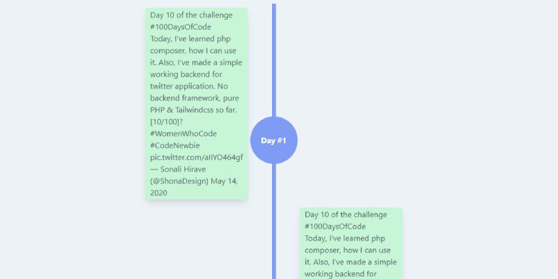
Twitter Timeline Component, which was developed by hiravesonali. Moreover, you can customize it according to your wish and need.
<!-- component -->
<div class="max-w-md mx-auto">
<!--frist row-->
<div class="flex flex-no-wrap lg:flex-row flex-row-reverse justify-center pt-10">
<!-- left col -->
<div class="w-2/5 sm:2/3 flex-none p-2">
<div class="text-gray-700 lg:float-right float-left border-2 rounded border-green-200 bg-green-200 shadow-lg px-2">
<blockquote class="twitter-tweet">
<p lang="en" dir="ltr">
Day 10 of the challenge
<a
href="https://twitter.com/hashtag/100DaysOfCode?src=hash&ref_src=twsrc%5Etfw"
>#100DaysOfCode</a>
<br />Today, I've learned php composer, how I can use it. Also, I've made a simple working backend for twitter application. No backend framework, pure PHP & Tailwindcss so far.
<br />[10/100]?
<a
href="https://twitter.com/hashtag/WomenWhoCode?src=hash&ref_src=twsrc%5Etfw"
>#WomenWhoCode</a>
<a
href="https://twitter.com/hashtag/CodeNewbie?src=hash&ref_src=twsrc%5Etfw"
>#CodeNewbie</a>
<a href="https://t.co/aIIYO464gf">pic.twitter.com/aIIYO464gf</a>
</p>— Sonali Hirave (@ShonaDesign)
<a
href="https://twitter.com/ShonaDesign/status/1260913733687279616?ref_src=twsrc%5Etfw"
>May 14, 2020</a>
</blockquote>
<script async src="https://platform.twitter.com/widgets.js" charset="utf-8"></script>
</div>
</div>
<!--line column-->
<div class="w-1/5 sm:1/3 flex-none float-left">
<div class="bg-indigo-400 p-1 h-full w-1 mx-auto">
<button
class="h-24 w-24 mt-56 bg-indigo-400 hover:bg-indigo-600 text-white font-bold rounded-full -ml-12"
>Day #1</button>
</div>
</div>
<!--right column-->
<div class="w-2/5 flex-none p-2 hidden lg:block"></div>
</div>
<div class="flex flex-no-wrap sm:flex-row-reverse1 justify-center">
<!-- left col -->
<div class="w-2/5 sm:2/3 flex-none p-2 hidden lg:block"></div>
<!--line column-->
<div class="w-1/5 sm:1/3 flex-none float-left">
<div class="bg-indigo-400 p-1 h-full w-1 mx-auto">
<button
class="h-24 w-24 mt-56 bg-indigo-400 hover:bg-indigo-600 text-white font-bold rounded-full -ml-12"
>Day #2</button>
</div>
</div>
<!--right column-->
<div class="w-2/5 flex-none p-2">
<div class="text-gray-700 float-left border-2 rounded border-green-200 bg-green-200 shadow-lg px-2">
<blockquote class="twitter-tweet">
<p lang="en" dir="ltr">
Day 10 of the challenge
<a
href="https://twitter.com/hashtag/100DaysOfCode?src=hash&ref_src=twsrc%5Etfw"
>#100DaysOfCode</a>
<br />Today, I've learned php composer, how I can use it. Also, I've made a simple working backend for twitter application. No backend framework, pure PHP & Tailwindcss so far.
<br />[10/100]?
<a
href="https://twitter.com/hashtag/WomenWhoCode?src=hash&ref_src=twsrc%5Etfw"
>#WomenWhoCode</a>
<a
href="https://twitter.com/hashtag/CodeNewbie?src=hash&ref_src=twsrc%5Etfw"
>#CodeNewbie</a>
<a href="https://t.co/aIIYO464gf">pic.twitter.com/aIIYO464gf</a>
</p>— Sonali Hirave (@ShonaDesign)
<a
href="https://twitter.com/ShonaDesign/status/1260913733687279616?ref_src=twsrc%5Etfw"
>May 14, 2020</a>
</blockquote>
<script async src="https://platform.twitter.com/widgets.js" charset="utf-8"></script>
</div>
</div>
</div>
<div class="flex flex-no-wrap lg:flex-row flex-row-reverse justify-center">
<!-- left col -->
<div class="w-2/5 sm:2/3 flex-none p-2">
<div class="text-gray-700 lg:float-right float-left border-2 rounded border-green-200 bg-green-200 shadow-lg px-2">
<blockquote class="twitter-tweet">
<p lang="en" dir="ltr">
Day 10 of the challenge
<a
href="https://twitter.com/hashtag/100DaysOfCode?src=hash&ref_src=twsrc%5Etfw"
>#100DaysOfCode</a>
<br />Today, I've learned php composer, how I can use it. Also, I've made a simple working backend for twitter application. No backend framework, pure PHP & Tailwindcss so far.
<br />[10/100]?
<a
href="https://twitter.com/hashtag/WomenWhoCode?src=hash&ref_src=twsrc%5Etfw"
>#WomenWhoCode</a>
<a
href="https://twitter.com/hashtag/CodeNewbie?src=hash&ref_src=twsrc%5Etfw"
>#CodeNewbie</a>
<a href="https://t.co/aIIYO464gf">pic.twitter.com/aIIYO464gf</a>
</p>— Sonali Hirave (@ShonaDesign)
<a
href="https://twitter.com/ShonaDesign/status/1260913733687279616?ref_src=twsrc%5Etfw"
>May 14, 2020</a>
</blockquote>
<script async src="https://platform.twitter.com/widgets.js" charset="utf-8"></script>
</div>
</div>
<!--line column-->
<div class="w-1/5 sm:1/3 flex-none float-left">
<div class="bg-indigo-400 p-1 h-full w-1 mx-auto">
<button
class="h-24 w-24 mt-56 bg-indigo-400 hover:bg-indigo-600 text-white font-bold rounded-full -ml-12"
>Day #3</button>
</div>
</div>
<!--right column-->
<div class="w-2/5 flex-none p-2 hidden lg:block"></div>
</div>
</div>| Author: | hiravesonali |
| Made with: | HTML & Tailwind CSS |
| Demo Link: | Source Code / Demo |
| Tags: | Twitter Timeline Component |
#05 Activity log timeline
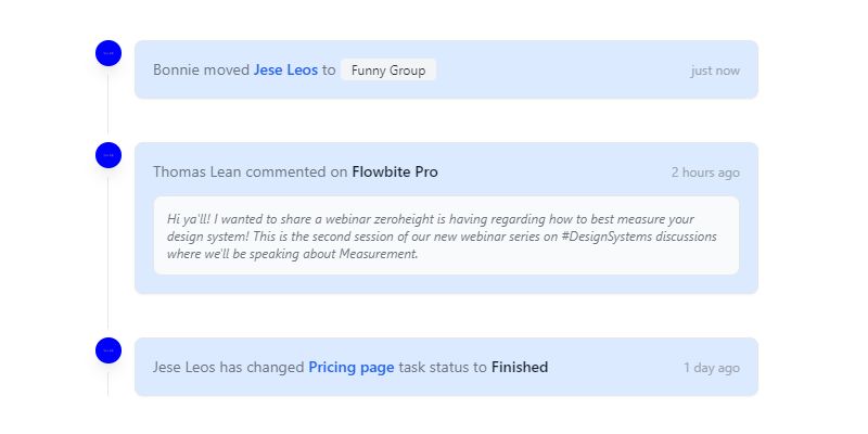
Activity log timeline, which was developed by Rahul. Moreover, you can customize it according to your wish and need.
<head>
  <meta charset="UTF-8">
  <meta name="viewport" content="width=device-width, initial-scale=1.0">
  <script src="https://cdn.tailwindcss.com"></script>
</head>
<body>

<div style="width:600px; margin: 100px auto;">

<ol class="relative border-l border-gray-200 dark:border-gray-700">
    <li class="mb-10 ml-6">
        <span class="flex absolute -left-3 justify-center items-center w-6 h-6 bg-blue-200 rounded-full ring-8 ring-white dark:ring-gray-900 dark:bg-blue-900">
            <img class="rounded-full shadow-lg" src="https://via.placeholder.com/150/0000FF/" alt="Bonnie image">
        </span>
        <div class="justify-between items-center p-4 bg-blue-100 rounded-lg border border-gray-200 shadow-sm sm:flex dark:bg-gray-700 dark:border-gray-600">
            <time class="mb-1 text-xs font-normal text-gray-400 sm:order-last sm:mb-0">just now</time>
            <div class="text-sm font-normal text-gray-500 dark:text-gray-300">Bonnie moved <a href="#" class="font-semibold text-blue-600 dark:text-blue-500 hover:underline">Jese Leos</a> to <span class="bg-gray-100 text-gray-800 text-xs font-normal mr-2 px-2.5 py-0.5 rounded dark:bg-gray-600 dark:text-gray-300">Funny Group</span></div>
        </div>
    </li>
    <li class="mb-10 ml-6">
        <span class="flex absolute -left-3 justify-center items-center w-6 h-6 bg-blue-200 rounded-full ring-8 ring-white dark:ring-gray-900 dark:bg-blue-900">
            <img class="rounded-full shadow-lg" src="https://via.placeholder.com/150/0000FF/" alt="Thomas Lean image">
        </span>
        <div class="p-4 bg-blue-100 rounded-lg border border-gray-200 shadow-sm dark:bg-gray-700 dark:border-gray-600">
            <div class="justify-between items-center mb-3 sm:flex">
                <time class="mb-1 text-xs font-normal text-gray-400 sm:order-last sm:mb-0">2 hours ago</time>
                <div class="text-sm font-normal text-gray-500 lex dark:text-gray-300">Thomas Lean commented on  <a href="#" class="font-semibold text-gray-900 dark:text-white hover:underline">Flowbite Pro</a></div>
            </div>
            <div class="p-3 text-xs italic font-normal text-gray-500 bg-gray-50 rounded-lg border border-gray-200 dark:bg-gray-600 dark:border-gray-500 dark:text-gray-300">Hi ya'll! I wanted to share a webinar zeroheight is having regarding how to best measure your design system! This is the second session of our new webinar series on #DesignSystems discussions where we'll be speaking about Measurement.</div>
        </div>
    </li>
    <li class="ml-6">
        <span class="flex absolute -left-3 justify-center items-center w-6 h-6 bg-blue-200 rounded-full ring-8 ring-white dark:ring-gray-900 dark:bg-blue-900">
            <img class="rounded-full shadow-lg" src="https://via.placeholder.com/150/0000FF/" alt="Jese Leos image">
        </span>
        <div class="justify-between items-center p-4 bg-blue-100 rounded-lg border border-gray-200 shadow-sm sm:flex dark:bg-gray-700 dark:border-gray-600">
            <time class="mb-1 text-xs font-normal text-gray-400 sm:order-last sm:mb-0">1 day ago</time>
            <div class="text-sm font-normal text-gray-500 lex dark:text-gray-300">Jese Leos has changed <a href="#" class="font-semibold text-blue-600 dark:text-blue-500 hover:underline">Pricing page</a> task status to  <span class="font-semibold text-gray-900 dark:text-white">Finished</span></div>
        </div>
    </li>
</ol>
  </div>
</body>| Author: | Rahul |
| Made with: | HTML & Tailwind CSS |
| Demo Link: | Source Code / Demo |
| Tags: | Activity log timeline |
#06 Simple Vertical Timeline
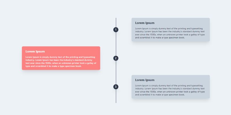
Simple Vertical Timeline, which was developed by rezakurniawan17. Moreover, you can customize it according to your wish and need.
<!-- component -->
<div class="container bg-gray-200 mx-auto w-full h-full">
  <div class="relative wrap overflow-hidden p-10 h-full">
    <div class="border-2-2 absolute border-opacity-20 border-gray-700 h-full border" style="left: 50%"></div>
    <!-- right timeline -->
    <div class="mb-8 flex justify-between items-center w-full right-timeline">
      <div class="order-1 w-5/12"></div>
      <div class="z-20 flex items-center order-1 bg-gray-800 shadow-xl w-8 h-8 rounded-full">
        <h1 class="mx-auto font-semibold text-lg text-white">1</h1>
      </div>
      <div class="order-1 bg-gray-400 rounded-lg shadow-xl w-5/12 px-6 py-4">
        <h3 class="mb-3 font-bold text-gray-800 text-xl">Lorem Ipsum</h3>
        <p class="text-sm leading-snug tracking-wide text-gray-900 text-opacity-100">Lorem Ipsum is simply dummy text of the printing and typesetting industry. Lorem Ipsum has been the industry's standard dummy text ever since the 1500s, when an unknown printer took a galley of type and scrambled it to make a type specimen book.</p>
      </div>
    </div>

    <!-- left timeline -->
    <div class="mb-8 flex justify-between flex-row-reverse items-center w-full left-timeline">
      <div class="order-1 w-5/12"></div>
      <div class="z-20 flex items-center order-1 bg-gray-800 shadow-xl w-8 h-8 rounded-full">
        <h1 class="mx-auto text-white font-semibold text-lg">2</h1>
      </div>
      <div class="order-1 bg-red-400 rounded-lg shadow-xl w-5/12 px-6 py-4">
        <h3 class="mb-3 font-bold text-white text-xl">Lorem Ipsum</h3>
        <p class="text-sm font-medium leading-snug tracking-wide text-white text-opacity-100">Lorem Ipsum is simply dummy text of the printing and typesetting industry. Lorem Ipsum has been the industry's standard dummy text ever since the 1500s, when an unknown printer took a galley of type and scrambled it to make a type specimen book.</p>
      </div>
    </div>

    <!-- right timeline -->
    <div class="mb-8 flex justify-between items-center w-full right-timeline">
      <div class="order-1 w-5/12"></div>
      <div class="z-20 flex items-center order-1 bg-gray-800 shadow-xl w-8 h-8 rounded-full">
        <h1 class="mx-auto font-semibold text-lg text-white">3</h1>
      </div>
      <div class="order-1 bg-gray-400 rounded-lg shadow-xl w-5/12 px-6 py-4">
        <h3 class="mb-3 font-bold text-gray-800 text-xl">Lorem Ipsum</h3>
        <p class="text-sm leading-snug tracking-wide text-gray-900 text-opacity-100">Lorem Ipsum is simply dummy text of the printing and typesetting industry. Lorem Ipsum has been the industry's standard dummy text ever since the 1500s, when an unknown printer took a galley of type and scrambled it to make a type specimen book.</p>
      </div>
    </div>

    <!-- left timeline -->
    <div class="mb-8 flex justify-between flex-row-reverse items-center w-full left-timeline">
      <div class="order-1 w-5/12"></div>
      <div class="z-20 flex items-center order-1 bg-gray-800 shadow-xl w-8 h-8 rounded-full">
        <h1 class="mx-auto text-white font-semibold text-lg">4</h1>
      </div>
      <div class="order-1 bg-red-400 rounded-lg shadow-xl w-5/12 px-6 py-4">
        <h3 class="mb-3 font-bold text-white text-xl">Lorem Ipsum</h3>
        <p class="text-sm font-medium leading-snug tracking-wide text-white text-opacity-100">Lorem Ipsum is simply dummy text of the printing and typesetting industry. Lorem Ipsum has been the industry's standard dummy text ever since the 1500s, when an unknown printer took a galley of type and scrambled it to make a type specimen book.</p>
      </div>
    </div>
  </div>
</div>| Author: | rezakurniawan17 |
| Made with: | HTML & Tailwind CSS |
| Demo Link: | Source Code / Demo |
| Tags: | Simple Vertical Timeline |
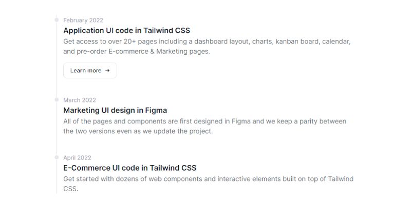
#07 CSS Timeline Component
CSS Timeline Component, which was developed by zoltanszogyenyi. Moreover, you can customize it according to your wish and need.
<!-- component --> <!-- This is an example component --> <div class="max-w-2xl mx-auto"> <ol class="relative border-l border-gray-200 dark:border-gray-700"> <li class="mb-10 ml-4"> <div class="absolute w-3 h-3 bg-gray-200 rounded-full -left-1.5 border border-white dark:border-gray-900 dark:bg-gray-700"> </div> <time class="mb-1 text-sm font-normal leading-none text-gray-400 dark:text-gray-500">February 2022</time> <h3 class="text-lg font-semibold text-gray-900 dark:text-white">Application UI code in Tailwind CSS</h3> <p class="mb-4 text-base font-normal text-gray-500 dark:text-gray-400">Get access to over 20+ pages including a dashboard layout, charts, kanban board, calendar, and pre-order E-commerce & Marketing pages.</p> <a href="#" class="inline-flex items-center px-4 py-2 text-sm font-medium text-gray-900 bg-white border border-gray-200 rounded-lg hover:bg-gray-100 hover:text-blue-700 focus:z-10 focus:ring-2 focus:ring-blue-700 focus:text-blue-700 dark:bg-gray-800 dark:text-gray-400 dark:border-gray-600 dark:hover:text-white dark:hover:bg-gray-700">Learn more <svg class="w-3 h-3 ml-2" fill="currentColor" viewBox="0 0 20 20" xmlns="http://www.w3.org/2000/svg"> <path fill-rule="evenodd" d="M12.293 5.293a1 1 0 011.414 0l4 4a1 1 0 010 1.414l-4 4a1 1 0 01-1.414-1.414L14.586 11H3a1 1 0 110-2h11.586l-2.293-2.293a1 1 0 010-1.414z" clip-rule="evenodd"></path> </svg></a> </li> <li class="mb-10 ml-4"> <div class="absolute w-3 h-3 bg-gray-200 rounded-full -left-1.5 border border-white dark:border-gray-900 dark:bg-gray-700"> </div> <time class="mb-1 text-sm font-normal leading-none text-gray-400 dark:text-gray-500">March 2022</time> <h3 class="text-lg font-semibold text-gray-900 dark:text-white">Marketing UI design in Figma</h3> <p class="text-base font-normal text-gray-500 dark:text-gray-400">All of the pages and components are first designed in Figma and we keep a parity between the two versions even as we update the project.</p> </li> <li class="ml-4"> <div class="absolute w-3 h-3 bg-gray-200 rounded-full -left-1.5 border border-white dark:border-gray-900 dark:bg-gray-700"> </div> <time class="mb-1 text-sm font-normal leading-none text-gray-400 dark:text-gray-500">April 2022</time> <h3 class="text-lg font-semibold text-gray-900 dark:text-white">E-Commerce UI code in Tailwind CSS</h3> <p class="text-base font-normal text-gray-500 dark:text-gray-400">Get started with dozens of web components and interactive elements built on top of Tailwind CSS.</p> </li> </ol> <p class="mt-5">This timeline component is part of a larger, open-source library of Tailwind CSS components. Learn more by going to the official <a class="text-blue-600 hover:underline" href="#" target="_blank">Flowbite Documentation</a>. </p> </div>
| Author: | zoltanszogyenyi |
| Made with: | HTML & Tailwind CSS |
| Demo Link: | Source Code / Demo |
| Tags: | CSS Timeline Component |
#08 Timeline dialog
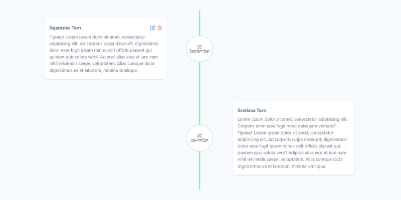
Timeline dialog, which was developed by tailwindcomponents. Moreover, you can customize it according to your wish and need.
<!-- component -->
<!-- This is an example component -->
<link rel="stylesheet" href="https://cdnjs.cloudflare.com/ajax/libs/font-awesome/5.14.0/css/all.min.css" integrity="sha512-1PKOgIY59xJ8Co8+NE6FZ+LOAZKjy+KY8iq0G4B3CyeY6wYHN3yt9PW0XpSriVlkMXe40PTKnXrLnZ9+fkDaog==" crossorigin="anonymous" />

<div class="min-h-screen bg-gray-100">

    <div class="min-h-screen flex justify-center">
        <div class="w-2/3 mx-auto">
            <div class="flex flex-row w-full">
    <!-- left col -->

    <div class="w-2/5 px-2 py-10">
        <div class="flex flex-col w-full rounded-lg shadow bg-white px-4 py-5">
            <div class="text-gray-600 mb-2 flex justify-between">
                <div class="font-bold">
                    Svjatoslav Torn
                </div>
                <div class="flex flex-row">
                    <button class="text-blue-500 mr-2 hover:text-blue-300 transition duration-200"><i class="far fa-edit"></i></button>
                    <button class="text-red-500 hover:text-red-300 transition duration-200"><i class="far fa-trash-alt"></i></button>
                </div>
            </div>
            <div class="text-gray-600">
                Привет Lorem ipsum dolor sit amet, consectetur adipisicing elit. Ad corporis culpa deserunt, dignissimos dolor esse fugit ipsam minus odit officiis placeat qui, quidem quis soluta vero? Adipisci alias eius et iure nam nihil reiciendis saepe, voluptatem. Alias cumque dicta dignissimos ea et laborum, minima similique.
            </div>
        </div>

    </div>
    <!--line column-->
    <div class="w-1/5  flex justify-center">
        <div class="relative flex h-full w-1 bg-green-300 items-center justify-center">
            <div class="absolute flex flex-col justify-center h-24 w-24 rounded-full border-2 border-green-300 leading-none text-center z-10 bg-white font-thin">
                <div>20</div>
                <div>September</div>
            </div>
        </div>
    </div>
    <!--right column-->
    <div class="w-2/5 px-2 py-10 ">

    </div>
</div>
            <div class="flex flex-row w-full">
    <!-- left col -->

    <div class="w-2/5 px-2 py-10">

    </div>
    <!--line column-->
    <div class="w-1/5  flex justify-center">
        <div class="relative flex h-full w-1 bg-green-300 items-center justify-center">
            <div class="absolute flex flex-col justify-center h-24 w-24 rounded-full border-2 border-green-300 leading-none text-center z-10 bg-white font-thin">
                <div>20</div>
                <div>сентября</div>
            </div>
        </div>
    </div>
    <!--right column-->
    <div class="w-2/5 px-2 py-10 ">
        <div class="flex flex-col w-full rounded-lg shadow bg-white px-4 py-5">
            <div class="text-gray-600 mb-2 flex justify-between">
                <div class="font-bold">
                    Svetlana Torn
                </div>
            </div>
            <div class="text-gray-600">
                Lorem ipsum dolor sit amet, consectetur adipisicing elit. Corporis enim esse fuga modi quisquam veritatis?
                Привет Lorem ipsum dolor sit amet, consectetur adipisicing elit. Ad corporis culpa deserunt, dignissimos dolor esse fugit ipsam minus odit officiis placeat qui, quidem quis soluta vero? Adipisci alias eius et iure nam nihil reiciendis saepe, voluptatem. Alias cumque dicta dignissimos ea et laborum, minima similique.
            </div>
        </div>
    </div>
</div>
            <div class="flex flex-row w-full">
    <!-- left col -->

    <div class="w-2/5 px-2 py-10">
        <div class="flex flex-col w-full rounded-lg shadow bg-white px-4 py-5">
            <div class="text-gray-600 mb-2 flex justify-between">
                <div class="font-bold">
                    Svjatoslav Torn
                </div>
                <div class="flex flex-row">
                    <button class="text-blue-500 mr-2 hover:text-blue-300 transition duration-200"><i class="far fa-edit"></i></button>
                    <button class="text-red-500 hover:text-red-300 transition duration-200"><i class="far fa-trash-alt"></i></button>
                </div>
            </div>
            <div class="text-gray-600">
                Привет Lorem ipsum dolor sit amet, consectetur adipisicing elit. Ad corporis culpa deserunt, dignissimos dolor esse fugit ipsam minus odit officiis placeat qui, quidem quis soluta vero? Adipisci alias eius et iure nam nihil reiciendis saepe, voluptatem. Alias cumque dicta dignissimos ea et laborum, minima similique.
            </div>
        </div>

    </div>
    <!--line column-->
    <div class="w-1/5  flex justify-center">
        <div class="relative flex h-full w-1 bg-green-300 items-center justify-center">
            <div class="absolute flex flex-col justify-center h-24 w-24 rounded-full border-2 border-green-300 leading-none text-center z-10 bg-white font-thin">
                <div>20</div>
                <div>сентября</div>
            </div>
        </div>
    </div>
    <!--right column-->
    <div class="w-2/5 px-2 py-10 ">

    </div>
</div>
        </div>


    </div>

</div>| Author: | tailwindcomponents |
| Made with: | HTML & Tailwind CSS |
| Demo Link: | Source Code / Demo |
| Tags: | Timeline dialog |
15+ Tailwind Progress bar examples
Hello guys in this tutorial i have added 15+ Tailwind Progress bar Examples which are available on Codepen and other resources.
#09 Responsive Tailwind Timeline Example
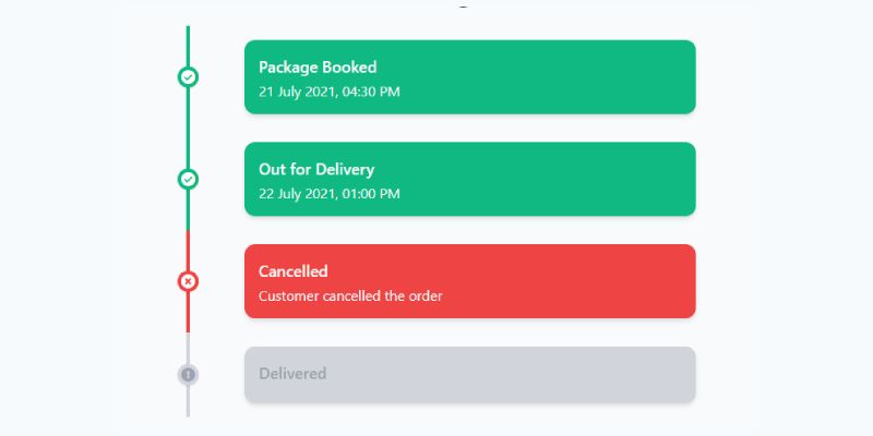
Responsive Tailwind Timeline Example, which was developed by Ishaan Sheikh. Moreover, you can customize it according to your wish and need.
<div class="p-4 mt-4">
    <h1 class="text-4xl text-center font-semibold mb-6">Package status</h1>
    <div class="container">
      <div class="flex flex-col md:grid grid-cols-12 text-gray-50">

        <div class="flex md:contents">
          <div class="col-start-2 col-end-4 mr-10 md:mx-auto relative">
            <div class="h-full w-6 flex items-center justify-center">
              <div class="h-full w-1 bg-green-500 pointer-events-none"></div>
            </div>
            <div class="w-6 h-6 absolute top-1/2 -mt-3 rounded-full bg-green-500 shadow text-center">
              <i class="fas fa-check-circle text-white"></i>
            </div>
          </div>
          <div class="bg-green-500 col-start-4 col-end-12 p-4 rounded-xl my-4 mr-auto shadow-md w-full">
            <h3 class="font-semibold text-lg mb-1">Package Booked</h3>
            <p class="leading-tight text-justify w-full">
              21 July 2021, 04:30 PM
            </p>
          </div>
        </div>

        <div class="flex md:contents">
          <div class="col-start-2 col-end-4 mr-10 md:mx-auto relative">
            <div class="h-full w-6 flex items-center justify-center">
              <div class="h-full w-1 bg-green-500 pointer-events-none"></div>
            </div>
            <div class="w-6 h-6 absolute top-1/2 -mt-3 rounded-full bg-green-500 shadow text-center">
              <i class="fas fa-check-circle text-white"></i>
            </div>
          </div>
          <div class="bg-green-500 col-start-4 col-end-12 p-4 rounded-xl my-4 mr-auto shadow-md w-full">
            <h3 class="font-semibold text-lg mb-1">Out for Delivery</h3>
            <p class="leading-tight text-justify">
              22 July 2021, 01:00 PM
            </p>
          </div>
        </div>

        <div class="flex md:contents">
          <div class="col-start-2 col-end-4 mr-10 md:mx-auto relative">
            <div class="h-full w-6 flex items-center justify-center">
              <div class="h-full w-1 bg-red-500 pointer-events-none"></div>
            </div>
            <div class="w-6 h-6 absolute top-1/2 -mt-3 rounded-full bg-red-500 shadow text-center">
              <i class="fas fa-times-circle text-white"></i>
            </div>
          </div>
          <div class="bg-red-500 col-start-4 col-end-12 p-4 rounded-xl my-4 mr-auto shadow-md w-full">
            <h3 class="font-semibold text-lg mb-1 text-gray-50">Cancelled</h3>
            <p class="leading-tight text-justify">
              Customer cancelled the order
            </p>
          </div>
        </div>

        <div class="flex md:contents">
          <div class="col-start-2 col-end-4 mr-10 md:mx-auto relative">
            <div class="h-full w-6 flex items-center justify-center">
              <div class="h-full w-1 bg-gray-300 pointer-events-none"></div>
            </div>
            <div class="w-6 h-6 absolute top-1/2 -mt-3 rounded-full bg-gray-300 shadow text-center">
              <i class="fas fa-exclamation-circle text-gray-400"></i>
            </div>
          </div>
          <div class="bg-gray-300 col-start-4 col-end-12 p-4 rounded-xl my-4 mr-auto shadow-md w-full">
            <h3 class="font-semibold text-lg mb-1 text-gray-400">Delivered</h3>
            <p class="leading-tight text-justify">

            </p>
          </div>
        </div>

      </div>
    </div>
</div>| Author: | Ishaan Sheikh |
| Made with: | HTML & Tailwind CSS |
| Demo Link: | Source Code / Demo |
| Tags: | Responsive Tailwind Timeline |
#10 Vertical Timeline Using Tailwind
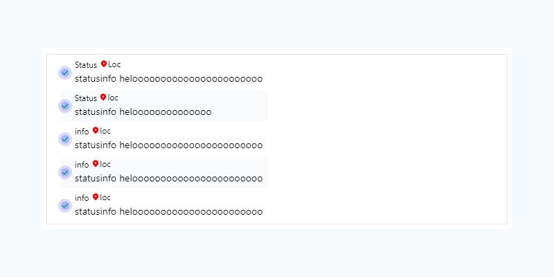
Vertical Timeline Using Tailwind, which was developed by tailwindcss. Moreover, you can customize it according to your wish and need.
<div class="border h-auto text-sm text-grey-dark flex mt-4 my-0 mx-2 px-5">
	<!-- list start remove mt-4 above-->
	<ul>
		<li class="list-none list-outside flex mt-1 mb-1 even:bg-gray-50 hover:bg-primaryh">
			<!-- svg start-->
			<div class="my-4 rounded-full h-3 w-3 flex items-center bg-indigo-300 ring-4 ring-indigo-400 ring-opacity-30">
				<svg xmlns="http://www.w3.org/2000/svg" class="h-5 w-5 text-green-600" viewBox="0 0 20 20" fill="currentColor">
					<path fill-rule="evenodd" d="M16.707 5.293a1 1 0 010 1.414l-8 8a1 1 0 01-1.414 0l-4-4a1 1 0 011.414-1.414L8 12.586l7.293-7.293a1 1 0 011.414 0z" clip-rule="evenodd" /> </svg>
			</div>
			<!-- svg end -->
			<div class="flex flex-col px-2">
				<ul><span class="text-xs">Status</span>
					<div class="inline-flex items-center text-xs">
						<svg xmlns="http://www.w3.org/2000/svg" class="h-3 w-3" viewBox="0 0 20 20" fill="red">
							<path fill-rule="evenodd" d="M5.05 4.05a7 7 0 119.9 9.9L10 18.9l-4.95-4.95a7 7 0 010-9.9zM10 11a2 2 0 100-4 2 2 0 000 4z" clip-rule="evenodd"></path>
						</svg> Loc </div>
				</ul>
				<ul><span class="text-sm">statusinfo helooooooooooooooooooooooo</span></ul>
			</div>
			<div class="block box-border border-red-900 border-solid h-32 leading-7 absolute"> </div>
		</li>
		<li class="list-none list-outside flex mt-1 mb-1 even:bg-gray-50 hover:bg-primaryh">
			<!-- svg start-->
			<div class="my-4 rounded-full h-3 w-3 flex items-center bg-indigo-300 ring-4 ring-indigo-400 ring-opacity-30">
				<svg xmlns="http://www.w3.org/2000/svg" class="h-5 w-5 text-green-600" viewBox="0 0 20 20" fill="currentColor">
					<path fill-rule="evenodd" d="M16.707 5.293a1 1 0 010 1.414l-8 8a1 1 0 01-1.414 0l-4-4a1 1 0 011.414-1.414L8 12.586l7.293-7.293a1 1 0 011.414 0z" clip-rule="evenodd" /> </svg>
			</div>
			<!-- svg end -->
			<div class="flex flex-col px-2">
				<ul><span class="text-xs">Status </span>
					<div class="inline-flex items-center text-xs">
						<svg xmlns="http://www.w3.org/2000/svg" class="h-3 w-3" viewBox="0 0 20 20" fill="red">
							<path fill-rule="evenodd" d="M5.05 4.05a7 7 0 119.9 9.9L10 18.9l-4.95-4.95a7 7 0 010-9.9zM10 11a2 2 0 100-4 2 2 0 000 4z" clip-rule="evenodd"></path>
						</svg> loc </div>
				</ul>
				<ul><span class="text-sm">statusinfo heloooooooooooooo</span></ul>
				<div class=""></div>
			</div>
		</li>
		<li class="list-none list-outside flex mt-1 mb-1 even:bg-gray-50 hover:bg-primaryh">
			<!-- svg start-->
			<div class="my-4 rounded-full h-3 w-3 flex items-center bg-indigo-300 ring-4 ring-indigo-400 ring-opacity-30">
				<svg xmlns="http://www.w3.org/2000/svg" class="h-5 w-5 text-green-600" viewBox="0 0 20 20" fill="currentColor">
					<path fill-rule="evenodd" d="M16.707 5.293a1 1 0 010 1.414l-8 8a1 1 0 01-1.414 0l-4-4a1 1 0 011.414-1.414L8 12.586l7.293-7.293a1 1 0 011.414 0z" clip-rule="evenodd" /> </svg>
			</div>
			<!-- svg end -->
			<div class="flex flex-col px-2">
				<ul><span class="text-xs">info</span>
					<div class="inline-flex items-center text-xs">
						<svg xmlns="http://www.w3.org/2000/svg" class="h-3 w-3" viewBox="0 0 20 20" fill="red">
							<path fill-rule="evenodd" d="M5.05 4.05a7 7 0 119.9 9.9L10 18.9l-4.95-4.95a7 7 0 010-9.9zM10 11a2 2 0 100-4 2 2 0 000 4z" clip-rule="evenodd"></path>
						</svg> loc</div>
				</ul>
				<ul><span class="text-sm">statusinfo helooooooooooooooooooooooo</span></ul>
			</div>
		</li>
		<li class="list-none list-outside flex mt-1 mb-1 even:bg-gray-50 hover:bg-primaryh">
			<!-- svg start-->
			<div class="my-4 rounded-full h-3 w-3 flex items-center bg-indigo-300 ring-4 ring-indigo-400 ring-opacity-30">
				<svg xmlns="http://www.w3.org/2000/svg" class="h-5 w-5 text-green-600" viewBox="0 0 20 20" fill="currentColor">
					<path fill-rule="evenodd" d="M16.707 5.293a1 1 0 010 1.414l-8 8a1 1 0 01-1.414 0l-4-4a1 1 0 011.414-1.414L8 12.586l7.293-7.293a1 1 0 011.414 0z" clip-rule="evenodd" /> </svg>
			</div>
			<!-- svg end -->
			<div class="flex flex-col px-2">
				<ul><span class="text-xs">info</span>
					<div class="inline-flex items-center text-xs">
						<svg xmlns="http://www.w3.org/2000/svg" class="h-3 w-3" viewBox="0 0 20 20" fill="red">
							<path fill-rule="evenodd" d="M5.05 4.05a7 7 0 119.9 9.9L10 18.9l-4.95-4.95a7 7 0 010-9.9zM10 11a2 2 0 100-4 2 2 0 000 4z" clip-rule="evenodd"></path>
						</svg>loc</div>
				</ul>
				<ul><span class="text-sm">statusinfo helooooooooooooooooooooooo</span></ul>
			</div>
		</li>
		<li class="list-none list-outside flex mt-1 mb-1 even:bg-gray-50 hover:bg-primaryh">
			<!-- svg start-->
			<div class="my-4 rounded-full h-3 w-3 flex items-center bg-indigo-300 ring-4 ring-indigo-400 ring-opacity-30">
				<svg xmlns="http://www.w3.org/2000/svg" class="h-5 w-5 text-green-600" viewBox="0 0 20 20" fill="currentColor">
					<path fill-rule="evenodd" d="M16.707 5.293a1 1 0 010 1.414l-8 8a1 1 0 01-1.414 0l-4-4a1 1 0 011.414-1.414L8 12.586l7.293-7.293a1 1 0 011.414 0z" clip-rule="evenodd" /> </svg>
			</div>
			<!-- svg end -->
			<div class="flex flex-col px-2">
				<ul><span class="text-xs">info</span>
					<div class="inline-flex items-center text-xs">
						<svg xmlns="http://www.w3.org/2000/svg" class="h-3 w-3" viewBox="0 0 20 20" fill="red">
							<path fill-rule="evenodd" d="M5.05 4.05a7 7 0 119.9 9.9L10 18.9l-4.95-4.95a7 7 0 010-9.9zM10 11a2 2 0 100-4 2 2 0 000 4z" clip-rule="evenodd"></path>
						</svg> loc</div>
				</ul>
				<ul><span class="text-sm">statusinfo helooooooooooooooooooooooo</span></ul>
			</div>
		</li>
	</ul>
	<!-- list end-->
</div>
| Author: | tailwindcss |
| Made with: | HTML & Tailwind CSS |
| Demo Link: | Source Code / Demo |
| Tags: | Vertical Timeline Using Tailwind |
#11 Events Timeline
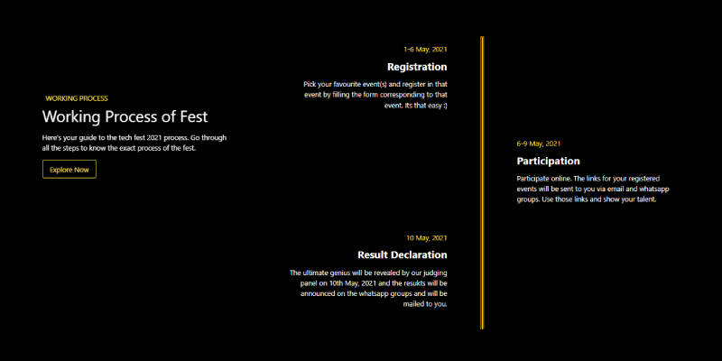
Events Timeline, which was developed by ahampriyanshu. Moreover, you can customize it according to your wish and need.
<!-- component -->
<section>
    <div class="bg-black text-white py-8">
    <div class="container mx-auto flex flex-col items-start md:flex-row my-12 md:my-24">
      <div class="flex flex-col w-full sticky md:top-36 lg:w-1/3 mt-2 md:mt-12 px-8">
        <p class="ml-2 text-yellow-300 uppercase tracking-loose">Working Process</p>
        <p class="text-3xl md:text-4xl leading-normal md:leading-relaxed mb-2">Working Process of Fest</p>
        <p class="text-sm md:text-base text-gray-50 mb-4">
          Here’s your guide to the tech fest 2021 process. Go through all the steps to know the exact process of the
          fest.
        </p>
        <a href="#"
        class="bg-transparent mr-auto hover:bg-yellow-300 text-yellow-300 hover:text-white rounded shadow hover:shadow-lg py-2 px-4 border border-yellow-300 hover:border-transparent">
        Explore Now</a>
      </div>
      <div class="ml-0 md:ml-12 lg:w-2/3 sticky">
        <div class="container mx-auto w-full h-full">
          <div class="relative wrap overflow-hidden p-10 h-full">
            <div class="border-2-2 border-yellow-555 absolute h-full border"
              style="right: 50%; border: 2px solid #FFC100; border-radius: 1%;"></div>
            <div class="border-2-2 border-yellow-555 absolute h-full border"
              style="left: 50%; border: 2px solid #FFC100; border-radius: 1%;"></div>
            <div class="mb-8 flex justify-between flex-row-reverse items-center w-full left-timeline">
              <div class="order-1 w-5/12"></div>
              <div class="order-1 w-5/12 px-1 py-4 text-right">
                <p class="mb-3 text-base text-yellow-300">1-6 May, 2021</p>
                <h4 class="mb-3 font-bold text-lg md:text-2xl">Registration</h4>
                <p class="text-sm md:text-base leading-snug text-gray-50 text-opacity-100">
                  Pick your favourite event(s) and register in that event by filling the form corresponding to that
                  event. Its that easy :)
                </p>
              </div>
            </div>
            <div class="mb-8 flex justify-between items-center w-full right-timeline">
              <div class="order-1 w-5/12"></div>
              <div class="order-1  w-5/12 px-1 py-4 text-left">
                <p class="mb-3 text-base text-yellow-300">6-9 May, 2021</p>
                <h4 class="mb-3 font-bold text-lg md:text-2xl">Participation</h4>
                <p class="text-sm md:text-base leading-snug text-gray-50 text-opacity-100">
                  Participate online. The links for your registered events will be sent to you via email and whatsapp
                  groups. Use those links and show your talent.
                </p>
              </div>
            </div>
            <div class="mb-8 flex justify-between flex-row-reverse items-center w-full left-timeline">
              <div class="order-1 w-5/12"></div>
              <div class="order-1 w-5/12 px-1 py-4 text-right">
                <p class="mb-3 text-base text-yellow-300"> 10 May, 2021</p>
                <h4 class="mb-3 font-bold text-lg md:text-2xl">Result Declaration</h4>
                <p class="text-sm md:text-base leading-snug text-gray-50 text-opacity-100">
                  The ultimate genius will be revealed by our judging panel on 10th May, 2021 and the resukts will be
                  announced on the whatsapp groups and will be mailed to you.
                </p>
              </div>
            </div>

            <div class="mb-8 flex justify-between items-center w-full right-timeline">
              <div class="order-1 w-5/12"></div>

              <div class="order-1  w-5/12 px-1 py-4">
                <p class="mb-3 text-base text-yellow-300">12 May, 2021</p>
                <h4 class="mb-3 font-bold  text-lg md:text-2xl text-left">Prize Distribution</h4>
                <p class="text-sm md:text-base leading-snug text-gray-50 text-opacity-100">
                  The winners will be contacted by our team for their addresses and the winning goodies will be sent at
                  their addresses.
                </p>
              </div>
            </div>
          </div>
          <img class="mx-auto -mt-36 md:-mt-36" src="https://user-images.githubusercontent.com/54521023/116968861-ef21a000-acd2-11eb-95ac-a34b5b490265.png" />
        </div>
      </div>
    </div>
  </div>
</section>| Author: | ahampriyanshu |
| Made with: | HTML & Tailwind CSS |
| Demo Link: | Source Code / Demo |
| Tags: | Events Timeline |
#12 Vertical Stepper Timeline
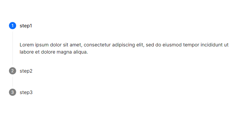
Vertical Stepper Timeline, which was developed by tailwind-elements. Moreover, you can customize it according to your wish and need.
<ul class="stepper" data-mdb-stepper="stepper" data-mdb-stepper-type="vertical">
  <li class="stepper-step stepper-active">
    <div class="stepper-head">
      <span class="stepper-head-icon"> 1 </span>
      <span class="stepper-head-text"> step1 </span>
    </div>
    <div class="stepper-content">
      Lorem ipsum dolor sit amet, consectetur adipiscing elit, sed do eiusmod tempor incididunt ut labore et dolore
      magna
      aliqua.
    </div>
  </li>
  <li class="stepper-step">
    <div class="stepper-head">
      <span class="stepper-head-icon"> 2 </span>
      <span class="stepper-head-text"> step2 </span>
    </div>
    <div class="stepper-content">
      Ut enim ad minim veniam, quis nostrud exercitation ullamco laboris nisi ut aliquip ex ea commodo consequat.
    </div>
  </li>
  <li class="stepper-step">
    <div class="stepper-head">
      <span class="stepper-head-icon"> 3 </span>
      <span class="stepper-head-text"> step3 </span>
    </div>
    <div class="stepper-content">
      Duis aute irure dolor in reprehenderit in voluptate velit esse cillum dolore eu fugiat nulla pariatur.
    </div>
  </li>
</ul>| Author: | tailwind-elements |
| Made with: | HTML & Tailwind CSS |
| Demo Link: | Source Code / Demo |
| Tags: | Vertical Stepper Timeline |
#13 React Tailwind Timeline Component
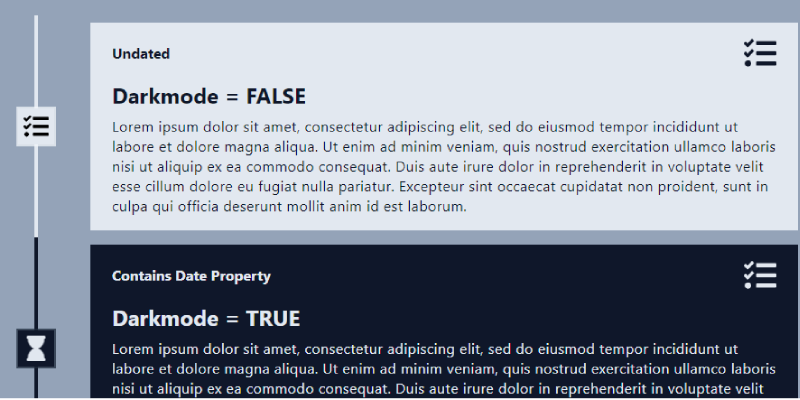
React Tailwind Timeline Component, which was developed by codesandbox. Moreover, you can customize it according to your wish and need.
import React from "react";
import "./styles.css";

import { Timeline, EventTimeline } from "react-tailwind-timeline-component";
import { FaTasks, FaHourglass, FaCheck, FaTimes } from "react-icons/fa";

export default function App() {
  return (
    <div className="bg-slate-400 min-h-screen">
      <Timeline
        className="py-5 max-w-2xl md:max-w-4xl mx-auto"
        beforeUndatedContent={false}
      >
        <EventTimeline
          title="Darkmode = FALSE"
          description="Lorem ipsum dolor sit amet, consectetur adipiscing elit, sed do eiusmod tempor incididunt ut labore et dolore magna aliqua. Ut enim ad minim veniam, quis nostrud exercitation ullamco laboris nisi ut aliquip ex ea commodo consequat. Duis aute irure dolor in reprehenderit in voluptate velit esse cillum dolore eu fugiat nulla pariatur. Excepteur sint occaecat cupidatat non proident, sunt in culpa qui officia deserunt mollit anim id est laborum."
          leftSideContent="Undated"
          icon={<FaTasks />}
          rightSideContent={<FaTasks />}
        />
        <EventTimeline
          title="Darkmode = TRUE"
          description="Lorem ipsum dolor sit amet, consectetur adipiscing elit, sed do eiusmod tempor incididunt ut labore et dolore magna aliqua. Ut enim ad minim veniam, quis nostrud exercitation ullamco laboris nisi ut aliquip ex ea commodo consequat. Duis aute irure dolor in reprehenderit in voluptate velit esse cillum dolore eu fugiat nulla pariatur. Excepteur sint occaecat cupidatat non proident, sunt in culpa qui officia deserunt mollit anim id est laborum."
          leftSideContent="Contains Date Property"
          icon={<FaHourglass className="text-slate-200 animate-pulse" />}
          rightSideContent={<FaTasks />}
          darkMode
          date={new Date(2020, 6, 1)}
        />
        <EventTimeline
          title="Dotted Line"
          description="Lorem ipsum dolor sit amet, consectetur adipiscing elit, sed do eiusmod tempor incididunt ut labore et dolore magna aliqua. Ut enim ad minim veniam, quis nostrud exercitation ullamco laboris nisi ut aliquip ex ea commodo consequat. Duis aute irure dolor in reprehenderit in voluptate velit esse cillum dolore eu fugiat nulla pariatur. Excepteur sint occaecat cupidatat non proident, sunt in culpa qui officia deserunt mollit anim id est laborum."
          leftSideContent={new Date(2020, 7, 15).toLocaleDateString()}
          lineClassName="border-green-500 border-dotted"
          iconBackgroundClassName="bg-green-500 ring-green-400 ring-2 ring-opacity-75"
          cardClassName="bg-green-400"
          icon={<FaCheck className="text-slate-200 animate-pulse" />}
          rightSideContent="Right Side Content"
          date={new Date(2020, 7, 15)}
        />
        <EventTimeline
          title="Dashed Line"
          description="Lorem ipsum dolor sit amet, consectetur adipiscing elit, sed do eiusmod tempor incididunt ut labore et dolore magna aliqua. Ut enim ad minim veniam, quis nostrud exercitation ullamco laboris nisi ut aliquip ex ea commodo consequat. Duis aute irure dolor in reprehenderit in voluptate velit esse cillum dolore eu fugiat nulla pariatur. Excepteur sint occaecat cupidatat non proident, sunt in culpa qui officia deserunt mollit anim id est laborum."
          leftSideContent={new Date(2020, 7, 5).toLocaleDateString()}
          lineClassName="border-red-500 border-dashed"
          iconBackgroundClassName="bg-red-500 ring-red-400 ring-2 ring-opacity-75"
          cardClassName="bg-red-400"
          icon={<FaTimes className="text-slate-200" />}
          rightSideContent={<FaTasks />}
          date={new Date(2020, 7, 5)}
        />
        <EventTimeline
          title="With On Icon Click"
          description="Lorem ipsum dolor sit amet, consectetur adipiscing elit, sed do eiusmod tempor incididunt ut labore et dolore magna aliqua. Ut enim ad minim veniam, quis nostrud exercitation ullamco laboris nisi ut aliquip ex ea commodo consequat. Duis aute irure dolor in reprehenderit in voluptate velit esse cillum dolore eu fugiat nulla pariatur. Excepteur sint occaecat cupidatat non proident, sunt in culpa qui officia deserunt mollit anim id est laborum."
          leftSideContent={new Date(2020, 7, 2).toLocaleDateString()}
          lineClassName="border-blue-300 border-dotted"
          iconBackgroundClassName="bg-blue-300 ring-blue-200 ring-2 ring-opacity-75 hover:scale-150 transition-all duration-200 cursor-pointer"
          cardClassName="bg-blue-200"
          icon={<FaHourglass className="text-slate-900" />}
          rightSideContent={<FaTasks />}
          date={new Date(2020, 7, 2)}
          onIconClick={() => alert("You just clicked the icon!")}
        />
        <EventTimeline
          title="Customized Darkmode"
          titleClassName="text-green-500"
          description="Lorem ipsum dolor sit amet, consectetur adipiscing elit, sed do eiusmod tempor incididunt ut labore et dolore magna aliqua. Ut enim ad minim veniam, quis nostrud exercitation ullamco laboris nisi ut aliquip ex ea commodo consequat. Duis aute irure dolor in reprehenderit in voluptate velit esse cillum dolore eu fugiat nulla pariatur. Excepteur sint occaecat cupidatat non proident, sunt in culpa qui officia deserunt mollit anim id est laborum."
          leftSideContent={new Date(2020, 7, 25).toLocaleDateString()}
          lineClassName="border-green-500 border-dotted"
          iconBackgroundClassName="bg-green-500 ring-green-400 ring-2 ring-opacity-75"
          icon={<FaCheck className="text-slate-200" />}
          rightSideContent={<FaTasks />}
          date={new Date(2020, 7, 25)}
          darkMode
          showLine={false}
        />
        <EventTimeline
          title="Customized Lightmode"
          description="Lorem ipsum dolor sit amet, consectetur adipiscing elit, sed do eiusmod tempor incididunt ut labore et dolore magna aliqua. Ut enim ad minim veniam, quis nostrud exercitation ullamco laboris nisi ut aliquip ex ea commodo consequat. Duis aute irure dolor in reprehenderit in voluptate velit esse cillum dolore eu fugiat nulla pariatur. Excepteur sint occaecat cupidatat non proident, sunt in culpa qui officia deserunt mollit anim id est laborum."
          leftSideContent={new Date(2020, 7, 28).toLocaleDateString()}
          lineClassName="border-green-500"
          leftSideContentClassName="text-green-500"
          iconBackgroundClassName="bg-green-500 ring-green-400 ring-2 ring-opacity-75"
          icon={<FaCheck className="text-slate-200" />}
          rightSideContent={<FaTasks />}
          date={new Date(2020, 7, 28)}
          rightSideContentClassName="hover:text-green-500"
          cardClassName="border-4 border-red-500 bg-gray-100 hover:bg-red-500"
          onTitleClick={() => alert("You just clicked the title!")}
          onCardClick={() => alert("You just clicked the card!")}
          onLeftSideContentClick={() =>
            alert("You just clicked the left side content!")
          }
          onRightSideContentClick={() =>
            alert("You just clicked the right side content!")
          }
          showIcon={false}
        />
      </Timeline>
    </div>
  );
}
| From: | codesandbox |
| Made with: | HTML & Tailwind CSS |
| Demo Link: | Source Code / Demo |
| Tags: | React Tailwind Timeline Component |
#14 Responsive Vertical Timeline
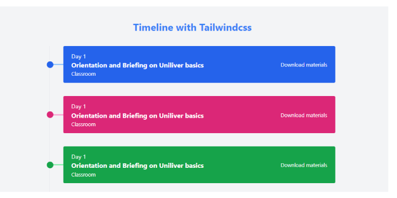
Responsive Vertical Timeline, which was developed by Saad Hasan. Moreover, you can customize it according to your wish and need.
<!-- component -->
<div class="w-10/12 md:w-7/12 lg:6/12 mx-auto relative py-20">
      <h1 class="text-3xl text-center font-bold text-blue-500">Timeline with Tailwindcss</h1>
      <div class="border-l-2 mt-10">
        <!-- Card 1 -->
        <div class="transform transition cursor-pointer hover:-translate-y-2 ml-10 relative flex items-center px-6 py-4 bg-blue-600 text-white rounded mb-10 flex-col md:flex-row space-y-4 md:space-y-0">
          <!-- Dot Follwing the Left Vertical Line -->
          <div class="w-5 h-5 bg-blue-600 absolute -left-10 transform -translate-x-2/4 rounded-full z-10 mt-2 md:mt-0"></div>

          <!-- Line that connecting the box with the vertical line -->
          <div class="w-10 h-1 bg-blue-300 absolute -left-10 z-0"></div>

          <!-- Content that showing in the box -->
          <div class="flex-auto">
            <h1 class="text-lg">Day 1</h1>
            <h1 class="text-xl font-bold">Orientation and Briefing on Uniliver basics</h1>
            <h3>Classroom</h3>
          </div>
          <a href="#" class="text-center text-white hover:text-gray-300">Download materials</a>
        </div>

        <!-- Card 2 -->
        <div class="transform transition cursor-pointer hover:-translate-y-2 ml-10 relative flex items-center px-6 py-4 bg-pink-600 text-white rounded mb-10 flex-col md:flex-row space-y-4 md:space-y-0">
          <!-- Dot Follwing the Left Vertical Line -->
          <div class="w-5 h-5 bg-pink-600 absolute -left-10 transform -translate-x-2/4 rounded-full z-10 mt-2 md:mt-0"></div>

          <!-- Line that connecting the box with the vertical line -->
          <div class="w-10 h-1 bg-pink-300 absolute -left-10 z-0"></div>

          <!-- Content that showing in the box -->
          <div class="flex-auto">
            <h1 class="text-lg">Day 1</h1>
            <h1 class="text-xl font-bold">Orientation and Briefing on Uniliver basics</h1>
            <h3>Classroom</h3>
          </div>
          <a href="#" class="text-center text-white hover:text-gray-300">Download materials</a>
        </div>

        <!-- Card 3 -->
        <div class="transform transition cursor-pointer hover:-translate-y-2 ml-10 relative flex items-center px-6 py-4 bg-green-600 text-white rounded mb-10 flex-col md:flex-row space-y-4 md:space-y-0">
          <!-- Dot Follwing the Left Vertical Line -->
          <div class="w-5 h-5 bg-green-600 absolute -left-10 transform -translate-x-2/4 rounded-full z-10 mt-2 md:mt-0"></div>

          <!-- Line that connecting the box with the vertical line -->
          <div class="w-10 h-1 bg-green-300 absolute -left-10 z-0"></div>

          <!-- Content that showing in the box -->
          <div class="flex-auto">
            <h1 class="text-lg">Day 1</h1>
            <h1 class="text-xl font-bold">Orientation and Briefing on Uniliver basics</h1>
            <h3>Classroom</h3>
          </div>
          <a href="#" class="text-center text-white hover:text-gray-300">Download materials</a>
        </div>

        <!-- Card 4 -->
        <div class="transform transition cursor-pointer hover:-translate-y-2 ml-10 relative flex items-center px-6 py-4 bg-purple-600 text-white rounded mb-10 flex-col md:flex-row space-y-4 md:space-y-0">
          <!-- Dot Follwing the Left Vertical Line -->
          <div class="w-5 h-5 bg-purple-600 absolute -left-10 transform -translate-x-2/4 rounded-full z-10 mt-2 md:mt-0"></div>

          <!-- Line that connecting the box with the vertical line -->
          <div class="w-10 h-1 bg-purple-300 absolute -left-10 z-0"></div>

          <!-- Content that showing in the box -->
          <div class="flex-auto">
            <h1 class="text-lg">Day 1</h1>
            <h1 class="text-xl font-bold">Orientation and Briefing on Uniliver basics</h1>
            <h3>Classroom</h3>
          </div>
          <a href="#" class="text-center text-white hover:text-gray-300">Download materials</a>
        </div>

        <!-- Card 5 -->
        <div class="transform transition cursor-pointer hover:-translate-y-2 ml-10 relative flex items-center px-6 py-4 bg-yellow-600 text-white rounded mb-10 flex-col md:flex-row">
          <!-- Dot Follwing the Left Vertical Line -->
          <div class="w-5 h-5 bg-yellow-600 absolute -left-10 transform -translate-x-2/4 rounded-full z-10 -mt-2 md:mt-0"></div>

          <!-- Line that connecting the box with the vertical line -->
          <div class="w-10 h-1 bg-yellow-300 absolute -left-10 z-0"></div>

          <!-- Content that showing in the box -->
          <div class="flex-auto">
            <h1 class="text-lg">Day 1</h1>
            <h1 class="text-xl font-bold">Orientation and Briefing on Uniliver basics</h1>
            <h3>Classroom</h3>
          </div>
          <a href="#" class="text-center text-white hover:text-gray-300">Download materials</a>
        </div>
      </div>
    <section class="mt-4 text-center">Build with ❤️ by <a href="https://github.com/saadh393" target="_blank">Saad Hasan </a></section>
</div>| Author: | Saad Hasan |
| Made with: | HTML & Tailwind CSS |
| Demo Link: | Source Code / Demo |
| Tags: | Responsive Vertical Timeline |
#15 Simple Vertical Timeline
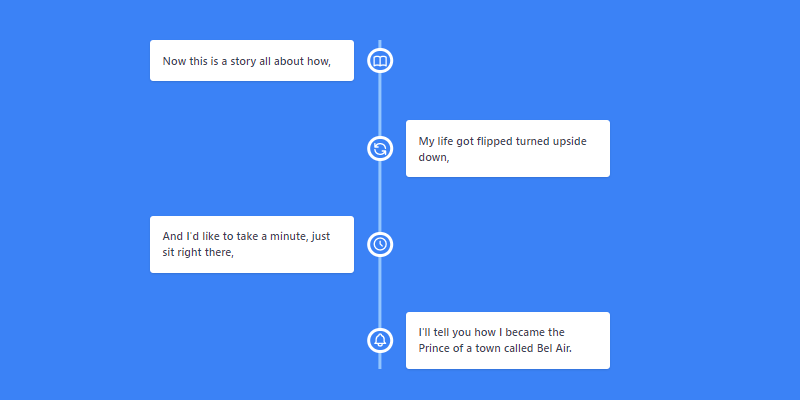
Simple Vertical Timeline, which was developed by Chris-Mingay. Moreover, you can customize it according to your wish and need.
<!-- component -->
<div class="min-h-screen bg-blue-500 py-6 flex flex-col justify-center sm:py-12">
  <div class="py-3 sm:max-w-xl sm:mx-auto w-full px-2 sm:px-0">

    <div class="relative text-gray-700 antialiased text-sm font-semibold">

      <!-- Vertical bar running through middle -->
      <div class="hidden sm:block w-1 bg-blue-300 absolute h-full left-1/2 transform -translate-x-1/2"></div>

      <!-- Left section, set by justify-start and sm:pr-8 -->
      <div class="mt-6 sm:mt-0 sm:mb-12">
        <div class="flex flex-col sm:flex-row items-center">
          <div class="flex justify-start w-full mx-auto items-center">
            <div class="w-full sm:w-1/2 sm:pr-8">
              <div class="p-4 bg-white rounded shadow">
                Now this is a story all about how,
              </div>
            </div>
          </div>
          <div class="rounded-full bg-blue-500 border-white border-4 w-8 h-8 absolute left-1/2 -translate-y-4 sm:translate-y-0 transform -translate-x-1/2 flex items-center justify-center">
            <svg xmlns="http://www.w3.org/2000/svg" class="h-5 w-5 text-white" fill="none" viewBox="0 0 24 24" stroke="currentColor">
              <path stroke-linecap="round" stroke-linejoin="round" stroke-width="2" d="M12 6.253v13m0-13C10.832 5.477 9.246 5 7.5 5S4.168 5.477 3 6.253v13C4.168 18.477 5.754 18 7.5 18s3.332.477 4.5 1.253m0-13C13.168 5.477 14.754 5 16.5 5c1.747 0 3.332.477 4.5 1.253v13C19.832 18.477 18.247 18 16.5 18c-1.746 0-3.332.477-4.5 1.253" />
            </svg>
          </div>
        </div>
      </div>

      <!-- Right section, set by justify-end and sm:pl-8 -->
      <div class="mt-6 sm:mt-0 sm:mb-12">
        <div class="flex flex-col sm:flex-row items-center">
          <div class="flex justify-end w-full mx-auto items-center">
            <div class="w-full sm:w-1/2 sm:pl-8">
              <div class="p-4 bg-white rounded shadow">
                My life got flipped turned upside down,
              </div>
            </div>
          </div>
          <div class="rounded-full bg-blue-500 border-white border-4 w-8 h-8 absolute left-1/2 -translate-y-4 sm:translate-y-0 transform -translate-x-1/2 flex items-center justify-center">
            <svg xmlns="http://www.w3.org/2000/svg" class="h-5 w-5 text-white" fill="none" viewBox="0 0 24 24" stroke="currentColor">
              <path stroke-linecap="round" stroke-linejoin="round" stroke-width="2" d="M4 4v5h.582m15.356 2A8.001 8.001 0 004.582 9m0 0H9m11 11v-5h-.581m0 0a8.003 8.003 0 01-15.357-2m15.357 2H15" />
            </svg>
          </div>
        </div>
      </div>

      <!-- Left section, set by justify-start and sm:pr-8 -->
      <div class="mt-6 sm:mt-0 sm:mb-12">
        <div class="flex flex-col sm:flex-row items-center">
          <div class="flex justify-start w-full mx-auto items-center">
            <div class="w-full sm:w-1/2 sm:pr-8">
              <div class="p-4 bg-white rounded shadow">
                And I'd like to take a minute, just sit right there,
              </div>
            </div>
          </div>
          <div class="rounded-full bg-blue-500 border-white border-4 w-8 h-8 absolute left-1/2 -translate-y-4 sm:translate-y-0 transform -translate-x-1/2 flex items-center justify-center">
            <svg xmlns="http://www.w3.org/2000/svg" class="h-5 w-5 text-white" fill="none" viewBox="0 0 24 24" stroke="currentColor">
              <path stroke-linecap="round" stroke-linejoin="round" stroke-width="2" d="M12 8v4l3 3m6-3a9 9 0 11-18 0 9 9 0 0118 0z" />
            </svg>
          </div>
        </div>
      </div>

      <!-- Right section, set by justify-end and sm:pl-8 -->
      <div class="mt-6 sm:mt-0">
        <div class="flex flex-col sm:flex-row items-center">
          <div class="flex justify-end w-full mx-auto items-center">
            <div class="w-full sm:w-1/2 sm:pl-8">
              <div class="p-4 bg-white rounded shadow">
                I'll tell you how I became the Prince of a town called Bel Air.
              </div>
            </div>
          </div>
          <div class="rounded-full bg-blue-500 border-white border-4 w-8 h-8 absolute left-1/2 -translate-y-4 sm:translate-y-0 transform -translate-x-1/2 flex items-center justify-center">
            <svg xmlns="http://www.w3.org/2000/svg" class="h-5 w-5 text-white" fill="none" viewBox="0 0 24 24" stroke="currentColor">
              <path stroke-linecap="round" stroke-linejoin="round" stroke-width="2" d="M15 17h5l-1.405-1.405A2.032 2.032 0 0118 14.158V11a6.002 6.002 0 00-4-5.659V5a2 2 0 10-4 0v.341C7.67 6.165 6 8.388 6 11v3.159c0 .538-.214 1.055-.595 1.436L4 17h5m6 0v1a3 3 0 11-6 0v-1m6 0H9" />
            </svg>
          </div>
        </div>
      </div>


    </div>

  </div>
</div>| Author: | Chris-Mingay |
| Made with: | HTML & Tailwind CSS |
| Demo Link: | Source Code / Demo |
| Tags: | Simple Vertical Timeline |
#16 Developer Timeline
Developer Timeline, which was developed by iCodeart. Moreover, you can customize it according to your wish and need.
| Author: | iCodeart |
| Made with: | HTML & Tailwind CSS |
| Demo Link: | Source Code / Demo |
| Tags: | Developer Timeline |