Hello guys in this tutorial i have added 15+ Tailwind Progress bar Examples which are available on Codepen and other resources.
Best Collection of Tailwind Progress bar examples
#01 Default progress bar
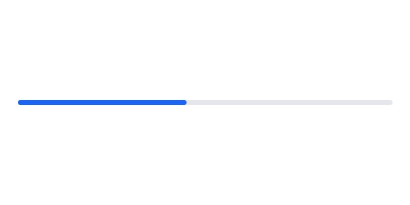
Default progress bar, which was developed by flowbite. Moreover, you can customize it according to your wish and need.
<div class="w-full bg-gray-200 rounded-full h-2.5 dark:bg-gray-700">
  <div class="bg-blue-600 h-2.5 rounded-full" style="width: 45%"></div>
</div>
| Author: | flowbite |
| Made with: | HTML & Tailwind CSS |
| Demo Link: | Source Code / Demo |
| Tags: | Default progress bar |
#02 Tailwind Progress bars component
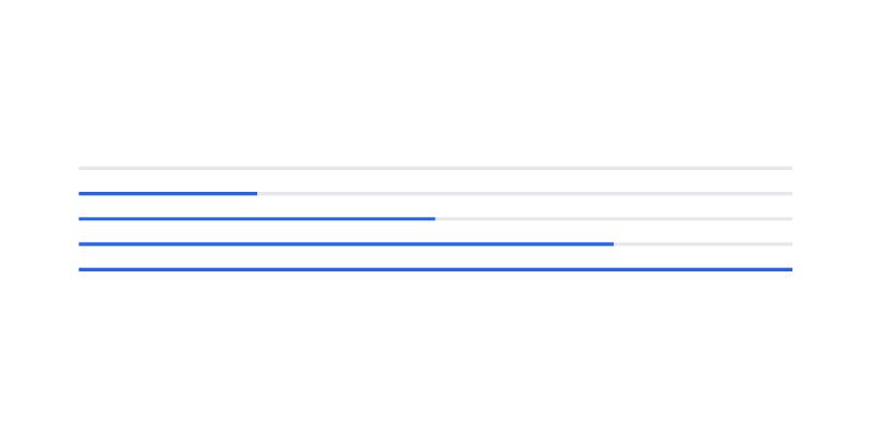
Tailwind Progress bars component, which was developed by tailwind-elements. Moreover, you can customize it according to your wish and need.
<div class="w-full bg-gray-200 h-1 mb-6">
  <div class="bg-blue-600 h-1" style="width: 0%"></div>
</div>
<div class="w-full bg-gray-200 h-1 mb-6">
  <div class="bg-blue-600 h-1" style="width: 25%"></div>
</div>
<div class="w-full bg-gray-200 h-1 mb-6">
  <div class="bg-blue-600 h-1" style="width: 50%"></div>
</div>
<div class="w-full bg-gray-200 h-1 mb-6">
  <div class="bg-blue-600 h-1" style="width: 75%"></div>
</div>
<div class="w-full bg-gray-200 h-1">
  <div class="bg-blue-600 h-1" style="width: 100%"></div>
</div>
| Author: | tailwind-elements |
| Made with: | HTML & Tailwind CSS |
| Demo Link: | Source Code / Demo |
| Tags: | Tailwind Progress bars component |
#03 Multicolor CSS Progress bar
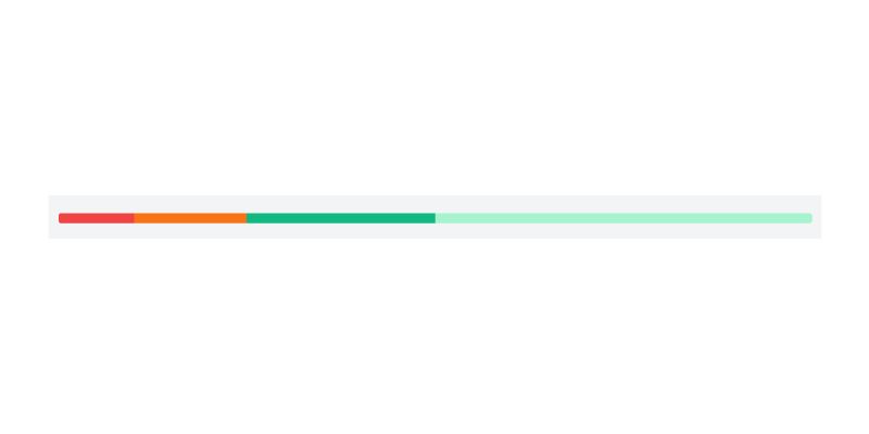
Multicolor CSS Progress bar, which was developed by tailwindcomponents. Moreover, you can customize it according to your wish and need.
<div class="relative pt-1 mx-5">
  <div class="overflow-hidden h-4 mb-4 text-xs flex rounded bg-emerald-200">
    <div style="width: 10%" class="shadow-none flex flex-col text-center whitespace-nowrap text-white justify-center bg-red-500"></div>
    <div style="width: 15%" class="shadow-none flex flex-col text-center whitespace-nowrap text-white justify-center bg-orange-500"></div>
    <div style="width: 25%" class="shadow-none flex flex-col text-center whitespace-nowrap text-white justify-center bg-emerald-500"></div>
  </div>
</div>| Author: | tailwindcomponents |
| Made with: | HTML & Tailwind CSS |
| Demo Link: | Source Code / Demo |
| Tags: | Tailwind Progress bars component |
#04 Progress Bar With Steps
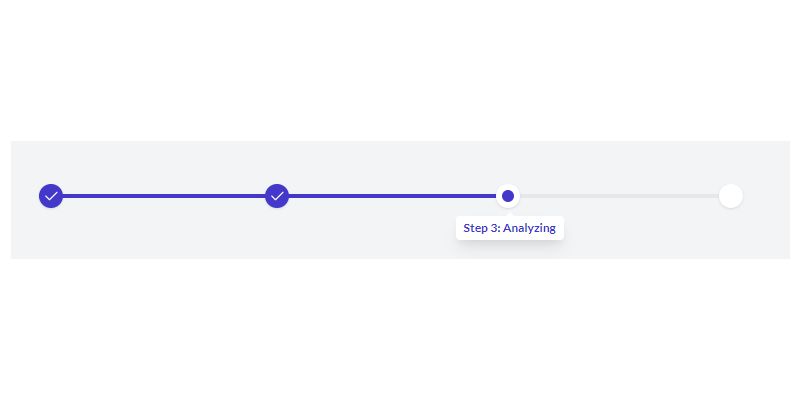
Progress Bar With Steps, which was developed by tailwinduikit. Moreover, you can customize it according to your wish and need.
                    <div class="w-11/12 lg:w-2/6 mx-auto">
                        <div class="bg-gray-200 dark:bg-gray-700 h-1 flex items-center justify-between">
                            <div class="w-1/3 bg-indigo-700 h-1 flex items-center">
                                <div class="bg-indigo-700 h-6 w-6 rounded-full shadow flex items-center justify-center">
                                    <img src="https://tuk-cdn.s3.amazonaws.com/can-uploader/thin_with_steps-svg1.svg" alt="check"/>
                                </div>
                            </div>
                            <div class="w-1/3 flex justify-between bg-indigo-700 h-1 items-center relative">
                                <div class="absolute right-0 -mr-2">
                                    <div class="relative bg-white dark:bg-gray-800 shadow-lg px-2 py-1 rounded mt-16 -mr-12">
                                        <svg class="absolute top-0 -mt-1 w-full right-0 left-0 text-white dark:text-gray-800" width="16px" height="8px" viewBox="0 0 16 8" version="1.1" xmlns="http://www.w3.org/2000/svg">
                                            <g id="Page-1" stroke="none" stroke-width="1" fill="none" fill-rule="evenodd">
                                                <g id="Progress-Bars" transform="translate(-322.000000, -198.000000)" fill="currentColor">
                                                    <g id="Group-4" transform="translate(310.000000, 198.000000)">
                                                        <polygon id="Triangle" points="20 0 28 8 12 8"></polygon>
                                                    </g>
                                                </g>
                                            </g>
                                        </svg>
                                        <p tabindex="0" class="focus:outline-none text-indigo-700 dark:text-indigo-400 text-xs font-bold">Step 3: Analyzing</p>
                                    </div>
                                </div>
                                <div class="bg-indigo-700 h-6 w-6 rounded-full shadow flex items-center justify-center -ml-2">
                                    <img src="https://tuk-cdn.s3.amazonaws.com/can-uploader/thin_with_steps-svg1.svg" alt="check"/>
                                </div>
                                <div class="bg-white dark:bg-gray-700 h-6 w-6 rounded-full shadow flex items-center justify-center -mr-3 relative">
                                    <div class="h-3 w-3 bg-indigo-700 rounded-full"></div>
                                </div>
                            </div>
                            <div class="w-1/3 flex justify-end">
                                <div class="bg-white dark:bg-gray-700 h-6 w-6 rounded-full shadow"></div>
                            </div>
                        </div>
                    </div>
| Author: | tailwinduikit |
| Made with: | HTML & Tailwind CSS |
| Demo Link: | Source Code / Demo |
| Tags: | Progress Bar With Steps |
#05 Tailwind CSS Progress Bar With Label Chip
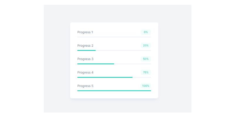
Tailwind CSS Progress Bar With Label Chip, which was developed by postsrc. Moreover, you can customize it according to your wish and need.
<div class="bg-white p-8 shadow-lg shadow-slate-200 rounded-lg w-full md:w-2/3 lg:w-1/3">
  <div class="flex items-center justify-between">
	<span class="text-slate-400 text-sm text-slate-500">Progress 1</span>
	<span class="px-2 py-1 bg-teal-50 rounded-lg text-xs text-teal-400 font-medium min-w-[46px] text-center">0%</span>
  </div>

  <div class="w-full bg-slate-100 h-1 mb-6 mt-2">
	<div class="bg-teal-400 h-1 rounded" style="width: 0%"></div>
  </div>

  <div class="flex items-center justify-between">
	<span class="text-slate-400 text-sm text-slate-500">Progress 2</span>
	<span class="px-2 py-1 bg-teal-50 rounded-lg text-xs text-teal-400 font-medium min-w-[46px] text-center">25%</span>
  </div>

  <div class="w-full bg-slate-100 h-1 mb-6 mt-2">
	<div class="bg-teal-400 h-1 rounded" style="width: 25%"></div>
  </div>

  <div class="flex items-center justify-between">
	<span class="text-slate-400 text-sm text-slate-500">Progress 3</span>
	<span class="px-2 py-1 bg-teal-50 rounded-lg text-xs text-teal-400 font-medium min-w-[46px] text-center">50%</span>
  </div>

  <div class="w-full bg-slate-100 h-1 mb-6 mt-2">
	<div class="bg-teal-400 h-1 rounded" style="width: 50%"></div>
  </div>

  <div class="flex items-center justify-between">
	<span class="text-slate-400 text-sm text-slate-500">Progress 4</span>
	<span class="px-2 py-1 bg-teal-50 rounded-lg text-xs text-teal-400 font-medium min-w-[46px] text-center">75%</span>
  </div>

  <div class="w-full bg-slate-100 h-1 mb-6 mt-2">
	<div class="bg-teal-400 h-1 rounded" style="width: 75%"></div>
  </div>

  <div class="flex items-center justify-between">
	<span class="text-slate-400 text-sm text-slate-500">Progress 5</span>
	<span class="px-2 py-1 bg-teal-50 rounded-lg text-xs text-teal-400 font-medium min-w-[46px] text-center">100%</span>
  </div>

  <div class="w-full bg-slate-100 h-1 mt-2">
	<div class="bg-teal-400 h-1 rounded" style="width: 100%"></div>
  </div>
</div>
| Author: | postsrc |
| Made with: | HTML & Tailwind CSS |
| Demo Link: | Source Code / Demo |
| Tags: | Tailwind CSS Progress Bar With Label Chip |
#06 Multiple CSS Progress Bars
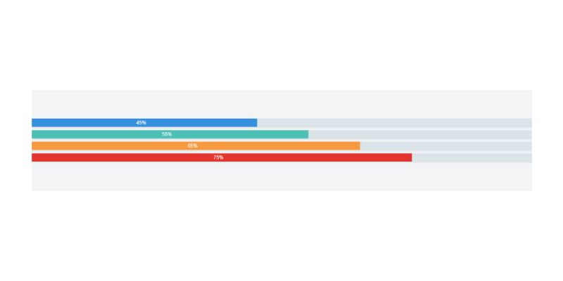
Multiple CSS Progress Bars, which was developed by tailwindcomponents. Moreover, you can customize it according to your wish and need.
<div class="w-full">
  <div class="shadow w-full bg-grey-light">
    <div class="bg-blue text-xs leading-none py-1 text-center text-white" style="width: 45%">45%</div>
  </div>
  <div class="shadow w-full bg-grey-light mt-2">
    <div class="bg-teal text-xs leading-none py-1 text-center text-white" style="width: 55%">55%</div>
  </div>
  <div class="shadow w-full bg-grey-light mt-2">
    <div class="bg-orange text-xs leading-none py-1 text-center text-white" style="width: 65%">65%</div>
  </div>
  <div class="shadow w-full bg-grey-light mt-2">
    <div class="bg-red text-xs leading-none py-1 text-center text-white" style="width: 75%">75%</div>
  </div>
<div>| Author: | tailwindcomponents |
| Made with: | HTML & Tailwind CSS |
| Demo Link: | Source Code / Demo |
| Tags: | Multiple CSS Progress Bar |
#07 Progress Bar With Tooltip

Progress Bar With Tooltip, which was developed by tailgrids. Moreover, you can customize it according to your wish and need.
<div class="w-full lg:w-5/12 px-4">
   <div class="mb-12">
      <div class="w-full h-[10px] relative bg-light rounded-2xl">
         <div class="
            absolute
            top-0
            left-0
            bg-primary
            rounded-2xl
            h-full
            w-1/2
            ">
            <span class="
               bg-primary
               text-white
               rounded-sm
               font-semibold
               text-xs
               py-1
               px-2
               absolute
               -right-4
               bottom-full
               mb-2
               ">
            <span class="
               w-2
               h-2
               rotate-45
               bg-primary
               absolute
               -z-10
               bottom-[-2px]
               left-1/2
               -translate-x-1/2
               rounded-sm
               "></span>
            50%
            </span>
         </div>
      </div>
   </div>
   <div class="mb-12">
      <div class="w-full h-[10px] relative bg-light rounded-2xl">
         <div class="
            absolute
            top-0
            left-0
            bg-primary
            rounded-2xl
            h-full
            w-[75%]
            ">
            <span class="
               bg-primary
               text-white
               rounded-sm
               font-semibold
               text-xs
               py-1
               px-2
               absolute
               -right-4
               bottom-full
               mb-2
               ">
            <span class="
               w-2
               h-2
               rotate-45
               bg-primary
               absolute
               -z-10
               bottom-[-2px]
               left-1/2
               -translate-x-1/2
               rounded-sm
               "></span>
            75%
            </span>
         </div>
      </div>
   </div>
   <div class="mb-12">
      <div class="w-full h-[10px] relative bg-light rounded-2xl">
         <div class="
            absolute
            top-0
            left-0
            bg-primary
            rounded-2xl
            h-full
            w-[90%]
            ">
            <span class="
               bg-primary
               text-white
               rounded-sm
               font-semibold
               text-xs
               py-1
               px-2
               absolute
               -right-4
               bottom-full
               mb-2
               ">
            <span class="
               w-2
               h-2
               rotate-45
               bg-primary
               absolute
               -z-10
               bottom-[-2px]
               left-1/2
               -translate-x-1/2
               rounded-sm
               "></span>
            90%
            </span>
         </div>
      </div>
   </div>
</div>| Author: | tailgrids |
| Made with: | HTML & Tailwind CSS |
| Demo Link: | Source Code / Demo |
| Tags: | Progress Bar With Tooltip |
#08 Progress steps bar
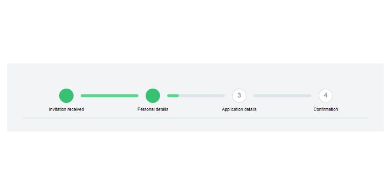
Progress steps bar, which was developed by tailwindcomponents. Moreover, you can customize it according to your wish and need.
<div class="max-w-xl mx-auto my-4 border-b-2 pb-4">
  <div class="flex pb-3">
    <div class="flex-1">
    </div>
    <div class="flex-1">
      <div class="w-10 h-10 bg-green mx-auto rounded-full text-lg text-white flex items-center">
        <span class="text-white text-center w-full">
          <i class="fa fa-check w-full fill-current white">
          </i>
        </span>
      </div>
    </div>
    <div class="w-1/6 align-center items-center align-middle content-center flex">
      <div class="w-full bg-grey-light rounded items-center align-middle align-center flex-1">
        <div class="bg-green-light text-xs leading-none py-1 text-center text-grey-darkest rounded " style="width: 100%">
        </div>
      </div>
    </div>
    <div class="flex-1">
      <div class="w-10 h-10 bg-green mx-auto rounded-full text-lg text-white flex items-center">
        <span class="text-white text-center w-full">
          <i class="fa fa-check w-full fill-current white">
          </i>
        </span>
      </div>
    </div>
    <div class="w-1/6 align-center items-center align-middle content-center flex">
      <div class="w-full bg-grey-light rounded items-center align-middle align-center flex-1">
        <div class="bg-green-light text-xs leading-none py-1 text-center text-grey-darkest rounded " style="width: 20%">
        </div>
      </div>
    </div>
    <div class="flex-1">
      <div class="w-10 h-10 bg-white border-2 border-grey-light mx-auto rounded-full text-lg text-white flex items-center">
        <span class="text-grey-darker text-center w-full">3
        </span>
      </div>
    </div>
    <div class="w-1/6 align-center items-center align-middle content-center flex">
      <div class="w-full bg-grey-light rounded items-center align-middle align-center flex-1">
        <div class="bg-green-light text-xs leading-none py-1 text-center text-grey-darkest rounded " style="width: 0%">
        </div>
      </div>
    </div>
    <div class="flex-1">
      <div class="w-10 h-10 bg-white border-2 border-grey-light mx-auto rounded-full text-lg text-white flex items-center">
        <span class="text-grey-darker text-center w-full">4
        </span>
      </div>
    </div>
    <div class="flex-1">
    </div>
  </div>
  <div class="flex text-xs content-center text-center">
    <div class="w-1/4">
      Invitation received
    </div>
    <div class="w-1/4">
      Personal details
    </div>
    <div class="w-1/4">
      Application details
    </div>
    <div class="w-1/4">
      Confirmation
    </div>
  </div>
</div>
| Author: | tailwindcomponents |
| Made with: | HTML & Tailwind CSS |
| Demo Link: | Source Code / Demo |
| Tags: | Progress steps bar |

15+ Tailwind Search Bar Examples
Hello guys in this tutorial i have added 15+ Tailwind Search Bar Examples which are available on Codepen and other resources.
#09 Tailwind CSS radial progress bar
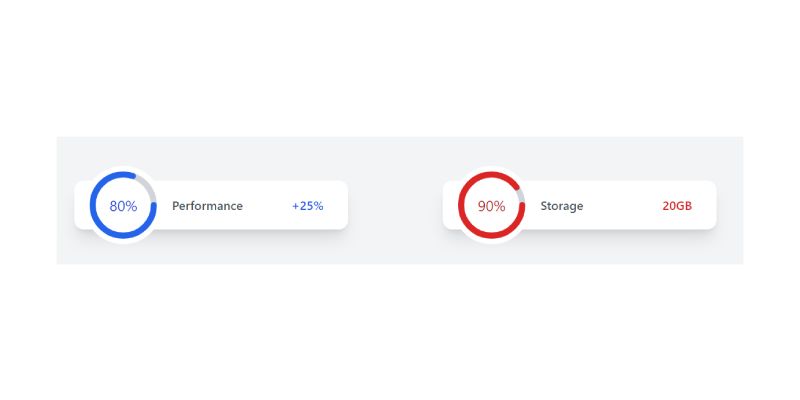
Tailwind CSS radial progress bar, which was developed by tailwindcomponents. Moreover, you can customize it according to your wish and need.
<!-- component -->
<script src="https://cdn.jsdelivr.net/gh/alpinejs/alpine@v2.7.3/dist/alpine.min.js" defer></script>
<div class="min-h-screen py-20 px-10 bg-gray-100">
  <div class="grid grid-cols-1 gap-20 lg:grid-cols-2 lg:gap-10">
    <div class="flex items-center flex-wrap max-w-md px-10 bg-white shadow-xl rounded-2xl h-20"
       x-data="{ circumference: 50 * 2 * Math.PI, percent: 80 }"
       >
          <div class="flex items-center justify-center -m-6 overflow-hidden bg-white rounded-full">
            <svg class="w-32 h-32 transform translate-x-1 translate-y-1" x-cloak aria-hidden="true">
              <circle
                class="text-gray-300"
                stroke-width="10"
                stroke="currentColor"
                fill="transparent"
                r="50"
                cx="60"
                cy="60"
                />
              <circle
                class="text-blue-600"
                stroke-width="10"
                :stroke-dasharray="circumference"
                :stroke-dashoffset="circumference - percent / 100 * circumference"
                stroke-linecap="round"
                stroke="currentColor"
                fill="transparent"
                r="50"
                cx="60"
                cy="60"
               />
            </svg>
            <span class="absolute text-2xl text-blue-700" x-text="`${percent}%`"></span>
          </div>
          <p class="ml-10 font-medium text-gray-600 sm:text-xl">Performance</p>

          <span class="ml-auto text-xl font-medium text-blue-600 hidden sm:block">+25%</span>
      </div>


    <div class="flex items-center flex-wrap max-w-md px-10 bg-white shadow-xl rounded-2xl h-20"
       x-data="{ circumference: 50 * 2 * Math.PI, percent: 90 }"
       >
          <div class="flex items-center justify-center -m-6 overflow-hidden bg-white rounded-full">
            <svg class="w-32 h-32 transform translate-x-1 translate-y-1" x-cloak aria-hidden="true">
              <circle
                class="text-gray-300"
                stroke-width="10"
                stroke="currentColor"
                fill="transparent"
                r="50"
                cx="60"
                cy="60"
                />
              <circle
                class="text-red-600"
                stroke-width="10"
                :stroke-dasharray="circumference"
                :stroke-dashoffset="circumference - percent / 100 * circumference"
                stroke-linecap="round"
                stroke="currentColor"
                fill="transparent"
                r="50"
                cx="60"
                cy="60"
               />
            </svg>
            <span class="absolute text-2xl text-red-700" x-text="`${percent}%`"></span>
          </div>
          <p class="ml-10 font-medium text-gray-600 sm:text-xl">Storage</p>

          <span class="ml-auto text-xl font-medium text-red-600 hidden sm:block">20GB</span>
      </div>
  </div>
</div>


<div class="fixed bottom-5 right-5 flex items-center space-x-4">
  <a href="https://twitter.com/ak_kamona" target="_blank" class="transition-transform transform hover:scale-125">
    <span class="sr-only">Twitter</span>
      <svg
         aria-hidden="true"
         class="w-8 h-8 text-blue-500"
         fill="currentColor"
         xmlns="http://www.w3.org/2000/svg"
         viewBox="0 0 24 24"
            >
      <path d="M19.633,7.997c0.013,0.175,0.013,0.349,0.013,0.523c0,5.325-4.053,11.461-11.46,11.461c-2.282,0-4.402-0.661-6.186-1.809 c0.324,0.037,0.636,0.05,0.973,0.05c1.883,0,3.616-0.636,5.001-1.721c-1.771-0.037-3.255-1.197-3.767-2.793 c0.249,0.037,0.499,0.062,0.761,0.062c0.361,0,0.724-0.05,1.061-0.137c-1.847-0.374-3.23-1.995-3.23-3.953v-0.05 c0.537,0.299,1.16,0.486,1.82,0.511C3.534,9.419,2.823,8.184,2.823,6.787c0-0.748,0.199-1.434,0.548-2.032 c1.983,2.443,4.964,4.04,8.306,4.215c-0.062-0.3-0.1-0.611-0.1-0.923c0-2.22,1.796-4.028,4.028-4.028 c1.16,0,2.207,0.486,2.943,1.272c0.91-0.175,1.782-0.512,2.556-0.973c-0.299,0.935-0.936,1.721-1.771,2.22 c0.811-0.088,1.597-0.312,2.319-0.624C21.104,6.712,20.419,7.423,19.633,7.997z"
            ></path>
    </svg>
  </a>
  <a href="https://github.com/Kamona-WD" target="_blank" class="transition-transform transform hover:scale-125">
    <span class="sr-only">Github</span>
      <svg
         aria-hidden="true"
         class="w-8 h-8 text-black"
         fill="currentColor"
         xmlns="http://www.w3.org/2000/svg"
         viewBox="0 0 24 24"
         >
        <path
              fill-rule="evenodd"
              clip-rule="evenodd"
              d="M12.026,2c-5.509,0-9.974,4.465-9.974,9.974c0,4.406,2.857,8.145,6.821,9.465 c0.499,0.09,0.679-0.217,0.679-0.481c0-0.237-0.008-0.865-0.011-1.696c-2.775,0.602-3.361-1.338-3.361-1.338 c-0.452-1.152-1.107-1.459-1.107-1.459c-0.905-0.619,0.069-0.605,0.069-0.605c1.002,0.07,1.527,1.028,1.527,1.028 c0.89,1.524,2.336,1.084,2.902,0.829c0.091-0.645,0.351-1.085,0.635-1.334c-2.214-0.251-4.542-1.107-4.542-4.93 c0-1.087,0.389-1.979,1.024-2.675c-0.101-0.253-0.446-1.268,0.099-2.64c0,0,0.837-0.269,2.742,1.021 c0.798-0.221,1.649-0.332,2.496-0.336c0.849,0.004,1.701,0.115,2.496,0.336c1.906-1.291,2.742-1.021,2.742-1.021 c0.545,1.372,0.203,2.387,0.099,2.64c0.64,0.696,1.024,1.587,1.024,2.675c0,3.833-2.33,4.675-4.552,4.922 c0.355,0.308,0.675,0.916,0.675,1.846c0,1.334-0.012,2.41-0.012,2.737c0,0.267,0.178,0.577,0.687,0.479 C19.146,20.115,22,16.379,22,11.974C22,6.465,17.535,2,12.026,2z"
              ></path>
    </svg>
  </a>
</div>| Author: | tailwindcomponents |
| Made with: | HTML & Tailwind CSS |
| Demo Link: | Source Code / Demo |
| Tags: | CSS radial progress bar |
#10 Circular Progress Bar

Circular Progress Bar, which was developed by Kamona-WD. Moreover, you can customize it according to your wish and need.
<!-- component -->
<script src="https://cdnjs.cloudflare.com/ajax/libs/alpinejs/3.2.2/cdn.js" defer></script>

<style>
    .container {
        height: 400vh;
    }
</style>

<div class="container">
    <!-- Top bar -->
    <div x-data="scrollProgress" class="fixed inset-x-0 top-0 z-50">
        <div class="h-1 bg-blue-500" :style="`width: ${percent}%`"></div>
    </div>

    <main class="w-scrren min-h-screen flex items-center justify-center">
      <h1 class="text-3xl font-medium">Scroll down</h1>
    </main>

    <!-- Circle -->
    <div
      x-data="scrollProgress"
      class="fixed inline-flex items-center justify-center overflow-hidden rounded-full bottom-5 left-5"
    >
      <!-- Building a Progress Ring: https://css-tricks.com/building-progress-ring-quickly/ -->
      <svg class="w-20 h-20">
        <circle
          class="text-gray-300"
          stroke-width="5"
          stroke="currentColor"
          fill="transparent"
          r="30"
          cx="40"
          cy="40"
        />
        <circle
          class="text-blue-600"
          stroke-width="5"
          :stroke-dasharray="circumference"
          :stroke-dashoffset="circumference - percent / 100 * circumference"
          stroke-linecap="round"
          stroke="currentColor"
          fill="transparent"
          r="30"
          cx="40"
          cy="40"
        />
      </svg>
      <span class="absolute text-xl text-blue-700" x-text="`${percent}%`"></span>
    </div>

    <!-- Social links -->
    <div class="fixed flex flex-col items-center space-y-4 bottom-5 right-5">
      <a href="https://twitter.com/ak_kamona" target="_blank" class="transition-transform transform hover:scale-125">
        <span class="sr-only">Twitter</span>
        <svg
          aria-hidden="true"
          class="w-8 h-8 text-blue-500"
          fill="currentColor"
          xmlns="http://www.w3.org/2000/svg"
          viewBox="0 0 24 24"
        >
          <path
            d="M19.633,7.997c0.013,0.175,0.013,0.349,0.013,0.523c0,5.325-4.053,11.461-11.46,11.461c-2.282,0-4.402-0.661-6.186-1.809 c0.324,0.037,0.636,0.05,0.973,0.05c1.883,0,3.616-0.636,5.001-1.721c-1.771-0.037-3.255-1.197-3.767-2.793 c0.249,0.037,0.499,0.062,0.761,0.062c0.361,0,0.724-0.05,1.061-0.137c-1.847-0.374-3.23-1.995-3.23-3.953v-0.05 c0.537,0.299,1.16,0.486,1.82,0.511C3.534,9.419,2.823,8.184,2.823,6.787c0-0.748,0.199-1.434,0.548-2.032 c1.983,2.443,4.964,4.04,8.306,4.215c-0.062-0.3-0.1-0.611-0.1-0.923c0-2.22,1.796-4.028,4.028-4.028 c1.16,0,2.207,0.486,2.943,1.272c0.91-0.175,1.782-0.512,2.556-0.973c-0.299,0.935-0.936,1.721-1.771,2.22 c0.811-0.088,1.597-0.312,2.319-0.624C21.104,6.712,20.419,7.423,19.633,7.997z"
          ></path>
        </svg>
      </a>
      <a href="https://github.com/Kamona-WD" target="_blank" class="transition-transform transform hover:scale-125">
        <span class="sr-only">Github</span>
        <svg
          aria-hidden="true"
          class="w-8 h-8 text-black"
          fill="currentColor"
          xmlns="http://www.w3.org/2000/svg"
          viewBox="0 0 24 24"
        >
          <path
            fill-rule="evenodd"
            clip-rule="evenodd"
            d="M12.026,2c-5.509,0-9.974,4.465-9.974,9.974c0,4.406,2.857,8.145,6.821,9.465 c0.499,0.09,0.679-0.217,0.679-0.481c0-0.237-0.008-0.865-0.011-1.696c-2.775,0.602-3.361-1.338-3.361-1.338 c-0.452-1.152-1.107-1.459-1.107-1.459c-0.905-0.619,0.069-0.605,0.069-0.605c1.002,0.07,1.527,1.028,1.527,1.028 c0.89,1.524,2.336,1.084,2.902,0.829c0.091-0.645,0.351-1.085,0.635-1.334c-2.214-0.251-4.542-1.107-4.542-4.93 c0-1.087,0.389-1.979,1.024-2.675c-0.101-0.253-0.446-1.268,0.099-2.64c0,0,0.837-0.269,2.742,1.021 c0.798-0.221,1.649-0.332,2.496-0.336c0.849,0.004,1.701,0.115,2.496,0.336c1.906-1.291,2.742-1.021,2.742-1.021 c0.545,1.372,0.203,2.387,0.099,2.64c0.64,0.696,1.024,1.587,1.024,2.675c0,3.833-2.33,4.675-4.552,4.922 c0.355,0.308,0.675,0.916,0.675,1.846c0,1.334-0.012,2.41-0.012,2.737c0,0.267,0.178,0.577,0.687,0.479 C19.146,20.115,22,16.379,22,11.974C22,6.465,17.535,2,12.026,2z"
          ></path>
        </svg>
      </a>
    </div>
</div>

<script>
    const scrollProgress = () => {
        return {
            init() {
                window.addEventListener('scroll', () => {
                    let winScroll = document.body.scrollTop || document.documentElement.scrollTop
                    let height = document.documentElement.scrollHeight - document.documentElement.clientHeight
                    this.percent = Math.round((winScroll / height) * 100)
                })
            },
            circumference: 30 * 2 * Math.PI,
            percent: 0,
        }
    }
</script>| Author: | Kamona-WD |
| Made with: | HTML & Tailwind CSS |
| Demo Link: | Source Code / Demo |
| Tags: | Circular Progress Bar |
#11 Gradient Progress Bars
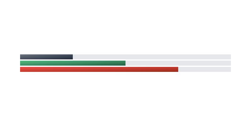
Gradient Progress Bars, which was developed by larainfo. Moreover, you can customize it according to your wish and need.
<div class="relative h-4">
    <div class="absolute w-full h-full bg-gray-200"></div>
    <div class="absolute w-1/4 h-full bg-gradient-to-br from-gray-500 to-gray-800 "></div>
</div>
<div class="relative h-4">
    <div class="absolute w-full h-full bg-gray-200"></div>
    <div class="absolute w-2/4 h-full bg-gradient-to-br from-green-500 to-green-800"></div>
</div>
<div class="relative h-4">
    <div class="absolute w-full h-full bg-gray-200"></div>
    <div class="absolute w-3/4 h-full bg-gradient-to-br from-red-500 to-red-800"></div>
</div>| Author: | larainfo |
| Made with: | HTML & Tailwind CSS |
| Demo Link: | Source Code / Demo |
| Tags: | Gradient Progress Bars |
#12 Tailwind Progress Bar Shimmer Animation
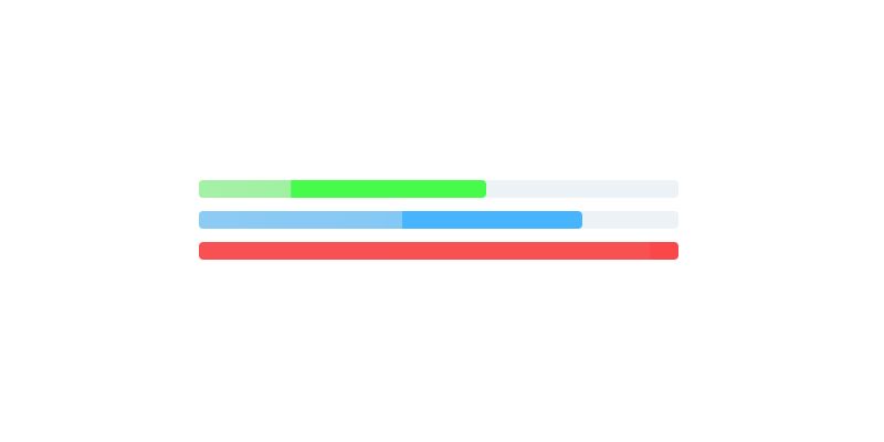
Progress Bar With Shimmer Animation, which was developed by Andre Prilly Kurniawan. Moreover, you can customize it according to your wish and need.
<div class="p-10 flex flex-col space-y-3">
  <div class="relative w-full sm:w-1/2 bg-gray-200 rounded">
    <div style="width: 60%" class="absolute top-0 h-4 rounded shim-green"></div>
  </div>

  <div class="relative w-full sm:w-1/2 bg-gray-200 rounded">
    <div style="width: 80%" class="absolute top-0 h-4 rounded shim-blue"></div>
  </div>

  <div class="relative w-full sm:w-1/2 bg-gray-200 rounded">
    <div style="width: 100%" class="absolute top-0 h-4 rounded shim-red"></div>
  </div>
</div>
<style>
.shim-green {
  position: relative;
  overflow: hidden;
  background-color: rgba(0, 255, 0, 0.7);
}
.shim-green::after {
  position: absolute;
  top: 0;
  right: 0;
  bottom: 0;
  left: 0;
  transform: translateX(-100%);
  background-image: linear-gradient(
    90deg,
    rgba(233, 233, 233, 1) 0,
    rgba(233, 233, 233, 0.9) 50%,
    rgba(233, 233, 233, 0.8) 100%
  );
  animation: shimmer 2s ease-out infinite;
  content: "";
}

.shim-blue {
  position: relative;
  overflow: hidden;
  background-color: rgba(0, 155, 255, 0.7);
}
.shim-blue::after {
  position: absolute;
  top: 0;
  right: 0;
  bottom: 0;
  left: 0;
  transform: translateX(-100%);
  background-image: linear-gradient(
    90deg,
    rgba(233, 233, 233, 1) 0,
    rgba(233, 233, 233, 0.9) 50%,
    rgba(233, 233, 233, 0.8) 100%
  );
  animation: shimmer 2.5s ease-out infinite;
  content: "";
}

.shim-red {
  position: relative;
  overflow: hidden;
  background-color: rgba(255, 0, 0, 0.7);
}
.shim-red::after {
  position: absolute;
  top: 0;
  right: 0;
  bottom: 0;
  left: 0;
  transform: translateX(-100%);
  background-image: linear-gradient(
    90deg,
    rgba(233, 233, 233, 1) 0,
    rgba(233, 233, 233, 0.9) 50%,
    rgba(233, 233, 233, 0.8) 100%
  );
  animation: shimmer 3s ease-out infinite;
  content: "";
}

@keyframes shimmer {
  100% {
    transform: translateX(0%);
    opacity: 0;
  }
}
</style>| Author: | Andre Prilly Kurniawan |
| Made with: | HTML & Tailwind CSS |
| Demo Link: | Source Code / Demo |
| Tags: | Progress Bar With Shimmer Animation |
#13 CSS Progress Bar with label inside
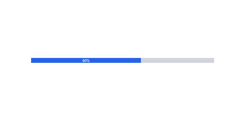
CSS Progress Bar with label inside, which was developed by Rahul. Moreover, you can customize it according to your wish and need.
<div style="width:600px; margin: 100px auto;">
  <div class="w-full bg-gray-300 dark:bg-gray-700">
    <div class="bg-blue-600 text-xs font-medium text-blue-100 text-center p-0.5 leading-none" style="width: 60%"> 60%</div>
  </div>
</div>| Author: | Rahul |
| Made with: | HTML & Tailwind CSS |
| Demo Link: | Source Code / Demo |
| Tags: | CSS Progress Bar with label inside |
#14 Vertical progress bar

Vertical progress bar, which was developed by preline. Moreover, you can customize it according to your wish and need.
<div class="flex flex-col flex-nowrap justify-end w-2 h-32 bg-gray-200 rounded-full overflow-hidden dark:bg-gray-700">
  <div class="bg-blue-500 overflow-hidden" role="progressbar" style="height: 25%" aria-valuenow="25" aria-valuemin="0" aria-valuemax="100"></div>
</div>
<div class="flex flex-col flex-nowrap justify-end w-2 h-32 bg-gray-200 rounded-full overflow-hidden dark:bg-gray-700">
  <div class="bg-blue-500 overflow-hidden" role="progressbar" style="height: 50%" aria-valuenow="50" aria-valuemin="0" aria-valuemax="100"></div>
</div>
<div class="flex flex-col flex-nowrap justify-end w-2 h-32 bg-gray-200 rounded-full overflow-hidden dark:bg-gray-700">
  <div class="bg-blue-500 overflow-hidden" role="progressbar" style="height: 75%" aria-valuenow="75" aria-valuemin="0" aria-valuemax="100"></div>
</div>
<div class="flex flex-col flex-nowrap justify-end w-2 h-32 bg-gray-200 rounded-full overflow-hidden dark:bg-gray-700">
  <div class="bg-blue-500 overflow-hidden" role="progressbar" style="height: 90%" aria-valuenow="90" aria-valuemin="0" aria-valuemax="100"></div>
</div>
<div class="flex flex-col flex-nowrap justify-end w-2 h-32 bg-gray-200 rounded-full overflow-hidden dark:bg-gray-700">
  <div class="bg-blue-500 overflow-hidden" role="progressbar" style="height: 17%" aria-valuenow="17" aria-valuemin="0" aria-valuemax="100"></div>
</div>
| Author: | preline |
| Made with: | HTML & Tailwind CSS |
| Demo Link: | Source Code / Demo |
| Tags: | Vertical progress bar |
#15 Animated Circular Progress Bar
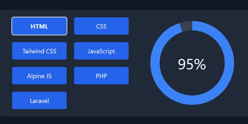
Animated Circular Progress Bar, which was developed by Hafiz_Dev. Moreover, you can customize it according to your wish and need.
<!-- component -->
<script defer src="https://unpkg.com/alpinejs@3.2.4/dist/cdn.min.js"></script>

<main class="grid w-full min-h-screen text-gray-100 bg-gray-900 place-content-center">

    <section x-data="skillDisplay"
        class="p-6 space-y-6 bg-gray-800 rounded-xl md:grid md:grid-cols-2 md:gap-4 sm:space-y-0">
        <div class="grid grid-cols-2 gap-6">
            <template x-for="skill in skills">
                <button x-text="skill.title"
                    class="px-4 py-2 text-xl text-gray-100 transition bg-blue-600 rounded-md h-14 w-44 hover:bg-blue-700"
                    :class="(currentSkill.title == skill.title) && 'font-bold ring-2 ring-gray-100'"
                    @click="currentSkill = skill"></button>
            </template>
        </div>

        <div class="flex items-center justify-center" x-data="{ circumference: 2 * 22 / 7 * 120 }">
            <svg class="transform -rotate-90 w-72 h-72">
                <circle cx="145" cy="145" r="120" stroke="currentColor" stroke-width="30" fill="transparent"
                    class="text-gray-700" />

                <circle cx="145" cy="145" r="120" stroke="currentColor" stroke-width="30" fill="transparent"
                    :stroke-dasharray="circumference"
                    :stroke-dashoffset="circumference - currentSkill.percent / 100 * circumference"
                    class="text-blue-500 " />
            </svg>
            <span class="absolute text-5xl" x-text="`${currentSkill.percent}%`"></span>
    </section>
</main>

<script>
    document.addEventListener('alpine:init', () => {
        Alpine.data('skillDisplay', () => ({
            skills: [{
                    'title': 'HTML',
                    'percent': '95',
                },
                {
                    'title': 'CSS',
                    'percent': '70',
                },
                {
                    'title': 'Tailwind CSS',
                    'percent': '90',
                },
                {
                    'title': 'JavaScript',
                    'percent': '70',
                },
                {
                    'title': 'Alpine JS',
                    'percent': '80',
                }, {
                    'title': 'PHP',
                    'percent': '65',
                }, {
                    'title': 'Laravel',
                    'percent': '75',
                }
            ],
            currentSkill: {
                'title': 'HTML',
                'percent': '95',
            }
        }));
    });
</script>| Author: | Hafiz_Dev |
| Made with: | HTML & Tailwind CSS |
| Demo Link: | Source Code / Demo |
| Tags: | Animated Circular Progress Bar |
#16 Task Widget with Progress bar
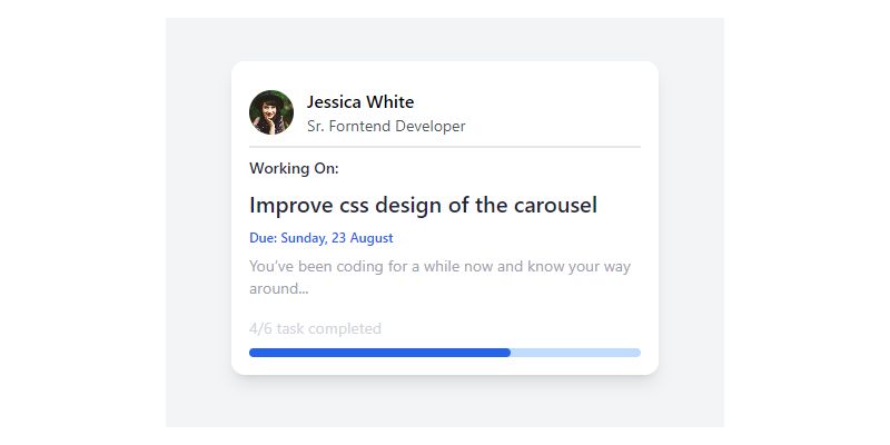
Task Widget with Progress bar, which was developed by Asad Ali Haider. Moreover, you can customize it according to your wish and need.
<!-- component -->
<!-- follow me on twitter @asad_codes -->
<div class="flex flex-wrap place-items-center h-screen">
    <!-- card -->
    <div class="shadow-lg rounded-xl w-72 md:w-96 p-4 bg-white relative overflow-hidden">
        <a href="#" class="w-full h-full block">
            <div class="flex items-center border-b-2 mb-2 py-2">
                <img class='w-10 h-10 object-cover rounded-full' alt='User avatar' src='https://images.unsplash.com/photo-1477118476589-bff2c5c4cfbb?ixlib=rb-1.2.1&ixid=eyJhcHBfaWQiOjEyMDd9&auto=format&fit=crop&w=200&q=200'>

                <div class="pl-3">
                    <div class="font-medium">
                        Jessica White
                    </div>
                    <div class="text-gray-600 text-sm">
                        Sr. Forntend Developer
                    </div>
                </div>
            </div>
            <div class="w-full">
                <p class="text-gray-800 text-sm font-medium mb-2">
                    Working On:
                </p>
                <p class="text-gray-800 text-xl font-medium mb-2">
                    Improve css design of the carousel
                </p>
                <p class="text-blue-600 text-xs font-medium mb-2">
                    Due: Sunday, 23 August
                </p>
                <p class="text-gray-400 text-sm mb-4">
                    You’ve been coding for a while now and know your way around...
                </p>
            </div>
            <div class="flex items-center justify-between my-2">
                <p class="text-gray-300 text-sm">
                    4/6 task completed
                </p>
            </div>
            <div class="w-full h-2 bg-blue-200 rounded-full">
                <div class="w-2/3 h-full text-center text-xs text-white bg-blue-600 rounded-full">
                </div>
            </div>
        </a>
    </div>
</div>

<!-- Does this resource worth a follow? -->
<div class="flex items-end justify-end fixed bottom-0 right-0 mb-4 mr-4 z-10">
    <div>
        <a title="Follow me on twitter" href="https://www.twitter.com/asad_codes" target="_blank" class="block w-16 h-16 rounded-full transition-all shadow hover:shadow-lg transform hover:scale-110 hover:rotate-12">
            <img class="object-cover object-center w-full h-full rounded-full" src="https://www.imore.com/sites/imore.com/files/styles/large/public/field/image/2019/12/twitter-logo.jpg"/>
        </a>
    </div>
</div>| Author: | Asad Ali Haider |
| Made with: | HTML & Tailwind CSS |
| Demo Link: | Source Code / Demo |
| Tags: | Task Widget with Progress bar |


![CSS Flip Card [ Top 10 Best Flip Card Animation ]](https://blog.stackfindover.com/wp-content/uploads/2021/10/css-flip-card-1024x576.jpg)