
Hello guys in this tutorial i have added Top 10 Tailwind CSS alert code examples which are available on Codepen and other resources.
What’s use of Alerts component?
The alert component can be used to provide information to your users like as error or success message, and also highlight important information on a page.
Best Collection of Tailwind Alert examples
#01 Tailwind alerts basic example
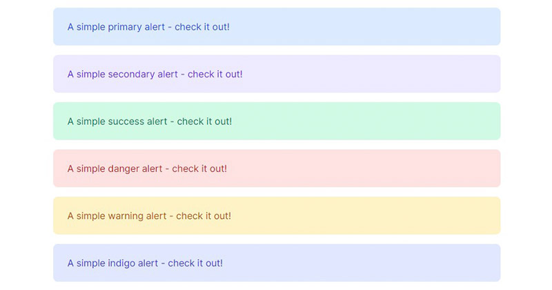
HTML CSS basic alert example, which was developed by tailwindelements. Moreover, you can customize it according to your wish and need.
<div class="m-5">

  <div class="bg-blue-100 rounded-lg py-5 px-6 mb-4 text-base text-blue-700 mb-3" role="alert">
    A simple primary alert - check it out!
  </div>
  <div class="bg-purple-100 rounded-lg py-5 px-6 mb-4 text-base text-purple-700 mb-3" role="alert">
    A simple secondary alert - check it out!
  </div>
  <div class="bg-green-100 rounded-lg py-5 px-6 mb-4 text-base text-green-700 mb-3" role="alert">
    A simple success alert - check it out!
  </div>
  <div class="bg-red-100 rounded-lg py-5 px-6 mb-4 text-base text-red-700 mb-3" role="alert">
    A simple danger alert - check it out!
  </div>
  <div class="bg-yellow-100 rounded-lg py-5 px-6 mb-4 text-base text-yellow-700 mb-3" role="alert">
    A simple warning alert - check it out!
  </div>
  <div class="bg-indigo-100 rounded-lg py-5 px-6 mb-4 text-base text-indigo-700 mb-3" role="alert">
    A simple indigo alert - check it out!
  </div>
  <div class="bg-gray-50 rounded-lg py-5 px-6 mb-4 text-base text-gray-500 mb-3" role="alert">
    A simple light alert - check it out!
  </div>
  <div class="bg-gray-300 rounded-lg py-5 px-6 mb-4 text-base text-gray-800 mb-3" role="alert">
    A simple dark alert - check it out!
  </div>

</div>| Author: | tailwindelements |
| Made with: | HTML & Tailwind CSS |
| Demo Link: | Source Code / Demo |
| Tags: | basic tailwind alerts |
#02 Success Payment Tailwind Alert
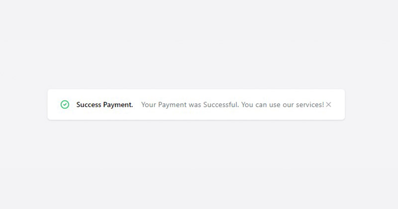
Success Payment Tailwind Alert, which was developed by tailwindcomponents. Moreover, you can customize it according to your wish and need.
<div class="relative flex flex-col sm:flex-row sm:items-center bg-white shadow rounded-md py-5 pl-6 pr-8 sm:pr-6">
  <div class="flex flex-row items-center border-b sm:border-b-0 w-full sm:w-auto pb-4 sm:pb-0">
    <div class="text-green-500">
      <svg class="w-6 sm:w-5 h-6 sm:h-5" fill="none" stroke="currentColor" viewBox="0 0 24 24" xmlns="http://www.w3.org/2000/svg"><path stroke-linecap="round" stroke-linejoin="round" stroke-width="2" d="M9 12l2 2 4-4m6 2a9 9 0 11-18 0 9 9 0 0118 0z"></path></svg>
    </div>
    <div class="text-sm font-medium ml-3">Success Payment.</div>
  </div>
  <div class="text-sm tracking-wide text-gray-500 mt-4 sm:mt-0 sm:ml-4">Your Payment was Successful. You can use our services!</div>
  <div class="absolute sm:relative sm:top-auto sm:right-auto ml-auto right-4 top-4 text-gray-400 hover:text-gray-800 cursor-pointer">
    <svg class="w-4 h-4" fill="none" stroke="currentColor" viewBox="0 0 24 24" xmlns="http://www.w3.org/2000/svg"><path stroke-linecap="round" stroke-linejoin="round" stroke-width="2" d="M6 18L18 6M6 6l12 12"></path></svg>
  </div>
</div>| Author: | tailwindcomponents |
| Made with: | HTML & Tailwind CSS |
| Demo Link: | Source Code / Demo |
| Tags: | Success Payment Tailwind Alert |
#03 Tailwind CSS Warning Alert
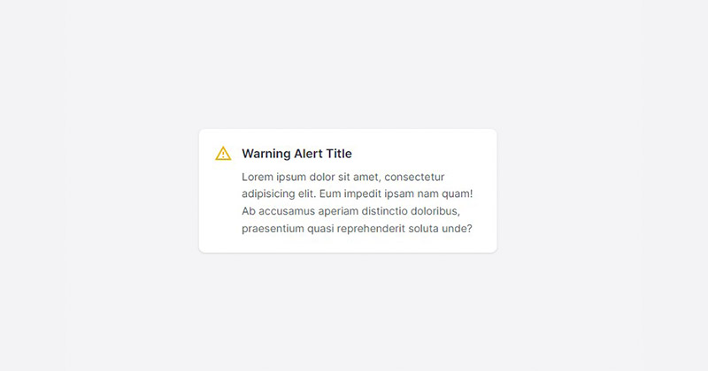
Tailwind CSS Warning Alert, which was developed by postsrc. Moreover, you can customize it according to your wish and need.
<div class="w-full md:w-1/3 mx-auto">
  <div class="flex p-5 rounded-lg shadow bg-white">
	<div>
	  <svg class="w-6 h-6 fill-current text-yellow-500" xmlns="http://www.w3.org/2000/svg" viewBox="0 0 24 24"><path d="M0 0h24v24H0V0z" fill="none"/><path d="M12 5.99L19.53 19H4.47L12 5.99M12 2L1 21h22L12 2zm1 14h-2v2h2v-2zm0-6h-2v4h2v-4z"/></svg>
	</div>
	<div class="ml-3">
	  <h2 class="font-semibold text-gray-800">Warning Alert Title</h2>
	  <p class="mt-2 text-sm text-gray-600 leading-relaxed">Lorem ipsum dolor sit amet, consectetur adipisicing elit. Eum impedit ipsam nam quam! Ab accusamus aperiam distinctio doloribus, praesentium quasi reprehenderit soluta unde?</p>
	</div>
  </div>
</div>
| Author: | postsrc |
| Made with: | HTML & Tailwind CSS |
| Demo Link: | Source Code / Demo |
| Tags: | Tailwind CSS Warning Alert |
#04 Tailwind CSS Basic Alerts With Border
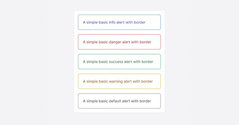
Tailwind Basic Alerts With Border, which was developed by postsrc. Moreover, you can customize it according to your wish and need.
<div class="w-full md:w-1/3 mx-auto bg-white p-4">
  <div class="p-5 leading-normal text-blue-700 border border-blue-500 rounded-lg" role="alert">
	<p>A simple basic info alert with border</p>
  </div>

  <div class="mt-5 p-5 leading-normal text-red-700 border border-red-500 rounded-lg" role="alert">
	<p>A simple basic danger alert with border</p>
  </div>

  <div class="mt-5 p-5 leading-normal text-green-700 border border-green-500 rounded-lg" role="alert">
	<p>A simple basic success alert with border</p>
  </div>

  <div class="mt-5 p-5 leading-normal text-yellow-700 border border-yellow-500 rounded-lg" role="alert">
	<p>A simple basic warning alert with border</p>
  </div>

  <div class="mt-5 p-5 leading-normal text-gray-700 border border-gray-500 rounded-lg" role="alert">
	<p>A simple basic default alert with border</p>
  </div>
</div>
| Author: | postsrc |
| Made with: | HTML & Tailwind CSS |
| Demo Link: | Source Code / Demo |
| Tags: | Tailwind Basic Alerts With Border |
#05 Tailwindcss animated ping alert bell
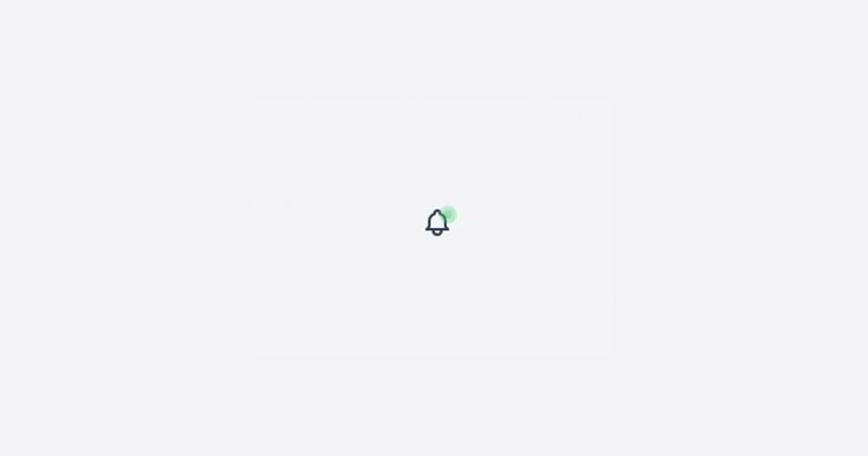
Tailwindcss animated ping alert bell, which was developed by blantonious. Moreover, you can customize it according to your wish and need.
<!-- component -->
<button class="inline-block relative">
    <svg xmlns="http://www.w3.org/2000/svg" class="h-6 w-6 text-gray-700" fill="none" viewBox="0 0 24 24" stroke="currentColor">
        <path stroke-linecap="round" stroke-linejoin="round" stroke-width="2" d="M15 17h5l-1.405-1.405A2.032 2.032 0 0118 14.158V11a6.002 6.002 0 00-4-5.659V5a2 2 0 10-4 0v.341C7.67 6.165 6 8.388 6 11v3.159c0 .538-.214 1.055-.595 1.436L4 17h5m6 0v1a3 3 0 11-6 0v-1m6 0H9" />
    </svg>
    <span class="animate-ping absolute top-1 right-0.5 block h-1 w-1 rounded-full ring-2 ring-green-400 bg-green-600"></span>
</button>| Author: | blantonious |
| Made with: | HTML & Tailwind CSS |
| Demo Link: | Source Code / Demo |
| Tags: | animated ping alert bell |
#06 Lo-fi Tailwind CSS Alert
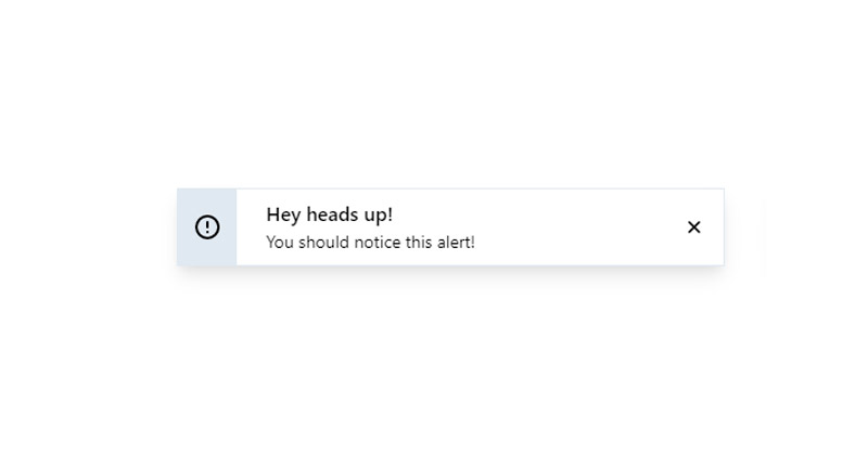
Lo-fi Tailwind CSS Alerts, which was developed by Rob Stinson. Moreover, you can customize it according to your wish and need.
<div class="flex flex-wrap items-center justify-center w-screen h-screen">
	<div class="flex space-x-10 w-full flex-wrap items-center justify-center">

		<!-- Component Start -->
		<div class="flex items-center h-16 border border-gray-300 pr-4 w-full max-w-md shadow-lg">
			<div class="flex items-center justify-center bg-gray-300 w-12 h-full">
				<svg class="w-6 h-6" xmlns="http://www.w3.org/2000/svg" fill="none" viewBox="0 0 24 24" stroke="currentColor">
					<path stroke-linecap="round" stroke-linejoin="round" stroke-width="2" d="M12 8v4m0 4h.01M21 12a9 9 0 11-18 0 9 9 0 0118 0z" />
				</svg>
			</div>
			<div class="px-6">
				<h5 class="font-semibold">Hey heads up!</h5>
				<p class="text-sm">You should notice this alert!</p>
			</div>
			<button class="ml-auto">
				<svg class="w-4 h-4" xmlns="http://www.w3.org/2000/svg" viewBox="0 0 20 20" fill="currentColor">
					<path fill-rule="evenodd" d="M4.293 4.293a1 1 0 011.414 0L10 8.586l4.293-4.293a1 1 0 111.414 1.414L11.414 10l4.293 4.293a1 1 0 01-1.414 1.414L10 11.414l-4.293 4.293a1 1 0 01-1.414-1.414L8.586 10 4.293 5.707a1 1 0 010-1.414z" clip-rule="evenodd" />
				</svg>
			</button>
		</div>
		<!-- Component End  -->
</div>
| Author: | Rob Stinson |
| Made with: | HTML & Tailwind CSS |
| Demo Link: | Source Code / Demo |
| Tags: | animated tailwind alert |
#07 Small Modern Alerts
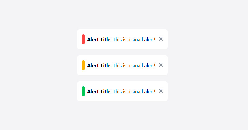
Small Modern Alerts, which was developed by tailwindcomponents. Moreover, you can customize it according to your wish and need.
<!-- component -->
<div class="flex h-screen">
  <div class="m-auto">
    <div class="shadow-md p-4 flex flex-row rounded-lg">
      <div class="bg-red-500 inline-block rounded-lg p-1 mr-1"></div>
      <b class="p-1">Alert Title</b>
      <p class="p-1">This is a small alert!</p>
      <a class="h-5 w-5 text-gray-500 inline-block p-1">
        <svg xmlns="http://www.w3.org/2000/svg" class="h-5 w-5" viewBox="0 0 20 20" fill="currentColor">
          <path fill-rule="evenodd" d="M4.293 4.293a1 1 0 011.414 0L10 8.586l4.293-4.293a1 1 0 111.414 1.414L11.414 10l4.293 4.293a1 1 0 01-1.414 1.414L10 11.414l-4.293 4.293a1 1 0 01-1.414-1.414L8.586 10 4.293 5.707a1 1 0 010-1.414z" clip-rule="evenodd" />
        </svg>
      </a>
    </div>
    <div class="shadow-md p-4 flex flex-row rounded-lg">
      <div class="bg-yellow-500 inline-block rounded-lg p-1 mr-1"></div>
      <b class="p-1">Alert Title</b>
      <p class="p-1">This is a small alert!</p>
      <a class="h-5 w-5 text-gray-500 inline-block p-1">
        <svg xmlns="http://www.w3.org/2000/svg" class="h-5 w-5" viewBox="0 0 20 20" fill="currentColor">
          <path fill-rule="evenodd" d="M4.293 4.293a1 1 0 011.414 0L10 8.586l4.293-4.293a1 1 0 111.414 1.414L11.414 10l4.293 4.293a1 1 0 01-1.414 1.414L10 11.414l-4.293 4.293a1 1 0 01-1.414-1.414L8.586 10 4.293 5.707a1 1 0 010-1.414z" clip-rule="evenodd" />
        </svg>
      </a>
    </div>
    <div class="shadow-md p-4 flex flex-row rounded-lg">
      <div class="bg-green-500 inline-block rounded-lg p-1 mr-1"></div>
      <b class="p-1">Alert Title</b>
      <p class="p-1">This is a small alert!</p>
      <a class="h-5 w-5 text-gray-500 inline-block p-1">
        <svg xmlns="http://www.w3.org/2000/svg" class="h-5 w-5" viewBox="0 0 20 20" fill="currentColor">
          <path fill-rule="evenodd" d="M4.293 4.293a1 1 0 011.414 0L10 8.586l4.293-4.293a1 1 0 111.414 1.414L11.414 10l4.293 4.293a1 1 0 01-1.414 1.414L10 11.414l-4.293 4.293a1 1 0 01-1.414-1.414L8.586 10 4.293 5.707a1 1 0 010-1.414z" clip-rule="evenodd" />
        </svg>
      </a>
    </div>
  </div>
</div>| Author: | tailwindcomponents |
| Made with: | HTML & Tailwind CSS |
| Demo Link: | Source Code / Demo |
| Tags: | Small Modern Alerts |
#08 Primer Toast Alerts
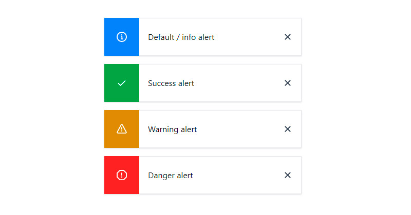
Primer Toast Alerts, which was updated by Rahul. Moreover, you can customize it according to your wish and need.
<div class="p-8 space-y-4">
    <div class="flex w-96 shadow">
      <div class="bg-blue-500 py-4 px-6  flex items-center">
        <svg xmlns="http://www.w3.org/2000/svg" class="fill-current text-white" viewBox="0 0 16 16" width="20" height="20">
          <path fill-rule="evenodd" d="M8 1.5a6.5 6.5 0 100 13 6.5 6.5 0 000-13zM0 8a8 8 0 1116 0A8 8 0 010 8zm6.5-.25A.75.75 0 017.25 7h1a.75.75 0 01.75.75v2.75h.25a.75.75 0 010 1.5h-2a.75.75 0 010-1.5h.25v-2h-.25a.75.75 0 01-.75-.75zM8 6a1 1 0 100-2 1 1 0 000 2z"></path>
        </svg>
      </div>
      <div class="px-4 py-6 bg-white  flex justify-between items-center w-full border border-l-transparent border-gray-200">
        <div>Default / info alert</div>
        <button>
          <svg xmlns="http://www.w3.org/2000/svg" class="fill-current text-gray-700" viewBox="0 0 16 16" width="20" height="20">
            <path fill-rule="evenodd" d="M3.72 3.72a.75.75 0 011.06 0L8 6.94l3.22-3.22a.75.75 0 111.06 1.06L9.06 8l3.22 3.22a.75.75 0 11-1.06 1.06L8 9.06l-3.22 3.22a.75.75 0 01-1.06-1.06L6.94 8 3.72 4.78a.75.75 0 010-1.06z"></path>
          </svg>
        </button>
      </div>
    </div>
    <div class="flex w-96 shadow">
      <div class="bg-green-600 py-4 px-6  flex items-center">
        <svg xmlns="http://www.w3.org/2000/svg" class="text-white fill-current" viewBox="0 0 16 16" width="20" height="20">
          <path fill-rule="evenodd" d="M13.78 4.22a.75.75 0 010 1.06l-7.25 7.25a.75.75 0 01-1.06 0L2.22 9.28a.75.75 0 011.06-1.06L6 10.94l6.72-6.72a.75.75 0 011.06 0z"></path>
        </svg>
      </div>
      <div class="px-4 py-6 bg-white  flex justify-between items-center w-full border border-l-transparent border-gray-200">
        <div>Success alert</div>
        <button>
          <svg xmlns="http://www.w3.org/2000/svg" class="fill-current text-gray-700" viewBox="0 0 16 16" width="20" height="20">
            <path fill-rule="evenodd" d="M3.72 3.72a.75.75 0 011.06 0L8 6.94l3.22-3.22a.75.75 0 111.06 1.06L9.06 8l3.22 3.22a.75.75 0 11-1.06 1.06L8 9.06l-3.22 3.22a.75.75 0 01-1.06-1.06L6.94 8 3.72 4.78a.75.75 0 010-1.06z"></path>
          </svg>
        </button>
      </div>
    </div>
    <div class="flex w-96 shadow">
      <div class="bg-yellow-600 py-4 px-6  flex items-center">
        <svg xmlns="http://www.w3.org/2000/svg" viewBox="0 0 16 16" class="fill-current text-white" width="20" height="20">
          <path fill-rule="evenodd" d="M8.22 1.754a.25.25 0 00-.44 0L1.698 13.132a.25.25 0 00.22.368h12.164a.25.25 0 00.22-.368L8.22 1.754zm-1.763-.707c.659-1.234 2.427-1.234 3.086 0l6.082 11.378A1.75 1.75 0 0114.082 15H1.918a1.75 1.75 0 01-1.543-2.575L6.457 1.047zM9 11a1 1 0 11-2 0 1 1 0 012 0zm-.25-5.25a.75.75 0 00-1.5 0v2.5a.75.75 0 001.5 0v-2.5z"></path>
        </svg>
      </div>
      <div class="px-4 py-6 bg-white  flex justify-between items-center w-full border border-l-transparent border-gray-200">
        <div>Warning alert</div>
        <button>
          <svg xmlns="http://www.w3.org/2000/svg" class="fill-current text-gray-700" viewBox="0 0 16 16" width="20" height="20">
            <path fill-rule="evenodd" d="M3.72 3.72a.75.75 0 011.06 0L8 6.94l3.22-3.22a.75.75 0 111.06 1.06L9.06 8l3.22 3.22a.75.75 0 11-1.06 1.06L8 9.06l-3.22 3.22a.75.75 0 01-1.06-1.06L6.94 8 3.72 4.78a.75.75 0 010-1.06z"></path>
          </svg>
        </button>
      </div>
    </div>
    <div class="flex w-96 shadow">
      <div class="bg-red-600 py-4 px-6  flex items-center">
        <svg xmlns="http://www.w3.org/2000/svg" viewBox="0 0 16 16" class="fill-current text-white" width="20" height="20">
          <path fill-rule="evenodd" d="M4.47.22A.75.75 0 015 0h6a.75.75 0 01.53.22l4.25 4.25c.141.14.22.331.22.53v6a.75.75 0 01-.22.53l-4.25 4.25A.75.75 0 0111 16H5a.75.75 0 01-.53-.22L.22 11.53A.75.75 0 010 11V5a.75.75 0 01.22-.53L4.47.22zm.84 1.28L1.5 5.31v5.38l3.81 3.81h5.38l3.81-3.81V5.31L10.69 1.5H5.31zM8 4a.75.75 0 01.75.75v3.5a.75.75 0 01-1.5 0v-3.5A.75.75 0 018 4zm0 8a1 1 0 100-2 1 1 0 000 2z"></path>
        </svg>
      </div>
      <div class="px-4 py-6 bg-white  flex justify-between items-center w-full border border-l-transparent border-gray-200">
        <div>Danger alert</div>
        <button>
          <svg xmlns="http://www.w3.org/2000/svg" class="fill-current text-gray-700" viewBox="0 0 16 16" width="20" height="20">
            <path fill-rule="evenodd" d="M3.72 3.72a.75.75 0 011.06 0L8 6.94l3.22-3.22a.75.75 0 111.06 1.06L9.06 8l3.22 3.22a.75.75 0 11-1.06 1.06L8 9.06l-3.22 3.22a.75.75 0 01-1.06-1.06L6.94 8 3.72 4.78a.75.75 0 010-1.06z"></path>
          </svg>
        </button>
      </div>
    </div>
</div>| Author: | Rahul |
| Made with: | HTML & Tailwind CSS |
| Demo Link: | Source Code / Demo |
| Tags: | Primer Toast Alerts |
#09 Tailwind Alert With Button
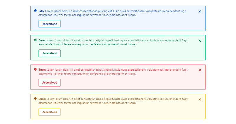
Tailwind Alert With Button, which was updated by Rahul. Moreover, you can customize it according to your wish and need.
<div class="container-fluid mx-auto px-4 mt-5">
   <!-- Info -->
  <div class="bg-blue-50 mb-5  border border-blue-400 rounded text-blue-800 text-sm p-4 flex items-start">
    <div>
      <svg xmlns="http://www.w3.org/2000/svg" class="h-4 w-4 mr-2" viewBox="0 0 20 20" fill="currentColor">
        <path fill-rule="evenodd" d="M18 10a8 8 0 11-16 0 8 8 0 0116 0zm-7-4a1 1 0 11-2 0 1 1 0 012 0zM9 9a1 1 0 000 2v3a1 1 0 001 1h1a1 1 0 100-2v-3a1 1 0 00-1-1H9z" clip-rule="evenodd" />
      </svg>
    </div>
    <div class="w-full">
      <p>
        <span class="font-bold">Info:</span> Lorem ipsum dolor sit amet consectetur adipisicing elit. Iusto quos exercitationem, voluptate eos reprehenderit fugit assumenda illo error facere consequuntur perferendis asperiores dolor et itaque.
      </p>
      <button class="border-blue-400 bg-white hover:bg-gray-50 px-4 py-2 mt-4 border rounded font-bold"> Understood </button>
    </div>
    <div>
      <svg xmlns="http://www.w3.org/2000/svg" class="h-6 w-6" fill="none" viewBox="0 0 24 24" stroke="currentColor">
        <path stroke-linecap="round" stroke-linejoin="round" stroke-width="2" d="M6 18L18 6M6 6l12 12" />
      </svg>
    </div>
  </div>
  <!-- Success -->
  <div class="bg-green-50 mb-5   border border-green-400 rounded text-green-800 text-sm p-4 flex items-start">
    <div>
      <svg xmlns="http://www.w3.org/2000/svg" class="h-4 w-4 mr-2" viewBox="0 0 20 20" fill="currentColor">
        <path fill-rule="evenodd" d="M18 10a8 8 0 11-16 0 8 8 0 0116 0zm-7-4a1 1 0 11-2 0 1 1 0 012 0zM9 9a1 1 0 000 2v3a1 1 0 001 1h1a1 1 0 100-2v-3a1 1 0 00-1-1H9z" clip-rule="evenodd" />
      </svg>
    </div>
    <div class="w-full">
      <p>
        <span class="font-bold">Error:</span> Lorem ipsum dolor sit amet consectetur adipisicing elit. Iusto quos exercitationem, voluptate eos reprehenderit fugit assumenda illo error facere consequuntur perferendis asperiores dolor et itaque.
      </p>
      <button class="border-green-400 bg-white hover:bg-gray-50 px-4 py-2 mt-4 border rounded font-bold"> Understood </button>
    </div>
    <div>
      <svg xmlns="http://www.w3.org/2000/svg" class="h-6 w-6" fill="none" viewBox="0 0 24 24" stroke="currentColor">
        <path stroke-linecap="round" stroke-linejoin="round" stroke-width="2" d="M6 18L18 6M6 6l12 12" />
      </svg>
    </div>
  </div>
  <!-- Error -->
  <div class="bg-red-50 mb-5   border border-red-400 rounded text-red-800 text-sm p-4 flex items-start">
    <div>
      <svg xmlns="http://www.w3.org/2000/svg" class="h-4 w-4 mr-2" viewBox="0 0 20 20" fill="currentColor">
        <path fill-rule="evenodd" d="M18 10a8 8 0 11-16 0 8 8 0 0116 0zm-7-4a1 1 0 11-2 0 1 1 0 012 0zM9 9a1 1 0 000 2v3a1 1 0 001 1h1a1 1 0 100-2v-3a1 1 0 00-1-1H9z" clip-rule="evenodd" />
      </svg>
    </div>
    <div class="w-full">
      <p>
        <span class="font-bold">Error:</span> Lorem ipsum dolor sit amet consectetur adipisicing elit. Iusto quos exercitationem, voluptate eos reprehenderit fugit assumenda illo error facere consequuntur perferendis asperiores dolor et itaque.
      </p>
      <button class="border-red-400 bg-white hover:bg-gray-50 px-4 py-2 mt-4 border rounded font-bold"> Understood </button>
    </div>
    <div>
      <svg xmlns="http://www.w3.org/2000/svg" class="h-6 w-6" fill="none" viewBox="0 0 24 24" stroke="currentColor">
        <path stroke-linecap="round" stroke-linejoin="round" stroke-width="2" d="M6 18L18 6M6 6l12 12" />
      </svg>
    </div>
  </div>
  <!-- Warning -->
  <div class="bg-yellow-50 mb-5  border border-yellow-400 rounded text-yellow-800 text-sm p-4 flex items-start">
    <div>
      <svg xmlns="http://www.w3.org/2000/svg" class="h-4 w-4 mr-2" viewBox="0 0 20 20" fill="currentColor">
        <path fill-rule="evenodd" d="M18 10a8 8 0 11-16 0 8 8 0 0116 0zm-7-4a1 1 0 11-2 0 1 1 0 012 0zM9 9a1 1 0 000 2v3a1 1 0 001 1h1a1 1 0 100-2v-3a1 1 0 00-1-1H9z" clip-rule="evenodd" />
      </svg>
    </div>
    <div class="w-full">
      <p>
        <span class="font-bold">Error:</span> Lorem ipsum dolor sit amet consectetur adipisicing elit. Iusto quos exercitationem, voluptate eos reprehenderit fugit assumenda illo error facere consequuntur perferendis asperiores dolor et itaque.
      </p>
      <button class="border-yellow-400 bg-white hover:bg-gray-50 px-4 py-2 mt-4 border rounded font-bold"> Understood </button>
    </div>
    <div>
      <svg xmlns="http://www.w3.org/2000/svg" class="h-6 w-6" fill="none" viewBox="0 0 24 24" stroke="currentColor">
        <path stroke-linecap="round" stroke-linejoin="round" stroke-width="2" d="M6 18L18 6M6 6l12 12" />
      </svg>
    </div>
  </div>
</div>| Author: | Rahul |
| Made with: | HTML & Tailwind CSS |
| Demo Link: | Source Code / Demo |
| Tags: | Tailwind Alert With Button |
#10 Tailwind Alert With Border
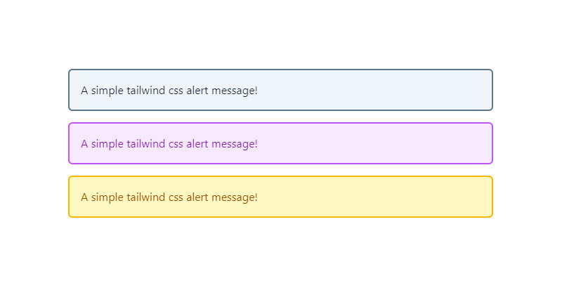
Tailwind Alert With Border, which was updated by Stackfindover. Moreover, you can customize it according to your wish and need.
<div class="container-fluid mx-auto px-4 mt-5">
   <div class="px-4 py-4 mb-5 rounded text-slate-800 bg-slate-100 ring-2 ring-slate-500" role="alert">
     A simple tailwind css alert message!
  </div>
  <div class="px-4 py-4 mb-5 text-purple-800 bg-purple-100 rounded ring-2 ring-purple-500" role="alert">
      A simple tailwind css alert message!
   </div>
   <div class="px-4 py-4 mb-5 text-yellow-800 bg-yellow-100 rounded ring-2 ring-yellow-500" role="alert">
      A simple tailwind css alert message!
   </div>
</div>| Author: | Stackfindover |
| Made with: | HTML & Tailwind CSS |
| Demo Link: | Source Code / Demo |
| Tags: | Tailwind Alert With Border |
Top 10 Circle progress bar css [ Codepen Examples ]
Hello guys in this tutorial we will create Circular progress bar using HTML CSS & JavaScript. and also i have added Top 10 Circle progress bar examples which is are available in codepen.