
Hello guys today we will learn How to create a shining text animation effects using Html and CSS, and also i have added top 10 shining text effect examples which is are available on codepen.
How to create Shining Text Animation Using CSS?
Step 1: — Creating a New Project
The first thing we’ll do is create a folder that will contain all of the files that make up the project. Create an empty folder on your devices and name it “as you want”.
Open up Visual Studio Code or any Text editor which is you liked, and create files(index.html, style.css) inside the folder which you have created for Shining Text Effect. In the next step, we will start creating the basic structure of the webpage.
Step 2: — Setting Up the basic structure
In this step, we will add the HTML code to create the basic structure of the project.
<!DOCTYPE html>
<html>
<head>
	<meta charset="utf-8">
	<title>Shining Text Effect</title>
	<link rel="stylesheet" type="text/css" href="style.css">
  <link href="https://fonts.googleapis.com/css2?family=IBM+Plex+Sans:wght@400;500&family=IBM+Plex+Serif:wght@300;400&display=swap" rel="stylesheet">
</head>
<body>

</body>
</html>
This is the base structure of most web pages that use HTML.
Add the following code inside the <body> tag:
<h2>Stackfindover</h2>
Step 3: — Adding Styles for the Classes
Then we need to add code for style.css which code i provide in below screen.
* {
  margin: 0;
  font-family: 'IBM Plex Sans',Serif;
}
body {
    width: 100vw;
    height: 100vh;
    display: flex;
    align-items: center;
    justify-content: center;
    background: #111;
}
h2 {
    font-size: 50px;
    line-height: 50px;
    font-weight: lighter;
    background-image: linear-gradient(90deg, #111 , #fff, #111);
    background-repeat: no-repeat;
    background-clip: text;
    -webkit-background-clip: text;
    color: transparent;
    text-shadow: 0px 0px 10px #fff;
    animation: shine 2s ease-in-out infinite;
    background-size: 80% 100%;
}
@keyframes shine {
    0% {
        background-position: -500% 0;
    }
    100% {
        background-position: 500% 0;
    }
}
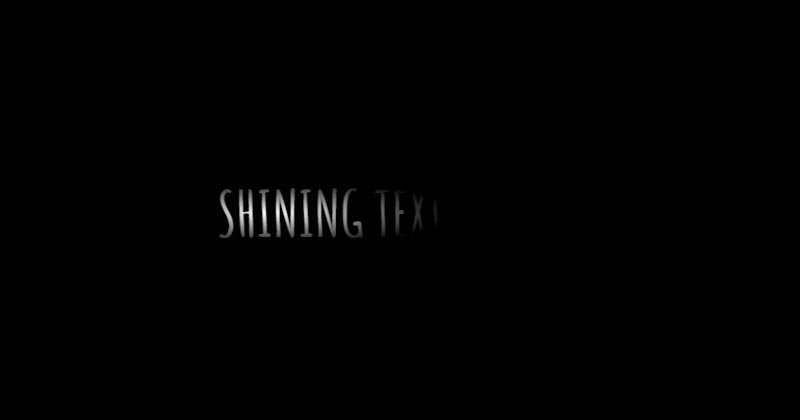
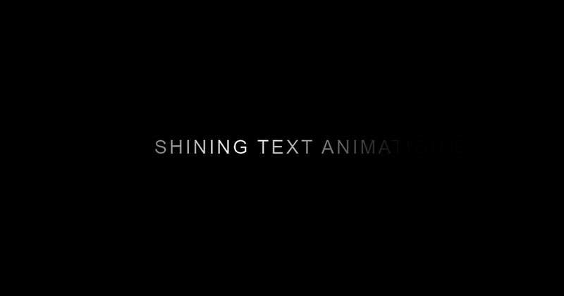
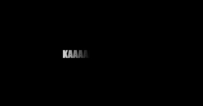
#Final Result
Best Collection of Shining text effect Codepen Example
#1: Shiny Golden Text animation
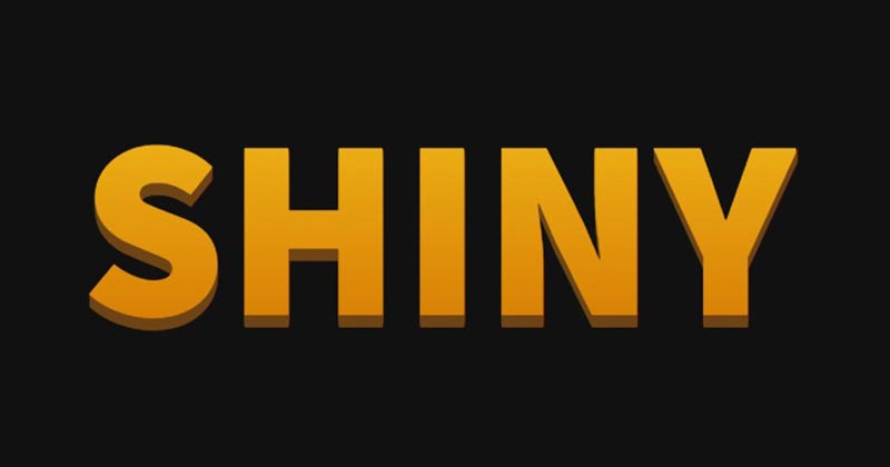
Shiny Golden Text animation, which was developed by Logan Franken. Moreover, you can customize it according to your wish and need.
| Author: | Logan Franken |
| Created on: | NOVEMBER 22, 2014 |
| Made with: | HTML & CSS |
| Demo Link: | Source Code / Demo |
| Tags: | Shiny Golden Text animation |
#2: CSS3 Shining Text Effect
CSS3 Shining Text Effect, which was developed by Fazlur Rahman. Moreover, you can customize it according to your wish and need.
| Author: | Fazlur Rahman |
| Created on: | DECEMBER 3, 2015 |
| Made with: | HTML & CSS(SCSS) |
| Demo Link: | Source Code / Demo |
| Tags: | CSS3 Shining Text Effect |
#3: Awesome Shining text animation
Awesome Shining text animation, which was developed by David Tisserand. Moreover, you can customize it according to your wish and need.
| Author: | David Tisserand |
| Created on: | NOVEMBER 23, 2019 |
| Made with: | HTML & CSS |
| Demo Link: | Source Code / Demo |
| Tags: | Awesome Shining text |
#4: Shining Text Animation Effects
Shining Text Animation Effects, which was developed by Bousahla Mounir. Moreover, you can customize it according to your wish and need.
| Author: | Bousahla Mounir |
| Created on: | JUNE 4, 2021 |
| Made with: | HTML & CSS |
| Demo Link: | Source Code / Demo |
| Tags: | Awesome Shining text |
#5: shining text with background clip
shining text with background clip, which was developed by William Smith. Moreover, you can customize it according to your wish and need.
| Author: | William Smith |
| Created on: | MARCH 14, 2018 |
| Made with: | HTML & CSS |
| Demo Link: | Source Code / Demo |
| Tags: | shining text with background clip |
#6: Simple Shining Text Effect
Simple Shining Text Effect, which was developed by AS. Moreover, you can customize it according to your wish and need.
| Author: | AS |
| Created on: | JANUARY 23, 2021 |
| Made with: | HTML & CSS |
| Demo Link: | Source Code / Demo |
| Tags: | Simple Shining Text Effect |
#7: Shining text with GreenSock

Shining text with GreenSock, which was developed by Mia. Moreover, you can customize it according to your wish and need.
| Author: | Mia |
| Created on: | FEBRUARY 18, 2020 |
| Made with: | HTML, CSS & JS |
| Demo Link: | Source Code / Demo |
| Tags: | Shining text with GreenSock |
#8: Pure CSS Shining Text Effect
Pure CSS Shining Text Effect, which was developed by saurav. Moreover, you can customize it according to your wish and need.
| Author: | saurav |
| Created on: | FEBRUARY 12, 2019 |
| Made with: | HTML & CSS |
| Demo Link: | Source Code / Demo |
| Tags: | Pure CSS Shining Text Effect |
#9: HTML CSS Shining Text
HTML CSS Shining Text, which was developed by jon01234. Moreover, you can customize it according to your wish and need.
| Author: | jon01234 |
| Created on: | AUGUST 26, 2019 |
| Made with: | HTML & CSS |
| Demo Link: | Source Code / Demo |
| Tags: | HTML CSS Shining Text |
#10: CSS Shining Text Animation
CSS Shining Text Animation, which was developed by Sparshcodes. Moreover, you can customize it according to your wish and need.
| Author: | Sparshcodes |
| Created on: | JANUARY 30, 2022 |
| Made with: | HTML & CSS |
| Demo Link: | Source Code / Demo |
| Tags: | CSS Shining Text Animation |
If you liked this article Top 10 Shining Text Effect examples, you should check out this one Awesome Slick Slider examples