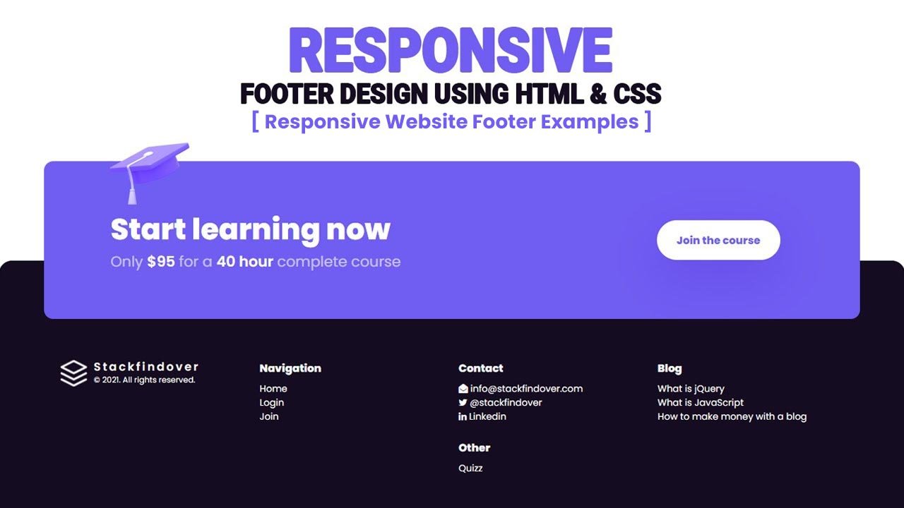
Hello guys, today I am going to show you how to create a 100% Responsive Website Footer, in this video, you will learn how do you create an awesome footer design 2021 using Html & CSS
What is the footer in the Html?
As the name suggests, the footer is the bottom part of a web page or a section.
What is the definition of a footer tag?
The <footer> tag defines the footer of a web page or a section. Usually, it contains contact details, navigation links, copyright information, etc.
What we can display in the footer?
- Privacy Policy
- Contact
- Address
- Navigation
- Social Icons
- Email Signup
- Copyright etc.
These are some basics we can use in our footer section in html.
Simple Code sample
<footer>
  <ul>
      <li><a href="mailto:info@stackfindover.com"><i class="fa fa-envelope-open"></i> info@stackfindover.com</a></li>
      <li><a href="#"><i class="fa fa-twitter"></i>@stackfindover</a></li>
      <li><a href="#"><i class="fa fa-linkedin"></i>Linkedin</a></li>
  </ul>
</footer>
In this article, we will be going to build a responsive website footer using HTML and CSS, Let’s get started with Coding!
Responsive website footer design step by step
Step 1 — Creating a New Project
In this step, we need to create a new project folder and files(index.html, style.css) for creating an awesome responsive website footer. In the next step, you will start creating the structure of the webpage.
You may like these also:
- Creative Contact Us Page Design
- How to create navigation like IMB style
- How to create an mobile menu like VI App
Step 2 — Setting Up the basic structure
In this step, we will add the HTML code to create the basic structure of the project.
<!DOCTYPE HTML>
<html>
<head>
	<meta charset="utf-8">
	<meta name="viewport" content="width=device-width, initial-scale=1.0">
	<title>How to create an awesome responsive footer design using HTML and CSS</title>
	<link rel="stylesheet" type="text/css" href="style.css"> </head>
    <link rel="stylesheet" href="https://cdnjs.cloudflare.com/ajax/libs/font-awesome/4.7.0/css/font-awesome.min.css">
    <link rel="preconnect" href="https://fonts.gstatic.com">
    <link href="https://fonts.googleapis.com/css2?family=Poppins:wght@100;300;400;600;800&display=swap" rel="stylesheet">
<body>

</body>

</html>
This is the base structure of most web pages that use HTML.
Add the following code inside the <body> tag:
<footer class="footer">
        <div class="start-learning">
            <div class="footer-start">
                <div class="texts">
                    <h2 class="section-title">Start learning now</h2>
                    <h3 class="section-sub-heading">
                        <span>Only</span><strong>$95</strong>
                        <span>for a</span> <strong>40 hour</strong>
                        <span>complete course</span>
                    </h3>
                </div>
                <a href="#" class="button">
                    <span class="label">Join the course</span>
                </a>
                <img class="illustration" src="illustration-student.png" alt="illustration" width="120" height="94">
            </div>
        </div>

        <div class="inner">
            <div class="column is-logo">
                <a href="#" class="main-logo">
                    <div class="logo">
                        <img src="logo.png" alt="stackfindover">
                    </div>
                    <div class="logo-info">
                        <div class="text">Stackfindover</div>
                        <span class="copyright">© 2021. All rights reserved.</span>
                    </div>
                </a>
            </div>
            <div class="column is-nav">
                <div class="column-title">Navigation</div>
                <ul>
                    <li><a href="#">Home</a></li>
                    <li><a href="#">Login</a></li>
                    <li><a href="#">Join</a></li>
                </ul>
            </div>

            <div class="column is-nav">
                <div class="column-title">Contact</div>
                <ul>
                    <li><a href="#"><i class="fa fa-envelope-open"></i> info@stackfindover.com</a></li>
                    <li><a href="#"><i class="fa fa-twitter"></i>@stackfindover</a></li>
                    <li><a href="#"><i class="fa fa-linkedin"></i>Linkedin</a></li>
                </ul>
                <div class="column-title">Other</div>
                <ul>
                    <li><a href="#">Quiz</a></li>
                </ul>
            </div>

            <div class="column is-nav">
                <div class="column-title">Blog</div>
                <ul>
                    <li><a href="#">What is jQuery</a></li>
                    <li><a href="#">What is JavaScript</a></li>
                    <li><a href="#">How to make money with a blog</a></li>
                </ul>
            </div>
        </div>
    </footer>
Step 3 — Adding Styles for the Classes
In this step, we will add styles to the section class Inside style.css file
* {
padding: 0;
margin: 0;
box-sizing: border-box;
font-family: 'Poppins', sans-serif;
}
body {
width: 100vw;
height: 100vh;
display: flex;
align-items: flex-end;
overflow: hidden;
}
ul { list-style: none; }
a { text-decoration: unset; }
a:hover { text-decoration: underline; }
ul > li > a { color:#fff; }
ul > li { line-height: 1.5em; }
.footer {
display: block;
width: 100%;
position: relative;
background: #150c21;
padding: 150px 25px 50px 25px;
border-top-left-radius: 20px;
border-top-right-radius: 20px;
}
.footer-start {
display: flex;
position: relative;
align-items: center;
justify-content: space-between;
max-width: 1280px;
width: 90%;
margin: auto;
padding: 80px 100px;
background: #705df2;
border-radius: 15px;
}
.start-learning {
position: absolute;
left: 0;
right: 0;
top: -150px;
}
.footer .inner {
display: flex;
align-items: self-start;
justify-content: space-between;
column-gap: 20px;
row-gap: 20px;
max-width: 1180px;
margin: auto;
text-align: left;
}
.main-logo {
position: relative;
display: flex;
align-items: center;
}
.main-logo .logo {
display: inline-block;
width: 40px;
height: 40px;
margin-right: 10px;
}
.main-logo .logo > img {
display: block;
width: 100%;
min-width: 40px;
}
.logo-info {
text-align: left;
line-height: 20px;
}
.text {
font-size: 17px;
line-height: 17px;
color: #fff;
letter-spacing: .18em;
font-weight: 600;
}
.copyright {
color: #fff;
font-size: 12px;
line-height: 12px;
}
.footer .column {
width: 100%;
font-size: 14px;
text-align: left;
}
.footer .column .column-title {
font-weight: 700;
font-size: 16px;
margin-bottom: 0.5em;
color: #fff;
}
.footer .column .column-title:not(:first-child) {
margin-top: 1em;
}
.illustration {
left: 8%;
position: absolute;
top: -28px;
}
a.button {
display: inline-flex;
position: relative;
height: 60px;
margin-right: 20px;
flex-direction: row;
align-items: center;
overflow: hidden;
background: #fff;
color: #705df2;
border-radius: 36px;
font-size: 16px;
font-weight: 700;
padding: 0 30px;
text-decoration: unset;
box-shadow: 0px 24px 74px rgb(60 0 189 / 20%);
}
.section-title {
font-size: 44px;
font-weight: 700;
color: #fff;
}
.section-sub-heading {
font-size: 22px;
font-weight: 400;
color: #fff;
}
.section-sub-heading span {
opacity: 0.6;
}
.section-sub-heading strong {
font-weight: 600;
}
@media only screen and (max-width: 990px) and (min-width: 200px) {
body {
height: 200vh;
overflow-y: scroll;
overflow-x: hidden;
}
.footer .inner {
display: grid;
grid-template-columns: repeat(auto-fit, minmax(200px, 1fr));
}
.start-learning {
position: unset;
}
.footer-start {
width: 100%;
display: block;
padding: 30px 20px;
margin: 30px 0;
}
.section-title {
font-size: 30px;
}
.section-sub-heading {
font-size: 18px;
}
footer.footer {
padding-top: 0;
}
a.button {
height: 50px;
margin-top: 10px;
}
.column.is-logo {
order: 4;
}
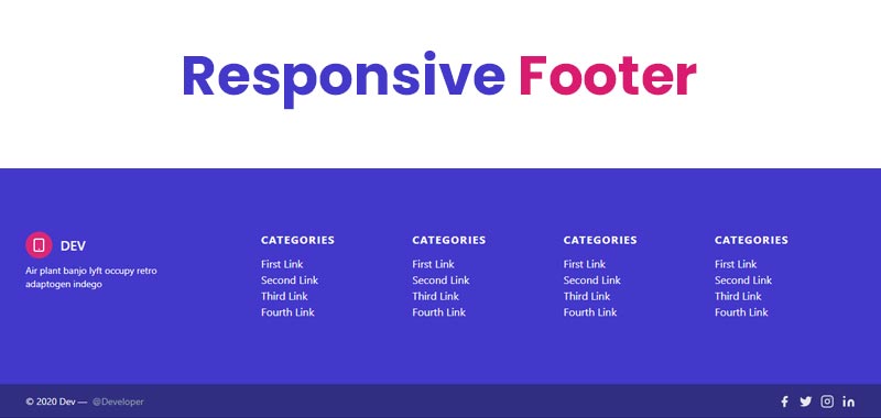
}#Final Result
If you want source code you can download it from the below button
Best collection of Responsive HTML Footer
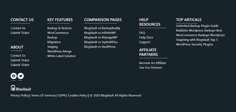
In this collection, I have listed Top 10 responsive footer examples. Check out these Awesome footer design like: #1Cool Responsive Footer Design, #2Responsive Flexbox Footer, #3Attractive responsive footer, and many more.
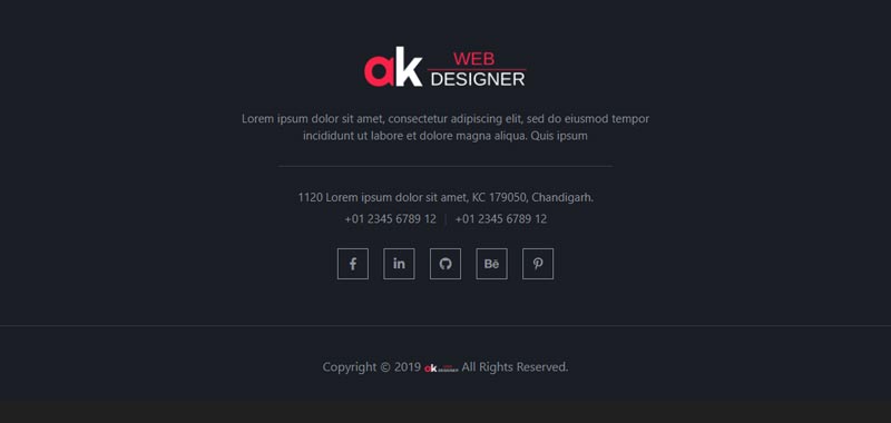
#1 Cool Responsive Footer Design
Cool Responsive Footer Design, which was developed by Anup Kumar. Moreover, you can customize it according to your wish and need.
| Author: | Anup Kumar |
| Created on: | January 7, 2019 |
| Made with: | HTML & CSS |
| Demo Link: | Source Code / Demo |
| Tags: | Cool Responsive Footer |
#2 Responsive Flexbox Footer
Responsive Flexbox Footer, which was developed by Matheus Almeida. Moreover, you can customize it according to your wish and need.
| Author: | Matheus Almeida |
| Created on: | August 4, 2019 |
| Made with: | HTML & CSS |
| Demo Link: | Source Code / Demo |
| Tags: | Responsive Flexbox Footer |
#3 Attractive responsive footer
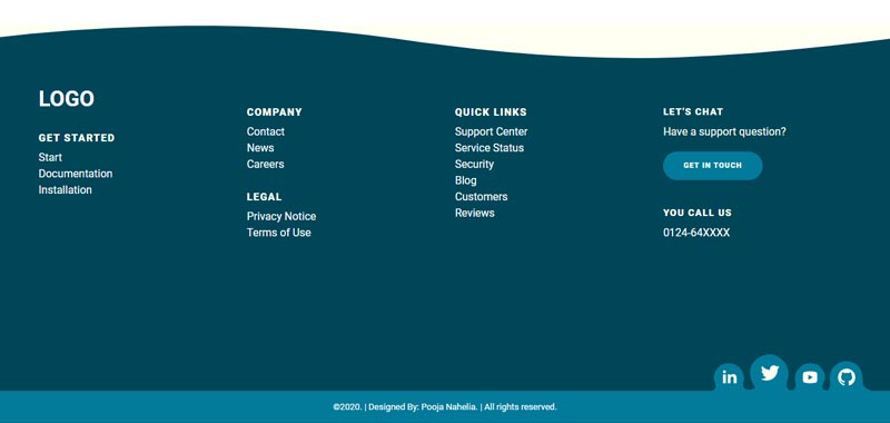
Attractive responsive footer, which was developed by Pooja Nahelia. Moreover, you can customize it according to your wish and need.
| Author: | Pooja Nahelia |
| Created on: | January 3, 2020 |
| Made with: | HTML & CSS |
| Demo Link: | Source Code / Demo |
| Tags: | Attractive responsive footer |
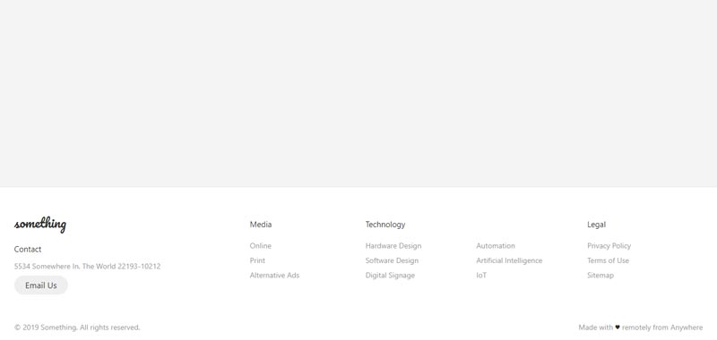
#4 Simple Responsive Footer
Simple Responsive Footer, which was developed by Anup Kumar. Moreover, you can customize it according to your wish and need.
| Author: | Anup Kumar |
| Created on: | March 25, 2019 |
| Made with: | HTML & CSS |
| Demo Link: | Source Code / Demo |
| Tags: | Simple Responsive Footer |
#5 Awesome Responsive Footer With Accordion Menu
Awesome Responsive Footer With Accordion Menu, which was developed by Kelly. Moreover, you can customize it according to your wish and need.
| Author: | Kelly |
| Created on: | May 26, 2020 |
| Made with: | HTML, CSS & JS |
| Demo Link: | Source Code / Demo |
| Tags: | Awesome Responsive Footer |
#6 Bootstrap Responsive footer
Bootstrap Responsive footer, which was developed by Prasad Lokhande. Moreover, you can customize it according to your wish and need.
| Author: | Prasad Lokhande |
| Created on: | September 17, 2020 |
| Made with: | HTML & CSS |
| Demo Link: | Source Code / Demo |
| Tags: | Bootstrap Responsive footer |
#7 Responsive Footer Design
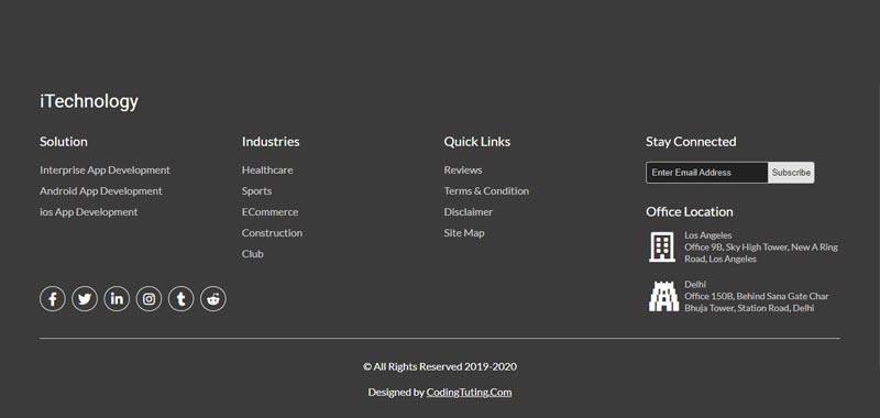
Responsive Footer Design, which was developed by CodingTuting. Moreover, you can customize it according to your wish and need.
| Author: | CodingTuting |
| Created on: | September 6, 2019 |
| Made with: | HTML, CSS & JS |
| Demo Link: | Source Code / Demo |
| Tags: | Responsive Footer Design |
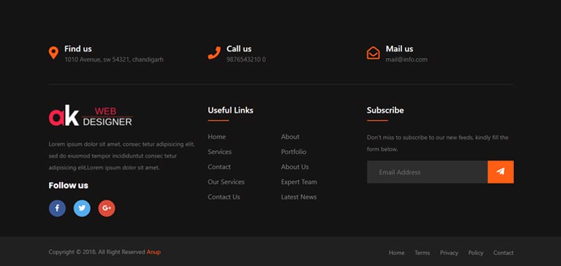
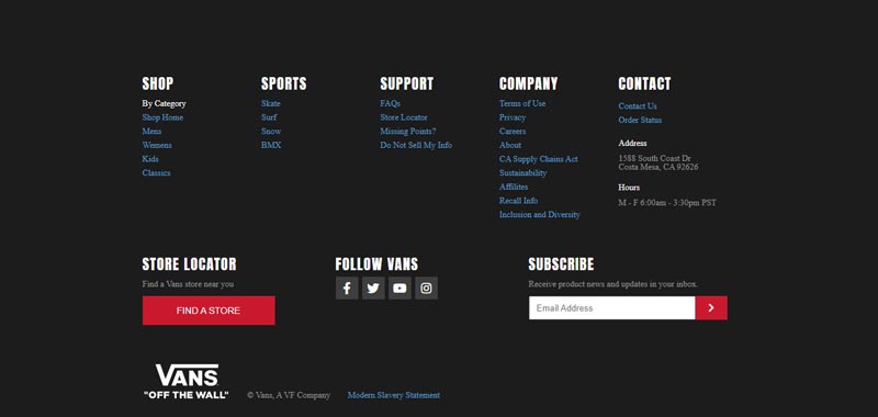
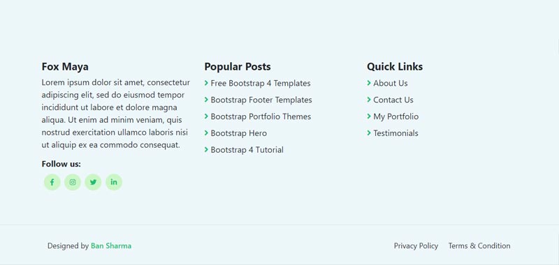
#8 Bootstrap Responsive Footer with Social Icons
Bootstrap Responsive Footer with Social Icons, which was developed by Ban Sharma. Moreover, you can customize it according to your wish and need.
| Author: | Ban Sharma |
| Created on: | December 22, 2020 |
| Made with: | HTML & CSS |
| Demo Link: | Source Code / Demo |
| Tags: | Bootstrap Responsive Footer |
#9 Responsive bootstrap footer

Responsive bootstrap footer, which was developed by Sebastian Sabadus. Moreover, you can customize it according to your wish and need.
| Author: | Sebastian Sabadus |
| Created on: | October 11, 2018 |
| Made with: | HTML & CSS |
| Demo Link: | Source Code / Demo |
| Tags: | Responsive footer |
#10 Responsive Footer With HTML & Tailwind CSS
Responsive Footer With HTML & Tailwind CSS, which was developed by Nacho Huala. Moreover, you can customize it according to your wish and need.
| Author: | Nacho Huala |
| Created on: | November 6, 2021 |
| Made with: | HTML & Tailwind CSS |
| Demo Link: | Source Code / Demo |
| Tags: | Tailwind Footer |
If you liked this article Top 10 Responsive Website Footer Examples, you should check out this one How To Create a Responsive Top Navigation Menu.