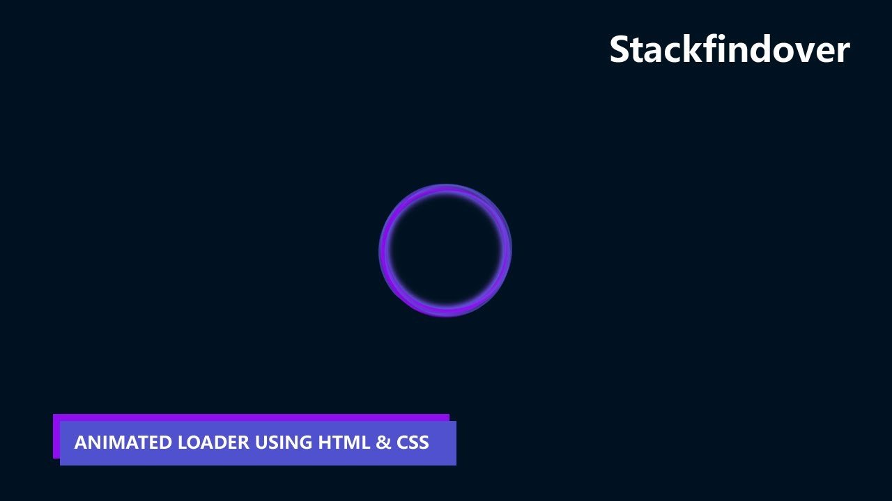
Hello guys in this tutorial we will create a loading animation using only html & css
First we need to create two files index.html and style.css then we need to do code for it.
Step:1
Add below code inside index.html
<!DOCTYPE html>
<html>
<head>
	<title>Animated Loading</title>
	<meta name="viewport" content="width=device-width, initial-scale=1">
	<link rel="stylesheet" type="text/css" href="style.css">
</head>
<body>
	<div class="loading_outer">
		<div class="load-circle">
			<div class="inner-loader"></div>
		</div>
		<div class="load-circle">
			<div class="inner-loader"></div>
		</div>
		<div class="load-circle">
			<div class="inner-loader"></div>
		</div>
		<div class="load-circle">
			<div class="inner-loader"></div>
		</div>
	</div>
</body>
</html>
Step:2
Then we need to add code for style.css which code i provide in below screen.
* {
    margin: 0;
    padding: 0;
}
body {
    background: #001221;
    display: flex;
    align-items: center;
    justify-content: center;
    height: 100vh;
    width: 100vw;
    overflow: hidden;
}
.loading_outer {
    width: 150px;
    height: 150px;
}
.load-circle {
    width: 100%;
    height: 100%;
    position: absolute;
}
.inner-loader {
    width: 100%;
    height: 100%;
    border-radius: 100%;
    border: 5px solid rgb(157 0 255 / 70%);
    border-right: none;
    border-top: none;
    background-clip: padding-box;
    box-shadow: inset 0 0 10px rgb(0 149 255),
                inset 0 0 10px rgb(255 0 188);
}
.load-circle:nth-of-child(0) {
    transform: rotate(0deg);
}
.load-circle:nth-of-child(0) .inner-loader {
    animation: spin 2.3s infinite linear;
}
.load-circle:nth-child(1) {
    transform: rotate(70deg);
}
.load-circle:nth-child(1) .inner-loader {
    animation: spin 2.3s infinite linear;
}
.load-circle:nth-child(2) {
    transform: rotate(140deg);
}
.load-circle:nth-child(2) .inner-loader {
    animation: spin 2.3s infinite linear;
}
.loading_outer {
    animation: spin 5.75s infinite linear;
}
.load-circle:nth-child(3) {
    transform: rotate(140deg);
}
.load-circle:nth-child(3) .inner-loader {
    animation: spin 2.3s infinite linear;
}

@keyframes spin {
    from {
        transform: rotate(0deg);
    }
    to {
        transform: rotate(360deg);
    }
}