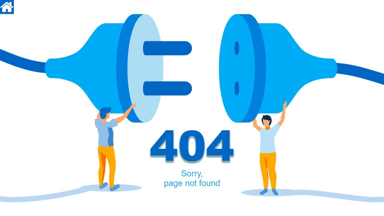
Hello guys in this tutorial we will create a beautiful 404 page using html & css
First we need to create two files index.html and style.css then we need to do code for it.
Step:1
Add below code inside index.html
<!DOCTYPE html>
<html>
<head>
	<title>404 Error</title>
	<link rel="stylesheet" type="text/css" href="style.css"><meta name="viewport" content="width=device-width, initial-scale=1">
	<link href="https://fonts.googleapis.com/css2?family=Roboto:wght@400;900&display=swap" rel="stylesheet">
	<link rel="stylesheet" href="https://cdnjs.cloudflare.com/ajax/libs/font-awesome/4.7.0/css/font-awesome.min.css">
</head>
<body>
	<section class="page-wrap">
		<h1>404</h1>
		<span>Sorry,<br />page not found</span>
	</section>
	<button class="gotohome"><i class="fa fa-home"></i></button>
</body>
</html>
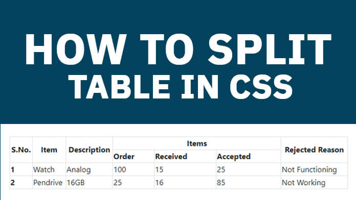
Step:2
Then we need to add code for style.css which code i provide in below screen.
* {
	padding: 0;
	margin: 0;
	font-family: 'Roboto', sans-serif;
}
h1 {
    color: #0067C4;
    font-weight: 900;
    font-size: 150px;
    position: absolute;
    left: 0;
    right: 0;
    bottom: 150px;
    text-shadow: 0px 2px 2px #ffa900,
				 0px 3px 3px #90bfe8,
				 0px 4px 4px #00abf5,
				 0px 5px 5px #0065c3;
}
body {
    display: flex;
    justify-content: center;
    align-items: center;
    min-height: 100vh;
    background: #fff;
    overflow: hidden;
}
.page-wrap {
    display: block;
    width: 100%;
    height: 100vh;
    text-align: center;
    position: relative;
    z-index: 9;
}
.icon-background {
    position: absolute;
    top: 0;
    bottom: 0;
    left: 0;
    right: 0;
    height: 100%;
    display: flex;
    align-items: center;
    justify-content: center;
    z-index: -1;
}
body:after {
    content: "";
    background: url(./right.png);
    width: 100%;
    position: absolute;
    right: 0;
    top: 0;
    bottom: 0;
    background-repeat: no-repeat;
    background-size: 50%;
    background-position: right;
}
body:before {
    content: "";
    background: url(./left.png);
    width: 100%;
    position: absolute;
    left: 0;
    top: 0;
    bottom: 0;
    background-repeat: no-repeat;
    background-size: 50%;
    background-position: left;
}
span {
    color: #00abf5;
    font-size: 30px;
    font-weight: 400;
    position: absolute;
    left: 0;
    right: 0;
    bottom: 100px;
}
.gotohome {
    position: fixed;
    left: 0;
    top: 0;
    width: 50px;
    height: 50px;
    background: #0067c4;
    border: unset;
    outline: none;
    cursor: pointer;
    z-index: 9;
}
.gotohome > i {
    font-size: 50px;
    color: #fff;
}

@media only screen and (max-width: 520px) and (min-width: 200px) {
	h1 {
	    font-size: 80px;
	}
	span {
		font-size: 25px;
	}
}
@media only screen and (max-width: 767px) and (min-width: 521px) {
	h1 {
	    font-size: 100px;
	}
}

