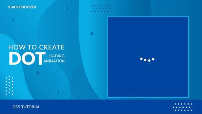
Hello, guys In this tutorial we will try to solve the mentioned query. and also we will learn how to create dot loading animation using HTML & CSS
Common Query
- Dot Loading Screen
- How to create loading animation
- How to create animated loading screen
How to create dot loading animation step by step
First, we need to create two files index.html and style.css then we need to do code for it.
Step:#1
Add below code inside index.html
<!DOCTYPE html>
<html lang="en">

<head>
  <meta charset="UTF-8" />
  <title>How to create Dot Loading Animation</title>
  <meta name="viewport" content="width=device-width, initial-scale=1.0" />
  <meta https-equiv="X-UA-Compatible" content="ie=edge" />
  <link rel="stylesheet" href="style.css" />
</head>

<body>
  <div class="loader-outer">
    <div class="loader">
      <span class="dot dot-1"></span>
      <span class="dot dot-2"></span>
      <span class="dot dot-3"></span>
      <span class="dot dot-4"></span>
    </div>
  </div>
</body>

</html>
Step:#2
Then we need to add code for style.css which code I provide in the below screen.
* {
  padding: 0;
  margin: 0;
}

body {
  display: flex;
  align-items: center;
  justify-content: center;
  height: 100vh;
  width: 100%;
  background: #000;
}

.loader>span {
  width: 15px;
  height: 15px;
  display: block;
  background: #fff;
  border-radius: 50%;
  position: relative;
  margin: 0 5px;
}

.loader {
  display: flex;
  align-items: center;
  justify-content: center;
}

.dot-1 {
  animation: anim 1s linear 0s infinite;
}

.dot-2 {
  animation: anim 1s linear 0.25s infinite;
}

.dot-3 {
  animation: anim 1s linear 0.50s infinite;
}

.dot-4 {
  animation: anim 1s linear 0.75s infinite;
}

@keyframes anim {
  0% {
    top: 0;
  }

  50% {
    top: 15px;
  }

  100% {
    top: 0;
  }
}
How to create dot loading animation output: Watch Now
We hope you liked this article. You should definitely keep your thoughts about it in the comment below and share this article with your friends.


