Hello, guys In this tutorial we will try to solve the mentioned query. and also we will learn how to make fully responsive website using HTML & CSS
Common Query
- How to create website using html and css
- How to create responsive website
- How to create website
See Also :- Best JavaScript Weather App In Codepen 2021
How To Make Fully Responsive Website Using HTML & CSS Step by Step
First, we need to create two files index.html and style.css then we need to do code for it.
Step:#1
Add below code inside index.html
<!DOCTYPE html>
<html lang="en">

<head>
  <meta charset="UTF-8" />
  <title>Landing Page Design 2021</title>
  <meta name="viewport" content="width=device-width, initial-scale=1.0" />
  <meta https-equiv="X-UA-Compatible" content="ie=edge" />
  <link rel="stylesheet" href="style.css" />
  <link href="https://fonts.googleapis.com/css2?family=IBM+Plex+Sans&display=swap" rel="stylesheet">
  <link rel="stylesheet" href="https://cdnjs.cloudflare.com/ajax/libs/font-awesome/4.7.0/css/font-awesome.min.css">
  <script src="https://ajax.googleapis.com/ajax/libs/jquery/3.5.1/jquery.min.js"></script>
</head>

<body>
  <header id="header">
    <div class="container">
      <div class="header-inner">
        <div class="brand">
          <h1><a href="#">Logo</a></h1>
        </div>
        <div class="navbar desktop">
          <nav class="nav">
            <ul class="menu-list">
              <li class="menu-item"><a href="#">Option 1</a></li>
              <li class="menu-item"><a href="#">Option 2</a></li>
              <li class="menu-item"><a href="#">Option 3</a></li>
            </ul>
          </nav>
        </div>
        <div class="toggle_menu hide_desktop"><i class="fa fa-bars"></i></div>
        <div class="navbar mobile hide_desktop">
          <nav class="nav">
            <ul class="menu-list">
              <li class="menu-item"><a href="#">Option 1</a></li>
              <li class="menu-item"><a href="#">Option 2</a></li>
              <li class="menu-item"><a href="#">Option 3</a></li>
              <button class="close"><i class="fa fa-times"></i></button>
            </ul>
          </nav>
        </div>
      </div>
    </div>
  </header>

  <div class="content">
    <div class="container">
      <div class="grid-row-2">
        <div class="col col-left">
          <h3>Business</h2>
            <h2>Startup</h2>
            <p>Lorem Ipsum is simply dummy text of the printing and typesetting industry. Lorem Ipsum has been the
              industry's standard dummy text ever since the 1500s, when an unknown printer took a galley of type and
              scrambled it to make a type specimen book.</p>
            <button class="button">Learn More</button>
        </div>
        <div class="col col-right"><img src="rocket.png" alt="rocket"></div>
      </div>
    </div>
  </div>

  <footer id="footer">
    <div class="footer-inner">
      <div class="container">
        <div class="grid-row-3">
          <div class="col">
            <div class="grid-icon-auto">
              <div class="icon">
                <img src="iocn-1.png" alt="icon 1">
              </div>
              <div class="text">
                <h3>Heading</h3>
                <p>Lorem Ipsum is simply dummy text of the printing and typesetting industry.</p>
              </div>
            </div>
          </div>
          <div class="col">
            <div class="grid-icon-auto">
              <div class="icon">
                <img src="iocn-2.png" alt="icon 1">
              </div>
              <div class="text">
                <h3>Heading</h3>
                <p>Lorem Ipsum is simply dummy text of the printing and typesetting industry.</p>
              </div>
            </div>
          </div>
          <div class="col">
            <div class="grid-icon-auto">
              <div class="icon">
                <img src="iocn-3.png" alt="icon 1">
              </div>
              <div class="text">
                <h3>Heading</h3>
                <p>Lorem Ipsum is simply dummy text of the printing and typesetting industry.</p>
              </div>
            </div>
          </div>
        </div>
      </div>
    </div>
  </footer>

  <script>
    jQuery(document).ready(function () {
      jQuery(".toggle_menu").click(function () {
        jQuery(".navbar.mobile").addClass("show");
      });
      jQuery(".close").click(function () {
        jQuery(".navbar.mobile").removeClass("show");
      });
    })
  </script>
</body>

</html>
Step:#2
Then we need to add code for style.css which code I provide in the below screen.
* {
padding: 0;
margin: 0;
font-family: 'IBM Plex Sans', sans-serif;
}
html,body {
background: url(bg.jpg)no-repeat center / cover;
height: 100vh;
width: 100vw;
overflow-x: hidden;
}
.container {
width: 90%;
max-width: 1140px;
margin: auto;
}
/* Header Start */
ul.menu-list {
list-style: none;
display: flex;
column-gap: 50px;
}
.menu-item > a {
text-decoration: unset;
color: #fff;
font-size: 18px;
}
.brand > h1 > a {
text-decoration: unset;
color: #fff;
font-size: 35px;
}
.header-inner {
display: flex;
align-items: center;
justify-content: space-between;
}
header#header {
padding: 20px 0;
}
.toggle_menu {
display: none;
}
/* Header End */
/* Content Start */
.grid-row-2 {
display: grid;
grid-template-columns: 1fr 1fr;
align-items: center;
justify-content: space-between;
}
.col-right {
text-align: right;
animation: rocket 0.6s ease-in-out;
-webkit-animation: rocket 0.6s ease-in-out;
}
@keyframes rocket {
0% {
transform: translateY(1000px);
-webkit-transform: translateY(1000px);
-moz-transform: translateY(1000px);
-ms-transform: translateY(1000px);
-o-transform: translateY(1000px);
}
100% {
transform: translateY(0px);
-webkit-transform: translateY(0px);
-moz-transform: translateY(0px);
-ms-transform: translateY(0px);
-o-transform: translateY(0px);
}
}
h3 {
font-size: 2em;
color: #f0962e;
text-transform: uppercase;
}
h2 {
color: #fff;
font-size: 5em;
text-transform: uppercase;
}
p {
color: #fff;
font-size: 18px;
}
.button {
font-size: 18px;
color: #fff;
padding: 10px 20px;
background: linear-gradient(to top left, #f47309, #fdcd58);
border-radius: 50px;
border: unset;
box-shadow: 5px 5px 10px rgb(0 0 0 / 30%);
cursor: pointer;
}
.col-left p, .col-left .button {
margin-bottom: 20px;
}
/* Content End */
/* Footer Start */
footer {
padding: 20px 0;
}
.grid-icon-auto {
display: grid;
grid-template-columns: auto auto;
column-gap: 20px;
}
.grid-row-3 {
display: grid;
grid-template-columns: 1fr 1fr 1fr;
column-gap: 20px;
}
footer p {
color: #1541c4;
}
/* Footer End */
.hide_desktop {
display: none;
}
@media screen and (max-width: 767px) and (min-width: 200px) {
html, body {
background: #1946c7;
}
.hide_desktop {
display: block;
}
.grid-row-3,.grid-row-2 {
grid-template-columns: 1fr;
row-gap: 30px;
}
.col.col-right {
display: none;
}
footer#footer p {
color: #fff;
}
.toggle_menu {
display: block;
font-size: 25px;
color: #fff;
cursor: pointer;
}
.navbar.desktop {
display: none;
}
.navbar.mobile ul.menu-list {
display: block;
}
.navbar.mobile {
position: fixed;
width: 80vw;
right: -1000px;
top: 0;
height: 100vh;
background: #fff;
transition: right 0.8s ease-in-out;
}
.navbar.mobile.show {
right: 0;
}
h2 {
font-size: 4em;
}
h3 {
font-size: 1.3em;
}
nav.nav {
height: 100%;
background: linear-gradient(to top left, #f47309, #fdcd58);
}
.navbar.mobile ul.menu-list > li > a {
color: #1946c7;
display: inline-block;
}
button.close {
background: #f47309;
width: 50px;
height: 50px;
display: flex;
align-items: center;
justify-content: center;
color: #fff;
font-size: 20px;
border: transparent;
position: absolute;
bottom: 0;
}
.navbar.mobile ul.menu-list > li > a {
padding: 10px;
background: linear-gradient(to top left, #f47309, #fdcd58);
width: 100%;
color: #fff;
border-bottom: 1px solid #ddd;
}
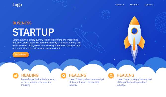
}How To Make Fully Responsive Website Using HTML & CSS Output: Watch Now
If you want source code you can download it from the below button
We hope you liked this article. You should definitely keep your thoughts about it in the comment below and share this article with your friends.