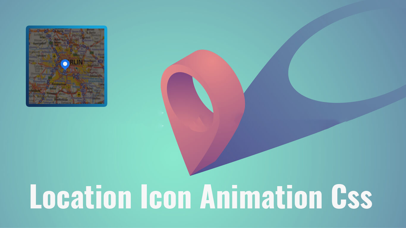
Hello guys in this tutorial we will create animated location icon using HTML & CSS
First we need to create two files index.html and style.css then we need to do code for it.
Step:1
Add below code inside index.html
<!DOCTYPE html>
<html lang="en">
  <head>
    <meta charset="UTF-8" />
    <title>Location icon animation CSS</title>
    <meta name="viewport" content="width=device-width, initial-scale=1.0" />
    <meta https-equiv="X-UA-Compatible" content="ie=edge" />
    <link rel="stylesheet" href="style.css" />
  </head>
  <body>
    <div class="Wrapper">
      <div class='pin'></div>
      <div class='pulse'></div>
    </div>
  </body>
</html>
Step:2
Then we need to add code for style.css which code i provide in below screen.
* {
  padding: 0;
  margin: 0;
}
body {
    background: #f1f2f3 url(map.jpg) no-repeat center/cover;
    height: 100vh;
    position: relative;
}
body:after{
    content: "";
    position: absolute;
    left: 0;
    right: 0;
    height: 100%;
    background: rgb(0 0 0 / .5);
    z-index: 0;
}
.pin {
  width: 30px;
  height: 30px;
  border-radius: 50% 50% 50% 0;
  background: #1a73e8;
  position: absolute;
  transform: rotate(-45deg);
  left: 50%;
  top: 50%;
  margin: -20px 0 0 -20px;
  animation-name: bounce;
  animation-fill-mode: both;
  animation-duration: 1s;
  z-index: 3;
}
.pin:after {
  content: '';
  width: 14px;
  height: 14px;
  margin: 8px 0 0 8px;
  background: #f1f2f3;
  position: absolute;
  border-radius: 50%;
}
.pulse {
  background: rgb(26 115 231 / .2);
  border-radius: 50%;
  height: 14px;
  width: 14px;
  position: absolute;
  left: 50%;
  top: 50%;
  margin: 11px 0px 0px -12px;
  transform: rotateX(55deg);
  z-index: 3;
}
.pulse:after {
  content: "";
  border-radius: 50%;
  height: 40px;
  width: 40px;
  position: absolute;
  margin: -13px 0 0 -13px;
  animation: pulsate 1s ease-out;
  animation-iteration-count: infinite;
  opacity: 0;
  box-shadow: 0 0 1px 2px rgb(26 115 231 /1);
  animation-delay: 1.1s;
}
@keyframes pulsate {
  0% {
    transform: scale(0.1, 0.1);
    opacity: 0;
  }
  50% {
    opacity: 1;
    -ms-filter: none;
    filter: none;
  }
  100% {
    transform: scale(1.2, 1.2);
    opacity: 0;
  }
}
@keyframes bounce {
  0% {
    opacity: 0;
    transform: translateY(-2000px) rotate(-45deg);
  }
  60% {
    opacity: 1;
    transform: translateY(30px) rotate(-45deg);
  }
  80% {
    transform: translateY(-10px) rotate(-45deg);
  }
  100% {
    transform: translateY(0) rotate(-45deg);
  }
}
![How to install WordPress on localhost [ Installation guide ]](https://blog.stackfindover.com/wp-content/uploads/2020/06/how-to-install-wordpress-1024x576.jpg)