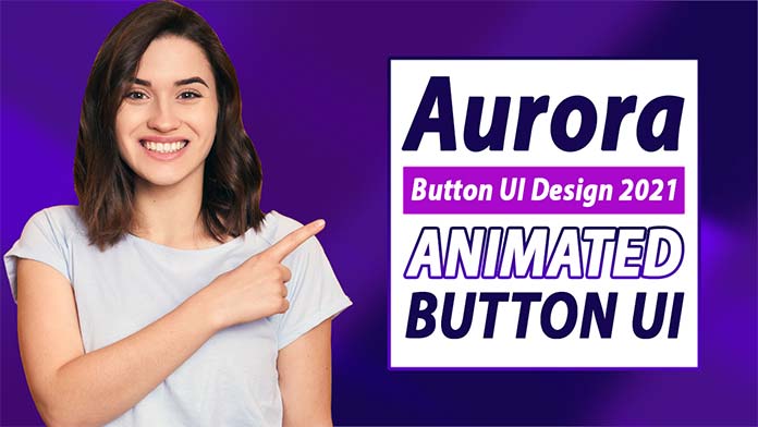
Hello, guys In this tutorial we will try to solve the mentioned query. and also we will learn how to create a animated button.
Common Query
- How to create a animated button?
- How to a button?
- How to create aurora UI button?
See Also :- How to find a word in a paragraph
How to create a animated button step by step
First, we need to create two files index.html and style.css then we need to do code for it.
Step:#1
Add below code inside index.html
<!DOCTYPE html>
<html lang="en">
  <head>
    <meta charset="UTF-8" />
    <title>Aurora UI Button</title>
    <meta name="viewport" content="width=device-width, initial-scale=1.0" />
    <meta https-equiv="X-UA-Compatible" content="ie=edge" />
    <link rel="stylesheet" href="style.css" />
    <link href="https://fonts.googleapis.com/css2?family=IBM+Plex+Sans&display=swap" rel="stylesheet">
  </head>
  <body>
    <div class="animated-button-outer">
      <div class="button">
        <span class="one"></span>
        <span class="two"></span>
        <span class="three"></span>
        <span class="four"></span>
        <span class="text">Button</span>
      </div>
    </div>
  </body>
</html>
Step:#2
Then we need to add code for style.css which code I provide in the below screen.
* {
    padding: 0;
    margin: 0;
    font-family: 'IBM Plex Sans', sans-serif;
}
body {
    display: flex;
    align-items: center;
    justify-content: center;
    height: 100vh;
    overflow: hidden;
    background-color: #f2f4f6;
}
.animated-button-outer {
  display: flex;
  align-items: center;
  justify-content: center;
  height: 100vh;
}
.button {
  width: 250px;
  height: 80px;
  background: #fff;
  position: relative;
  overflow: hidden;
  cursor: pointer;
  border: 1px solid rgb(0 0 0 / 50%);
}
.button > span {
  position: absolute;
  filter: blur(50px);
  opacity: 0.8;
}
.button .one {
  width: 600px;
  height: 600px;
  left: -50px;
  top: -300px;
  background: #1b0035;
  z-index: 3;
  transform: rotate(0) translate(80px) rotate(0);
  animation: fly 12s linear infinite;
  -webkit-animation: fly 12s linear infinite;
}
.button .two {
  width: 500px;
  height: 800px;
  background: #3f0069;
  bottom: -30px;
  left: -50px;
}
.button .three {
  width: 450px;
  height: 450px;
  border-radius: 50%;
  bottom: -80px;
  right: -100px;
  background: #ff00aa;
  animation: flyPlus 10s linear infinite;
  -webkit-animation: flyPlus 10s linear infinite;
}
.button .four {
  width: 350px;
  height: 350px;
  bottom: 0;
  right: 0;
  background: #90e0ff;
  margin: auto;
  animation: flyPlus 15s linear infinite;
  -webkit-animation: flyPlus 15s linear infinite;
}
.animated-button-outer .button .text {
  opacity: 1;
  filter: unset;
  left: 0;
  right: 0;
  height: 100%;
  text-align: center;
  display: flex;
  align-items: center;
  justify-content: center;
  font-size: 20px;
  font-weight: 600;
  color: #fff;
  z-index: 9;
  text-transform: uppercase;
}


@keyframes fly {
  100% {
    transform: rotate(2turn) translate(200px) rotate(-2turn);
    -webkit-transform: rotate(2turn) translate(200px) rotate(-2turn);
    -moz-transform: rotate(2turn) translate(200px) rotate(-2turn);
    -ms-transform: rotate(2turn) translate(200px) rotate(-2turn);
    -o-transform: rotate(2turn) translate(200px) rotate(-2turn);
  }
}


@keyframes flyPlus {
  100% {
    transform: rotate(-2turn) translate(200px) rotate(2turn);
    -webkit-transform: rotate(-2turn) translate(200px) rotate(2turn);
    -moz-transform: rotate(-2turn) translate(200px) rotate(2turn);
    -ms-transform: rotate(-2turn) translate(200px) rotate(2turn);
    -o-transform: rotate(-2turn) translate(200px) rotate(2turn);
}
}
How to create a animated button output: Watch Now
We hope you liked this article. You should definitely keep your thoughts about it in the comment below and share this article with your friends.