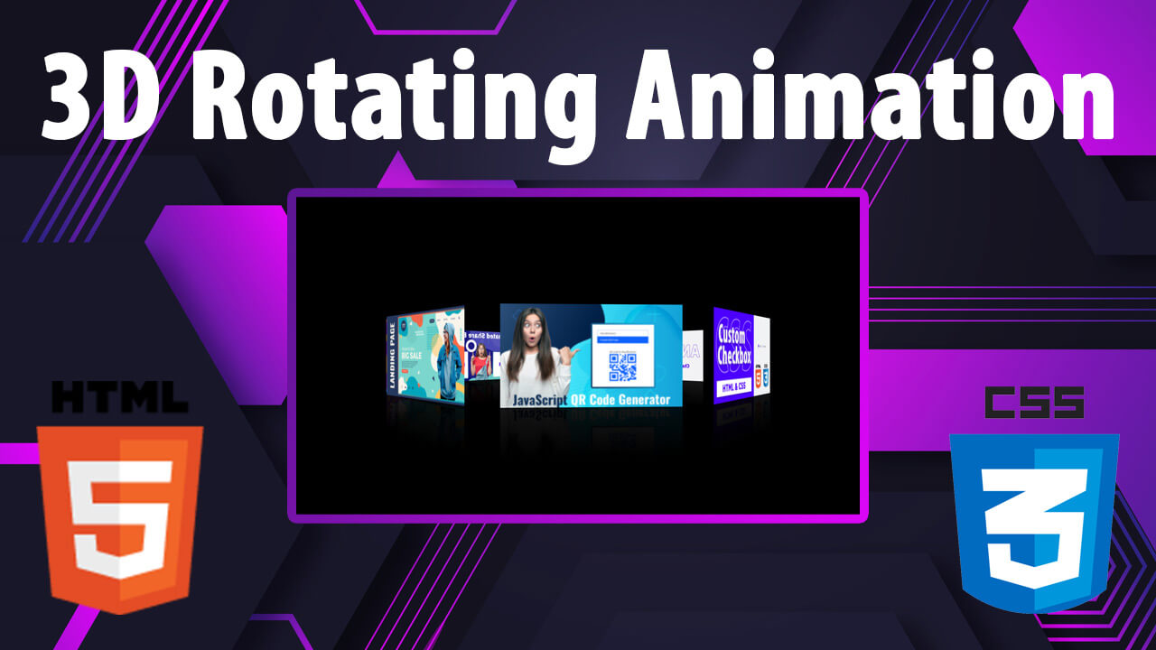
Hello guys in this tutorial, we are going to learn how to add 3D rotation animation effects using html and css.
CSS 3D Transforms Methods
With the CSS transform property you can use the following 3D transformation methods:
rotateX()rotateY()rotateZ()
The rotateX() Method
#myDiv {
  transform: rotateX(150deg);
}
The rotateY() Method
#myDiv {
  transform: rotateY(150deg);
}
The rotateZ() Method
#myDiv {
  transform: rotateZ(150deg);
}
First we need to create two files index.html and style.css then we need to do code for it.
Step:1
Add below code inside index.html
<!DOCTYPE html>
<html lang="en">
  <head>
    <meta charset="UTF-8" />
    <title>How to make 3D Rotating Image in CSS ?</title>
    <meta name="viewport" content="width=device-width, initial-scale=1.0" />
    <meta https-equiv="X-UA-Compatible" content="ie=edge" />
    <link rel="stylesheet" href="style.css" />
  </head>
  <body>
    <div class="box">
      <span style="--i:1"> <img src="01.jpg"> </span>
      <span style="--i:2"> <img src="02.jpg"> </span>
      <span style="--i:3"> <img src="03.jpg"> </span>
      <span style="--i:4"> <img src="04.jpg"> </span>
      <span style="--i:5"> <img src="05.jpg"> </span>
      <span style="--i:6"> <img src="06.jpg"> </span>
      <span style="--i:7"> <img src="07.jpg"> </span>
      <span style="--i:8"> <img src="08.jpg"> </span>
      <span style="--i:9"> <img src="09.jpg"> </span>
    </div>
  </body>
</html>
Step:2
Then we need to add code for style.css which code i provide in below screen.
* {
    padding: 0;
    margin: 0;
    font-family: 'IBM Plex Sans', sans-serif;
}
body {
    display: flex;
    align-items: center;
    justify-content: center;
    height: 100vh;
    background: #000;
}
.box {
    position: relative;
    width: 300px;
    height: 150px;
    transform-style: preserve-3d;
    animation: animate 30s linear;
}
@keyframes animate {
    0% {
        transform: perspective(1000px) rotateY(0deg);
    }
    100% {
        transform: perspective(1000px) rotateY(360deg);
    }
}
.box > span {
    position: absolute;
    top: 0;
    left: 0;
    width: 100%;
    height: 100%;
    transform-origin: center;
    transform-style: preserve-3d;
    transform: rotateY(calc(var(--i) * 45deg)) translateZ(400px);
    -webkit-box-reflect: below 0px linear-gradient(transparent, transparent, #0000001a);
}
.box > span > img {
    position: absolute;
    top: 0;
    left: 0;
    height: 100%;
    width: 100%;
    object-fit: contain;
}

![CSS Shining Text Animation [ Top 10 Shining Text Effect ]](https://blog.stackfindover.com/wp-content/uploads/2022/06/shining-text-animation-1024x576.jpg)