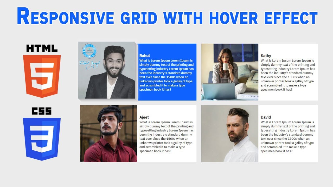
Hello guys today we will learn how to make a responsive grid with a hover effect using HTML & CSS
First we need to create two files index.html and Style.css then we need to do code for it.
Step:1
Add below code inside index.html
<!DOCTYPE html>
<html>
<head>
	<title>Responsive Grid</title>
	<meta name="viewport" content="width=device-width, initial-scale=1.0">
	<link rel="stylesheet" type="text/css" href="style.css">
	<link href="https://fonts.googleapis.com/css2?family=IBM+Plex+Sans:wght@500&display=swap" rel="stylesheet">
</head>
<body>
	<section class="our_team_section">
		<div class="container">
			<div class="gridRow twoColGrid">
				<div class="gridCol">
					<div class="gridRow twoColGrid">
						<div class="imageCol">
							<img src="rahul.jpg" alt="Rahul">
						</div>
						<div class="contentCol">
							<h2>Rahul</h2>
							<p>What is Lorem Ipsum Lorem Ipsum is simply dummy text of the printing and typesetting industry Lorem Ipsum has been the industry's standard dummy text ever since the 1500s when an unknown printer took a galley of type and scrambled it to make a type specimen book it has?</p>
						</div>
					</div>
				</div>
				<div class="gridCol">
					<div class="gridRow twoColGrid">
						<div class="imageCol">
							<img src="kathy.jpg" alt="Kathy">
						</div>
						<div class="contentCol">
							<h2>Kathy</h2>
							<p>What is Lorem Ipsum Lorem Ipsum is simply dummy text of the printing and typesetting industry Lorem Ipsum has been the industry's standard dummy text ever since the 1500s when an unknown printer took a galley of type and scrambled it to make a type specimen book it has?</p>
						</div>
					</div>
				</div>
				<div class="gridCol">
					<div class="gridRow twoColGrid">
						<div class="imageCol">
							<img src="ajeet.jpg" alt="Ajeet">
						</div>
						<div class="contentCol">
							<h2>Ajeet</h2>
							<p>What is Lorem Ipsum Lorem Ipsum is simply dummy text of the printing and typesetting industry Lorem Ipsum has been the industry's standard dummy text ever since the 1500s when an unknown printer took a galley of type and scrambled it to make a type specimen book it has?</p>
						</div>
					</div>
				</div>
				<div class="gridCol">
					<div class="gridRow twoColGrid">
						<div class="imageCol">
							<img src="david.jpg" alt="David">
						</div>
						<div class="contentCol">
							<h2>David</h2>
							<p>What is Lorem Ipsum Lorem Ipsum is simply dummy text of the printing and typesetting industry Lorem Ipsum has been the industry's standard dummy text ever since the 1500s when an unknown printer took a galley of type and scrambled it to make a type specimen book it has?</p>
						</div>
					</div>
				</div>
			</div>
		</div>
	</section>
</body>
</html>
You can download Images from below button
Step:2
Then we need to add code for style.css which code i provide in below screen.
*{
  padding: 0;
  margin: 0;
  font-family: 'IBM Plex Sans', sans-serif;
  color: #333;
}
body {
    margin: 0;
    padding: 0;
    background: #ebebeb;
    width: 100%;
    height: 100vh;
    display: flex;
    align-items: center;
    justify-content: center;
}
h2 {
    font-size: 20px;
    line-height: 30px;
}
.container {
    width: 100%;
    max-width: 1220px;
    margin: auto;
}
.twoColGrid {
    display: grid;
    grid-template-columns: 49% 49%;
    column-gap: 2%;
    grid-row-gap: 4%;
    align-items: center;
    justify-content: center;
}
.imageCol > img {
    width: 100%;
    display: block;
    transition: 1s ease-in-out;
}
.gridCol {
    background: #fff;
    transition: background 1s ease-in-out;
}
.gridCol:hover {
    background: #0f62fe;
}
.gridCol:hover p,.gridCol:hover h2 {
	color: #fff;
}

.imageCol:hover img {
	cursor: pointer;
    transition: 1s ease-in-out;
    transform: translate(-10px, -10px);
    -webkit-box-shadow: 5px 5px 0px 0px #bbb,
    			10px 10px 0px 0px #ccc,
    			15px 15px 0px 0px #ddd,
    			5px -4px 15px 7px #eee;
    box-shadow: 5px 5px 0px 0px #bbb,
    			10px 10px 0px 0px #ccc,
    			15px 15px 0px 0px #ddd,
    			5px -4px 15px 7px #eee;
}

@media only screen and (max-width: 767px) and (min-width: 100px) {
	body {
	    height: 100%;
	}
	.container {
	    max-width: 90%;
	    width: 100%;
	}
	.twoColGrid {
	    display: block;
        margin-bottom: 15px;
	}
	.contentCol {
	    padding: 20px;
	}
}
@media only screen and (max-width: 1023px) and (min-width: 768px) {
	body {
	    height: 100%;
	}
	.container {
	    max-width: 95%;
	    width: 100%;
	}
	p {
	    font-size: 12px;
	}
}

