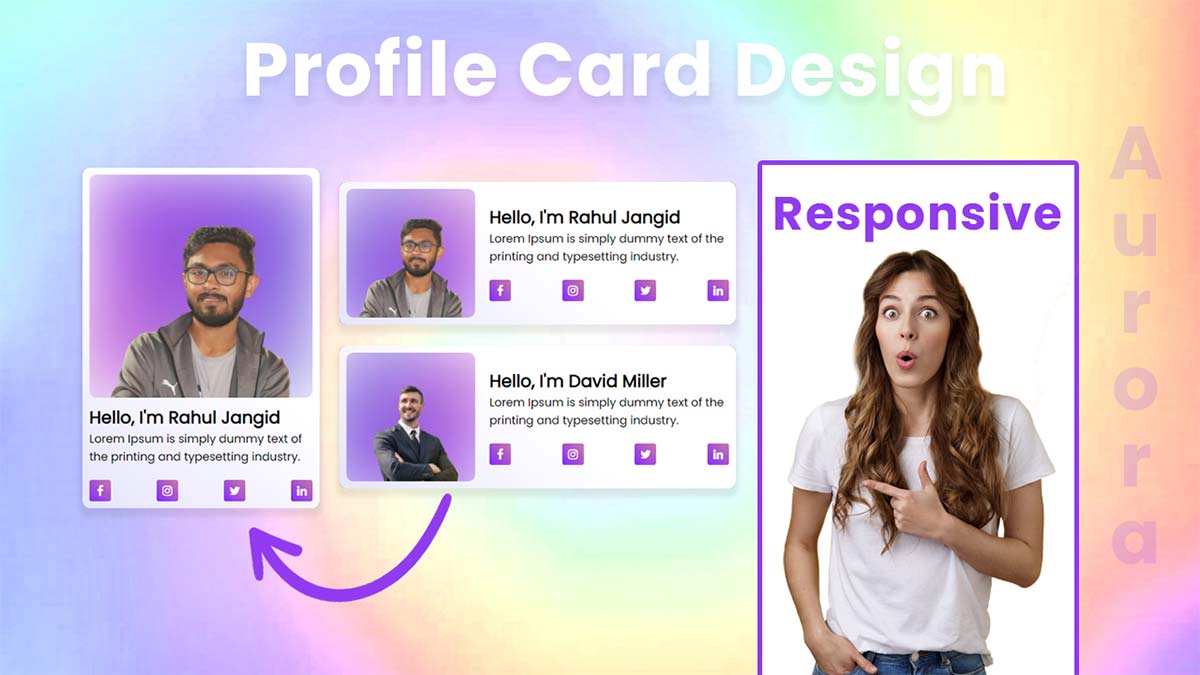
Hello guys, today I am going to show you how to to create a awesome aurora profile card design, in this article i will create a responsive profile card design with simple aurora background animation using HTML & CSS.
Profile Card Design 2021 step by step
In this step, we need to create a new project folder and files(index.html, style.css) for creating a profile card design. In the next step, you will start creating the structure of the webpage.
Step 2 — Setting Up the basic structure
In this step, we will add the HTML code to create the basic structure of the project.
<!DOCTYPE html>
<html lang="en">
<head>
    <meta charset="UTF-8">
    <meta http-equiv="X-UA-Compatible" content="IE=edge">
    <meta name="viewport" content="width=device-width, initial-scale=1.0">
    <title>How to Awesome profile Card Design</title>
    <link rel="stylesheet" href="style.css">
    <link rel="preconnect" href="https://fonts.googleapis.com">
    <link rel="preconnect" href="https://fonts.gstatic.com" crossorigin>
    <link href="https://fonts.googleapis.com/css2?family=Poppins:wght@200;300;400&display=swap" rel="stylesheet">
    <link rel="stylesheet" href="https://cdnjs.cloudflare.com/ajax/libs/font-awesome/4.7.0/css/font-awesome.min.css">
</head>
<body>

</body>
</html>
This is the base structure of most web pages that use HTML.
Add the following code inside the <body> tag:
<div class="container">
    <div class="cards grid-row">
      <div class="card flex-row colmun">
        <div class="col-left card-image">
          <div class="card-bg-img">
            <img src="purple.jpg" alt="card background image">
          </div>
          <div class="profile-img">
            <img src="profile.png" alt="profile">
          </div>
        </div>
        <div class="col-right card-info">
          <div class="card-info-inner">
            <h2>Hello, I'm David Miller</h2>
            <p>Lorem Ipsum is simply dummy text of the printing and typesetting industry.</p>
            <ul class="social">
              <li><a href="#"><i class="fa fa-facebook"></i></a></li>
              <li><a href="#"><i class="fa fa-instagram"></i></a></li>
              <li><a href="#"><i class="fa fa-twitter"></i></a></li>
              <li><a href="#"><i class="fa fa-linkedin"></i></a></li>
            </ul>
          </div>
        </div>
      </div>
      <div class="card flex-row colmun">
        <div class="col-left card-image">
          <div class="card-bg-img">
            <img src="purple.jpg" alt="card background image">
          </div>
          <div class="profile-img">
            <img src="rahul.png" alt="rahul">
          </div>
        </div>
        <div class="col-right card-info">
          <div class="card-info-inner">
            <h2>Hello, I'm Rahul Jangid</h2>
            <p>Lorem Ipsum is simply dummy text of the printing and typesetting industry.</p>
            <ul class="social">
              <li><a href="#"><i class="fa fa-facebook"></i></a></li>
              <li><a href="#"><i class="fa fa-instagram"></i></a></li>
              <li><a href="#"><i class="fa fa-twitter"></i></a></li>
              <li><a href="#"><i class="fa fa-linkedin"></i></a></li>
            </ul>
          </div>
        </div>
      </div>
    </div>
  </div>
Step 3 — Adding Styles for the Classes
In this step, we will add styles to the section class Inside style.css file
* {
  padding: 0;
  margin: 0;
  box-sizing: border-box;
  font-family: 'Poppins', sans-serif;
}
body {
  display: flex;
  align-items: center;
  justify-content: center;
  height: 100vh;
  width: 100vw;
  overflow-x: hidden;
  background: #d9eaff;
}
.container {
  width: 95%;
  max-width: 1140px;
  margin: auto;
}
.grid-row {
  display: grid;
  grid-template-columns: 1fr 1fr;
  column-gap: 30px;
}
.flex-row {
  display: flex;
  align-items: center;
  column-gap: 20px;
}
.card {
  padding: 10px;
  background: rgb(229,228,252);
  background: linear-gradient(
38deg
, rgba(229,228,252, 1), rgb(255 255 255) 51%);
  border-radius: 10px;
  box-shadow: 0px 0px 10px rgb(0 0 0 / 10%);
  margin-bottom: 20px;
}
.card-image {
  position: relative;
  overflow: hidden;
  border-radius: 10px;
}
.card-bg-img img {
  display: block;
  width: 100%;
  max-width: 200px;
  border-radius: 10px;
  animation: scaleAnim 10s ease-in-out infinite;
}
@keyframes scaleAnim {
  0% {
    transform: scale(1);
  }
  50% {
    transform: scale(1.5) rotate(360deg);
  }
  100% {
    transform: scale(1) rotate(0deg);
  }
}
.card-bg-img {
  filter: blur(50px);
}
.flex-row > div {
  min-width: 180px;
}
.profile-img {
  position: absolute;
  top: 0;
  bottom: 0;
  left: 0;
  right: 0;
}
.profile-img img {
  display: block;
  width: 100%;
  height: auto;
  object-fit: cover;
}
.social {
  list-style: none;
  display: flex;
  align-items: center;
  justify-content: space-between;
  margin-top: 20px;
}
.social li {
  width: 30px;
  height: 30px;
  display: flex;
  align-items: center;
  justify-content: center;
  background: linear-gradient(
45deg
, #832dff, #c7a);
  border-radius: 3px;
}
.social li a {
  color: #fff;
}

@media screen and (max-width: 1060px) and (min-width:900px) {
  h2 {
    font-size: 20px;
  }
  p {
    font-size: 14px;
  }
}

@media screen and (max-width: 899px) and (min-width:768px) {
  .flex-row > div {
    min-width: 150px;
  }
  h2 {
    font-size: 16px;
  }
  p {
    font-size: 12px;
  }
}
@media screen and (max-width: 767px) and (min-width:521px) {
  .grid-row {
    display: block;
  }
}
@media screen and (max-width: 520px) and (min-width:200px) {
  .grid-row, .flex-row {
    display: block;
  }
  .card-bg-img img {
      max-width: unset;
  }
  .card-info-inner {
      display: block;
      margin-top: 10px;
  }
}
#Final Result
If you want source code you can download it from the below button
We hope you liked this article. You should definitely keep your thoughts about it in the comment below and share this article with your friends.