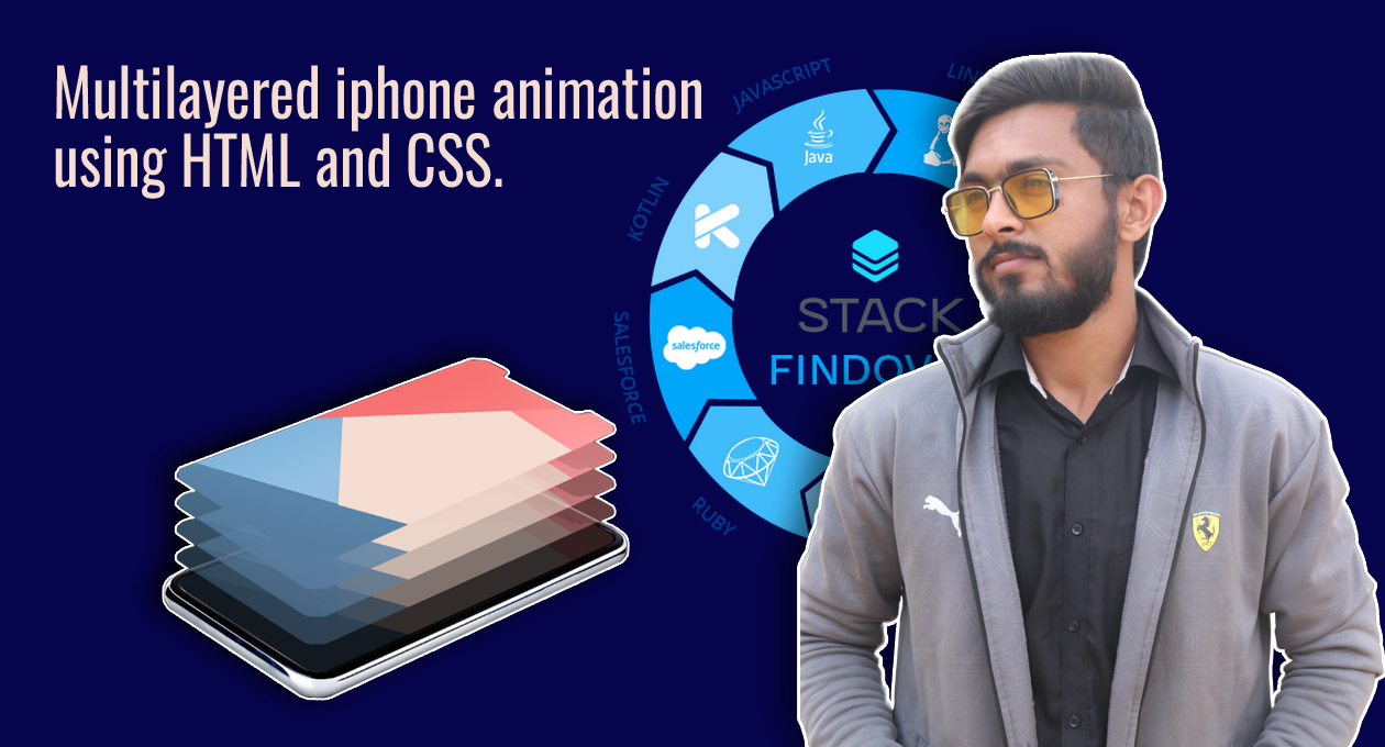
Hello guys today we will learn how to make a Multilayered iphone animation using HTML and CSS, So let’s get started.
First we need to create two files index.html and Style.css then we need to do code for multilayered iphone animation —>
Step:1
Add below code inside index.html
<!DOCTYPE html>
<html>
<head>
    <title>Layered Image Hover Effect</title>
    <link rel="stylesheet" type="text/css" href="style.css">
    <link href="https://fonts.googleapis.com/css2?family=Roboto:ital,wght@1,900&display=swap" rel="stylesheet">
</head>
<body>
    <div class="box">
        <div class="innerbox">
            <div class="innerboxx">
                 <img src="iphone.png" alt="Iphone Image">
                 <img src="screen.png" class="screen screen1" alt="Iphone Image">
                 <img src="screen.png" class="screen screen2" alt="Iphone Image">
                 <img src="screen.png" class="screen screen3" alt="Iphone Image">
                 <img src="screen.png" class="screen screen4" alt="Iphone Image">
                 <img src="screen.png" class="screen screen5" alt="Iphone Image">
             </div>
        </div>
    </div>
</body>
</html>Step:2
Then we need to add code for style.css which code i provide in below text.
* {
    font-family: 'Roboto', sans-serif;
}
body {
    margin: 0;
    padding: 0;
    height: 100vh;
    display: flex;
    justify-content: center;
    align-items: center;
    background: #000;
    overflow: hidden;
}
.box, .innerbox,.innerboxx{
    transition: all 1s;
}
.box {
    position: relative;
    width: 677px;
    height: 342px;
}
.box .screen {
    position: absolute;
    top: -17px;
    left: 2px;
    transition: all 0.5s;
}
.box:hover .screen.screen5 {
    transform: translateY(-160px);
    opacity: 1;
}
.box:hover .screen.screen4 {
    transform: translateY(-120px);
    opacity: 0.8;
}
.box:hover .screen.screen3 {
    transform: translateY(-80px);
    opacity: 0.6;
}
.box:hover .screen.screen2 {
    transform: translateY(-40px);
    opacity: 0.4;
}
.box:hover .screen.screen1 {
    transform: translateY(0px);
    opacity: 0.2;
}