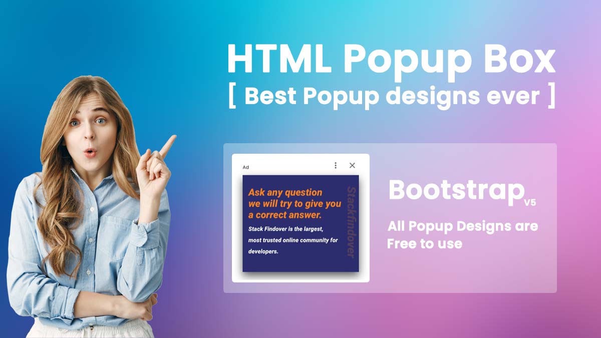

Hello Friends, in this article I will teach you what is an html popup and how to create a simple popup using HTML, CSS and JavaScript, and also I have listed best popup examples made with HTML, CSS, and JS. Check out these excellent examples which are available on CodePen.
What Is an HTML Popup?
While using HTML ( HyperText Markup Language ) popup is a separate display window that allow to showing a warning or any other important information to the website visitors.
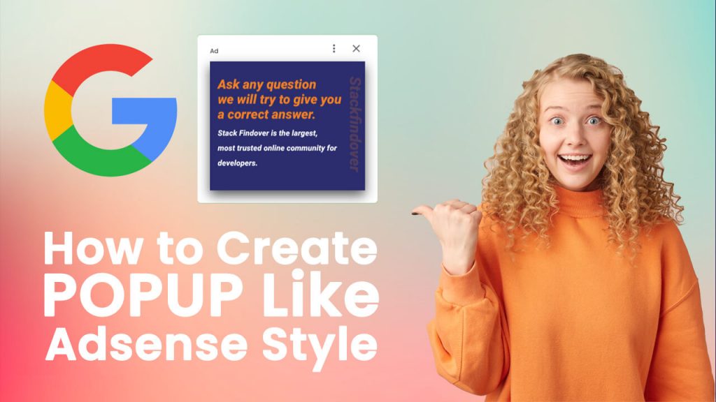
A Simple Guide to create Popup Like AdSense Ad Style
Step 1 — Creating a New Project
In this step, we need to create a new project folder and files (index.html, style.css, main.js) for creating an HTML Popup. In the next step, we will start creating the structure of the webpage.
Step 2 — Setting Up the basic structure
In this step, we will add the HTML code to create the basic structure of the project.
<!DOCTYPE html>
<html lang="en">
<head>
    <meta charset="UTF-8">
    <meta http-equiv="X-UA-Compatible" content="IE=edge">
    <meta name="viewport" content="width=device-width, initial-scale=1.0">
    <title>Goolge Adsense Style Popup</title>
    <link rel="stylesheet" href="style.css">
    <link rel="preconnect" href="https://fonts.googleapis.com">
    <link rel="preconnect" href="https://fonts.gstatic.com" crossorigin>
    <link href="https://fonts.googleapis.com/css2?family=Poppins:wght@300;400;500;600;800&display=swap" rel="stylesheet">
    <script src="https://ajax.googleapis.com/ajax/libs/jquery/3.5.1/jquery.min.js"></script>
</head>
<body>

</body>
</html>
This is the base structure of most web pages that use HTML.
Add the following code inside the <body> tag:
 <div id="content">
        <div class="container">
            <div class="click-me"><a href="#">Click Me</a></div>
        </div>
    </div>
    <!-- Start popup code -->

    <div id="ad_position_box">
        <div class="card">
            <div class="top-row flex-row">
                <div class="colmun">
                    <span>Ad</span>
                </div>
                <div class="colmun">
                    <button class="report"><svg viewBox="0 0 14 24" fill="none"><path fill-rule="evenodd" clip-rule="evenodd" d="M2 8C3.1 8 4 7.1 4 6C4 4.9 3.1 4 2 4C0.9 4 0 4.9 0 6C0 7.1 0.9 8 2 8ZM2 10C0.9 10 0 10.9 0 12C0 13.1 0.9 14 2 14C3.1 14 4 13.1 4 12C4 10.9 3.1 10 2 10ZM0 18C0 16.9 0.9 16 2 16C3.1 16 4 16.9 4 18C4 19.1 3.1 20 2 20C0.9 20 0 19.1 0 18Z" fill="#5F6368"></path></svg></button>
                    <button class="skip"><svg viewBox="0 0 48 48" fill="#5F6368"><path d="M38 12.83L35.17 10 24 21.17 12.83 10 10 12.83 21.17 24 10 35.17 12.83 38 24 26.83 35.17 38 38 35.17 26.83 24z"></path><path d="M0 0h48v48H0z" fill="none"></path></svg></button>
                </div>
            </div>
            <div class="ad-content">
                <img src="ad.jpg" alt="ad">
            </div>
        </div>
    </div>
<script src="main.js"></script>
Step 3 — Adding Styles for the Classes
In this step, we will add styles to the section class Inside style.css file
* {
  padding: 0;
  margin: 0;
  text-decoration: unset;
  list-style: none;
  font-family: 'Poppins', sans-serif;
}
html, body {
  width: 100%;
  height: 100%;
  background: url(bg.jpg) no-repeat center / cover;
  position: relative;
  overflow-x: hidden;
  display: flex;
  align-items: center;
  justify-content: center;
}
.click-me a {
  color: #ffffff;
  padding: 5px 20px;
  background: rgb(255 255 255 / 20%);
  border-radius: 50px;
}

/* Adsense style popup */
svg {
  width: 1.2em;
  height: 1.2em;
}
div#ad_position_box button {
  background: transparent;
  border: unset;
  font-size: 20px;
  cursor: pointer;
}
.flex-row {
  display: flex;
  align-items: center;
  justify-content: space-between;
}
div#ad_position_box {
  display: none;
  align-items: center;
  justify-content: center;
  height: 100%;
  width: 100%;
  position: fixed;
  top: 50%;
  transform: translateY(-50%);
  backdrop-filter: blur(50px);
}
div#ad_position_box.active {
  display: flex;
}
div#ad_position_box .card {
  background: #fff;
  padding: 10px 24px 25px;
  border-radius: 6px;
  position: relative;
  box-shadow: 0px 8px 12px rgb(60 64 67 / 15%), 0px 4px 4px rgb(60 64 67 / 30%);
}
.ad-content {
  display: block;
  box-shadow: 0px 10px 22px rgb(0 0 0 / 65%);
}
.ad-content img{
  display: block;
  width: 100%;
}
Step 4 — Add some line of jQuery code inside main js file
$(".click-me a").click(function(){
  $("#ad_position_box").addClass("active");
});
$(".skip").click(function(){
  $("#ad_position_box").removeClass("active");
});
#Final Result
If you want source code you can download it from the below button
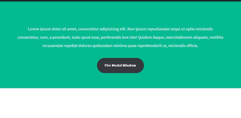
How To Make a Modal Box With HTML, CSS and JavaScript
#1) Add HTML:
<!-- Trigger/Open The Modal -->
<button id="model-btn">Open Modal</button>
<!-- The Modal -->
<div id="modal-row" class="modal">
<!-- Modal content -->
<div class="modal-content">
<span class="close">×</span>
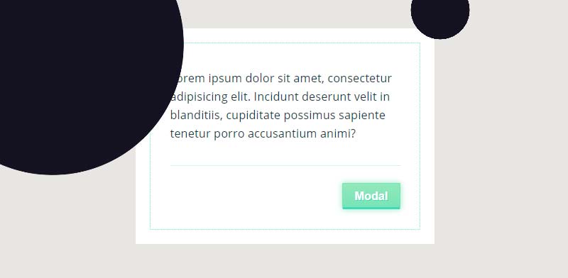
<p>Lorem Ipsum is simply dummy text of the printing and typesetting industry. Lorem Ipsum has been the industry's standard dummy text ever since the 1500s, when an unknown printer took a galley of type and scrambled it to make a type specimen book.</p>
</div>
</div>#2) Add CSS:
 /* The Modal (background) */
.modal {
  display: none; /* Hidden by default */
  position: fixed; /* Fixed in screen */
  z-index: 1; /* Sit on top */
  padding-top: 50px; /* Location of popup */
  left: 0;
  top: 0;
  width: 100%; /* Full width */
  height: 100%; /* Full height */
  overflow: hidden; /* Enable scroll if needed */
  background-color: rgba(0,0,0,0.4); /* Black w/ opacity */
}
/* Modal Content */
.modal-content {
  background-color: #fefefe;
  margin: auto;
  padding: 20px;
  border: 1px solid #888;
  width: 60%;
  border-radius:10px;
}
/* The Close Button */
#close {
  color: #aeaeae;
  float: right;
  font-size: 28px;
  font-weight: bold;
}
#close:hover,
#close:focus {
  color: #000;
  text-decoration: none;
  cursor: pointer;
}
#3) Add JavaScript:
var modal = document.getElementById("modal-row");
var btn = document.getElementById("model-btn");
var close = document.getElementById("close");
btn.onclick = function() {
  modal.style.display = "block";
}
close.onclick = function() {
  modal.style.display = "none";
}
window.onclick = function(event) {
  if (event.target == modal) {
    modal.style.display = "none";
  }
}
This is a simple example to create a html popup using JavaScript
How to launch Bootstrap modal on page load
For creating a bootstrap model we have to import bootstrap library inside our project folder or we can use CDN also.
by clicking below button you can check bootstrap 5 documentation
Bootstrap v5.0We can use the Bootstrap .modal() function for launching the modal box automatically when page load.
Simple Example:
<!DOCTYPE html>
<html lang="en">
<head>
    <meta charset="UTF-8">
    <meta http-equiv="X-UA-Compatible" content="IE=edge">
    <meta name="viewport" content="width=device-width, initial-scale=1.0">
    <title>How to launch Bootstrap modal on page load</title>
    <script src="https://ajax.googleapis.com/ajax/libs/jquery/3.5.1/jquery.min.js"></script>
    <link href="https://cdn.jsdelivr.net/npm/bootstrap@5.1.0/dist/css/bootstrap.min.css" rel="stylesheet" integrity="sha384-KyZXEAg3QhqLMpG8r+8fhAXLRk2vvoC2f3B09zVXn8CA5QIVfZOJ3BCsw2P0p/We" crossorigin="anonymous">
    <script src="https://cdn.jsdelivr.net/npm/bootstrap@5.1.0/dist/js/bootstrap.bundle.min.js" integrity="sha384-U1DAWAznBHeqEIlVSCgzq+c9gqGAJn5c/t99JyeKa9xxaYpSvHU5awsuZVVFIhvj" crossorigin="anonymous"></script>
</head>
<body>
    <div id="myModal" class="modal fade" tabindex="-1">
        <div class="modal-dialog">
            <div class="modal-content">
            <div class="modal-header">
                <h5 class="modal-title">Modal title</h5>
                <button type="button" class="btn-close" data-bs-dismiss="modal" aria-label="Close"></button>
            </div>
            <div class="modal-body">
                <p>Modal body text goes here.</p>
            </div>
            <div class="modal-footer">
                <button type="button" class="btn btn-secondary" data-bs-dismiss="modal">Close</button>
                <button type="button" class="btn btn-primary">Save changes</button>
            </div>
            </div>
        </div>
    </div>
    <script>
        $(document).ready(function(){
            $("#myModal").modal('show');
        });
    </script>
</body>
</html>
Output:
Best Collection of Popup design
#1 Morphing Modal Window
Morphing Modal Window design using HTML CSS and JavaScript, which was developed by CodyHouse . Moreover, you can customize it according to your wish and need.
| Author: | CodyHouse |
| Created on: | March 12, 2015 |
| Made with: | HTML, CSS(SCSS) & JavaScript |
| Demo Link: | Source Code / Demo |
| Tags: | Morphing Modal Window |
#2 Simple blob radius html popup animation
Simple blob radius html modal animation using HTML CSS and JavaScript, which was developed by Giana. Moreover, you can customize it according to your wish and need.
| Author: | Giana |
| Created on: | January 16, 2016 |
| Made with: | HTML, CSS(SCSS) & JavaScript |
| Demo Link: | Source Code / Demo |
| Tags: | blob modal animation |
#3 Animated Modal Box
Awesome Modal Box Design using HTML CSS and JavaScript, which was developed by lefoy. Moreover, you can customize it according to your wish and need.
| Author: | lefoy |
| Created on: | July 11, 2015 |
| Made with: | HTML, CSS(SCSS) & JavaScript |
| Demo Link: | Source Code / Demo |
| Tags: | Animated Modal Box |
#4 ModalX Animated Modal
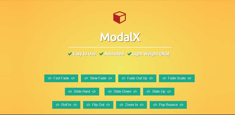
ModalX Animated Modals using HTML CSS and JavaScript, which was developed by Christopher Bicudo. Moreover, you can customize it according to your wish and need.
| Author: | Christopher Bicudo |
| Created on: | July 28, 2016 |
| Made with: | HTML, CSS & JavaScript |
| Demo Link: | Source Code / Demo |
| Tags: | ModalX Animated Modals |
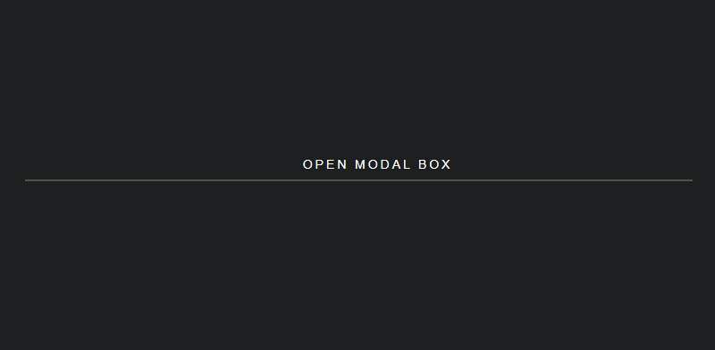
#5 CSS only Popup no JavaScript
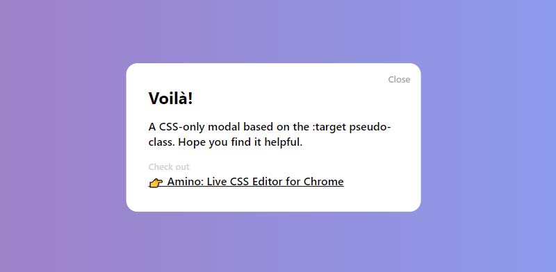
Simple CSS only Popup no JavaScript, which was developed by Timothy Long. Moreover, you can customize it according to your wish and need.
| Author: | Timothy Long |
| Created on: | December 19, 2013 |
| Made with: | HTML & CSS |
| Demo Link: | Source Code / Demo |
| Tags: | CSS only Modal |

![Button Click Effect CSS [ Top 10 Button Press Effect ]](https://blog.stackfindover.com/wp-content/uploads/2020/12/button-click-effect-css-1024x576.jpg)
Greetings from Los angeles! I’m bored to death at
work so I decided to browse your website on my iphone during lunch
break. I love the information you present here and
can’t wait to take a look when I get home. I’m amazed at how fast your blog
loaded on my mobile .. I’m not even using WIFI, just 3G ..
Anyways, awesome blog!