Hello, guys today we will learn how to make a lazy man with walking animation using HTML & CSS
First we need to create two files index.html and style.css then we need to do code for it.
Step:1
Add below code inside index.html
<!DOCTYPE html>
<html>
<head>
<title>Lazy Man Walking</title>
<meta charset="utf-8">
<link rel="stylesheet" type="text/css" href="style.css">
<link href="https://fonts.googleapis.com/css2?family=Oswald&display=swap" rel="stylesheet">
</head>
<body>
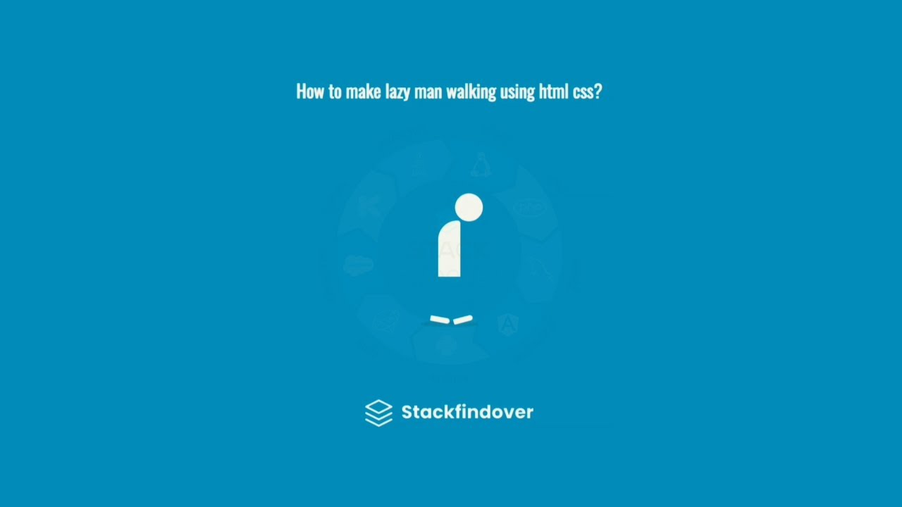
<div class="container">
<div class="toptext"><h1 style="color: #fff">How to make lazy man walking using html css?</h1></div>
<div class="headChar"></div>
<div class="bodyChar"></div>
<div class="firstLeg"></div>
<div class="secondLeg"></div>
<div class="shadowChar"></div>
<div class="logo"><img width="300px" src="logo.png" alt="logo"></div>
</div>
</body>
</html>Step:2
Then we need to add code for style.css which code i provide in below screen.
* {
    margin: 0;
    padding: 0;
    box-sizing: border-box;
    font-family: 'Oswald', sans-serif;
}
/******************* Animation css ***************/
@keyframes headChange {
    0% {
        transform: translateY(0px);
    }
    50% {
        transform: translateY(7px);
    }
    100% {
        transform: translateY(0px);
    }
}
@keyframes bodyChange {
    0% {
        transform: translateY(0px);
    }
    50% {
        transform: translateY(3px);
    }
    100% {
        transform: translateY(0px);
    }
}

@keyframes walk {
    0% {
        transform: translateX(0px) rotate(0deg);
    }
    20% {
        transform: translateX(-20px) rotate(0deg);
    }
    40% {
        transform: translate(-40px,0px) rotate(0deg);
    }
    60% {
        transform: translate(-30px, -10px) rotate(35deg);
    }
    90% {
        transform: translate(10px, -7px) rotate(-35deg);
    }
    100% {
        transform: translateX(0px);
    }
}
@keyframes shadowChange {
    0% {
        width: 100px;
    }
    50% {
        width: 110px;
    }
    100% {
        width: 0px;
    }
}


/*******************End Animation css ***************/

body {
    background: #2196F3;
    height: 100vh;
    display: flex;
}
.container {
    margin: auto;
    width: 300px;
    height: 300px;
    display: flex;
    flex-direction: column;
    justify-content: space-evenly;
    align-items: center;
    position: relative;
}
.headChar {
    width: 50px;
    height: 50px;
    background: #fff;
    border-radius: 50%;
    position: relative;
    line-height: 35px;
    left: 35px;
    top:  20px;
    animation: headChange 1s infinite 1.6s ease-in;
}
.bodyChar {
    width: 40px;
    height: 100px;
    background: #fff;
    border-radius: 60px 10px 0 0;
    animation: bodyChange 1s infinite 1.6s ease-in;
}
.firstLeg, .secondLeg {
    width: 35px;
    height: 10px;
    background: #fff;
    border-radius: 20px 50px 50px 20px;
    position: relative;
    top: 55px;
    left: 20px;
    animation: walk 2s infinite linear;
}
.secondLeg {
    top: 25px;
    animation-delay: 1s;
}
.shadowChar {
    width: 100px;
    height: 10px;
    background: rgba(197, 82, 82, 0.2);
    border-radius: 50%;
    animation: shadowChange 1s infinite 1.6s linear;
}


.logo{
    position: fixed;
    bottom: 0;
}
.toptext {
    position: fixed;
    top: 0;
}


