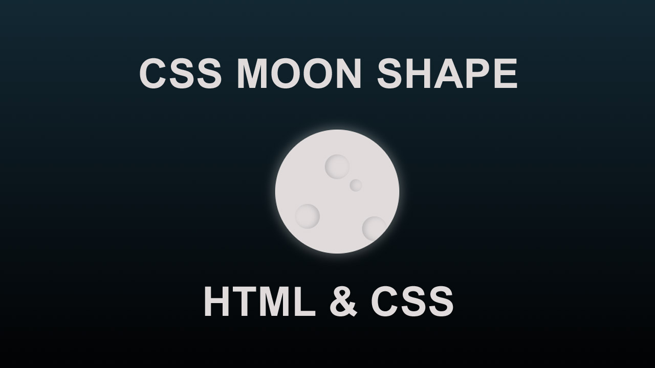
Hello guys in this tutorial we will create moon shape using html and css
First we need to create two files index.html and style.css then we need to do code for it.
Step:1
Add below code inside index.html
<!DOCTYPE html>
<html>
<head>
  <meta charset="utf-8">
  <title>Realistic css moon effect</title>
  <link rel="stylesheet" type="text/css" href="style.css">
</head>
<body>
  <div class="moon-outer">
    <div class="moon">
      <div class="details"></div>
      <div class="details one"></div>
      <div class="details two"></div>
      <div class="details three"></div>
      <div class="details four small"></div>
    </div>
  </div>
</body>
</html>
Step:2
Then we need to add code for style.css which code i provide in below screen.
* {
    margin: 0;
    padding: 0;
    box-sizing: border-box;
}

body {
    height: 100%;
    background: linear-gradient(#122833, #000);
    min-height: 100vh;
    overflow: hidden;
    --width:100px;
    --height:100px;
}
.moon-outer {
    display: flex;
    align-items: center;
    justify-content: center;
    height: 100vh;
    width: 100vw;
}

.moon {
    width: var(--width);
    height:var(--height);
    border-radius: 50%;
    animation: shine 2s ease-in-out infinite;
    background-color: rgb(230, 224, 224);
    box-shadow: 0px 0px 8px 2px rgba(235, 235, 231, 0.301);
    position: relative;
    overflow: hidden;
}

.details {
    width: var(--width);
    height:var(--height);
    border-radius: 50%;
    background-color: rgba(165, 165, 165, 0.089);
}

.details.one {
    position: absolute;
    top: 20px;
    left: 40px;
    width: 20px;
    height: 20px;
    border-radius: 50%;
    background-color: transparent;
    box-shadow: inset 2px 0 4px rgba(167, 167, 167, 0.685);
}

.details.two {
    position: absolute;
    top: 60px;
    left: 16px;
    width: 20px;
    height: 20px;
    border-radius: 50%;
    background-color: transparent;
    box-shadow: inset -2px 0 4px rgba(167, 167, 167, 0.685);
}

.details.three {
    position: absolute;
    top: 70px;
    left: 70px;
    width: 20px;
    height: 20px;
    border-radius: 50%;
    background-color: transparent;
    box-shadow: inset 2px 0 4px rgba(167, 167, 167, 0.685);
}

.details.four.small {
    position: absolute;
    top: 40px;
    left: 60px;
    width: 10px;
    height: 10px;
    border-radius: 50%;
    background-color: transparent;
    box-shadow: inset 2px 0 4px rgba(167, 167, 167, 0.585);
}
![CSS Search Box [ Best Collection of Search Box Design ]](https://blog.stackfindover.com/wp-content/uploads/2021/09/CSS-Search-Box-1024x576.jpg)

![HTML Resume Templates [ 20 Best Resume Designs ]](https://blog.stackfindover.com/wp-content/uploads/2021/09/html-resume-1024x576.jpg)