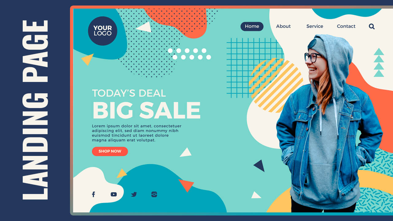
Hello guys in this tutorial we will create responsive landing page design using HTML CSS & jQuery
First we need to create two files index.html and style.css then we need to do code for it.
Step:1
Add below code inside index.html
<!DOCTYPE html>
<html lang="en">
  <head>
    <meta charset="UTF-8" />
    <title>Sales Landing Page</title>
    <meta name="viewport" content="width=device-width, initial-scale=1.0" />
    <meta https-equiv="X-UA-Compatible" content="ie=edge" />
    <link rel="preconnect" href="https://fonts.gstatic.com">
    <link href="https://fonts.googleapis.com/css2?family=Montserrat:wght@300;400;500;600;800&display=swap" rel="stylesheet">
    <link rel="stylesheet" href="style.css" />
    <link rel="stylesheet" href="https://cdnjs.cloudflare.com/ajax/libs/font-awesome/4.7.0/css/font-awesome.min.css">
    <script src="https://ajax.googleapis.com/ajax/libs/jquery/3.5.1/jquery.min.js"></script>
  </head>
  <body>
    <header id="main-header">
      <div class="container">
        <div class="grid-200-auto">
          <div class="logo">
            <a href="#" alt="logo">Logo</a>
          </div>
          <nav class="navbar desktop-nav">
            <ul class="menu-items">
              <li class="menu-item active" ><a href="#">Home</a></li>
              <li class="menu-item" ><a href="#">About</a></li>
              <li class="menu-item" ><a href="#">Services</a></li>
              <li class="menu-item" ><a href="#">Contact</a></li>
              <li class="menu-item search-icon" ><a href="#"><i class="fa fa-search"></i></a></li>
            </ul>
          </nav>
          <button class="toggle-nav"><i class="fa fa-bars"></i></button>
          <nav class="navbar mobile-nav">
            <ul class="menu-items">
              <li class="menu-close" ><i class="fa fa-times"></i></li>

              <li class="menu-item active" ><a href="#">Home</a></li>
              <li class="menu-item" ><a href="#">About</a></li>
              <li class="menu-item" ><a href="#">Services</a></li>
              <li class="menu-item" ><a href="#">Contact</a></li>
              <li class="menu-item search-icon" ><a href="#"><i class="fa fa-search"></i></a></li>
            </ul>
          </nav>
        </div>
      </div>
    </header>
    <div class="main-content">
      <div class="container">
        <div class="left-content">
          <h2>TODAY’S DEAL</h2>
          <h1>BIG SALE</h1>
          <p>Lorem ipsum dolor sit amet, consectetuer adipiscing elit, sed diam nonummy nibh euismod tincidunt ut laoreet dolore magna aliquam erat volutpat.</p>
          <button class="shop-now">Shop Now</button>
        <div class="social-icons">
          <ul class="inline-list">
            <li><a href="#"><i class="fa fa-facebook"></i></a></li>
            <li><a href="#"><i class="fa fa-youtube"></i></a></li>
            <li><a href="#"><i class="fa fa-instagram"></i></a></li>
            <li><a href="#"><i class="fa fa-twitter"></i></a></li>
          </ul>
        </div>
        </div>
        <div class="left-image"><img src="girl.png"></div>
      </div>
    </div>
    <div id="search-popup">
      <form>
        <input type="text" placeholder="Search...">
      </form>
      <span class="close-popup"><i class="fa fa-times"></i></span>
    </div>
    <script type="text/javascript">
      $(document).ready(function(){
        $(".search-icon").click(function(){
          $("div#search-popup").addClass("show")
        });
        $(".close-popup").click(function(){
          $("div#search-popup").removeClass("show")
        });
        $("button.toggle-nav").click(function(){
          $("nav.navbar.mobile-nav").addClass("show");
          $("li.menu-close").addClass("show");
        });
        $(".menu-close").click(function(){
          $("nav.navbar.mobile-nav").removeClass("show");
          $("li.menu-close").removeClass("show");
        });
      });
    </script>
  </body>
</html>Step:2
Then we need to add code for style.css which code i provide in below screen.
* {
  padding: 0;
  margin: 0;
  font-family: 'Montserrat', sans-serif;
}
body {
    background: #79D6CC url(bg.jpg) no-repeat center /cover;
    height: 100vh;
    overflow: hidden;
}
.container {
    width: 95%;
    margin: auto;
    max-width: 1240px;
}
.logo > a {
    width: 100px;
    height: 100px;
    display: flex;
    align-items: center;
    justify-content: center;
    border-radius: 50%;
    text-decoration: none;
    background: #23385C;
    font-size: 20px;
    color: #fff;
    z-index: 1;
}
header#main-header {
    padding: 30px 0 0;
    position: relative;
}
.logo {
    position: relative;
}
.logo:before {
    content: "";
    position: absolute;
    left: 0;
    top: 0;
    width: 220px;
    height: 220px;
    background: #00A5B9;
    z-index: -1;
    transform: translateY(-50px) translateX(-30px) rotate(175deg);
    animation: wave 10s ease-in-out infinite;
}

@keyframes wave {
    0%, 100% {
        border-radius: 66% 34% 37% 63% / 57% 31% 69% 43%;
    }
    50% {
        border-radius: 26% 74% 51% 49% / 22% 53% 47% 78%;
    }
}
ul.menu-items {
    list-style: none;
    display: inline-flex;
    column-gap: 50px;
}
li.menu-item > a {
    display: block;
    color: #23385c;
    text-decoration: unset;
    font-weight: 500;
    font-size: 16px;
    padding: 10px 20px;
    border-radius: 50px;
    transition: background .06s linear;
}

li.menu-item.active > a,
li.menu-item:hover > a  {
    color: #fff;
    background: #23385c;
}
.grid-200-auto {
    display: grid;
    grid-template-columns: 200px auto;
    align-items: center;
    justify-content: space-between;
}

.main-content,
.main-content > .container {
    position: relative;
    display: block;
    height: 100%;
}
.left-image {
    position: absolute;
    right: 0;
    top: 0;
}
.left-image > img {
    width: 100%;
    display: block;
    max-width: 550px;
    margin: 0 0 0 auto;
}
.left-content {
    position: absolute;
    left: 0;
    right: 0;
    top: 25%;
    display: block;
    max-width: 450px;
}
.left-content h2 {
    color: #fff;
    font-size: 35px;
    font-weight: 600;
}
.left-content h1 {
    color: #fff;
    font-size: 70px;
    line-height: 70px;
    font-weight: 800;
}
p {
    color: #23385c;
    font-size: 18px;
    line-height: 24px;
    font-weight: 500;
}
.shop-now {
    display: inline-block;
    padding: 10px 20px;
    border-radius: 50px;
    background: #ff6a49;
    color: #fff;
    border: 1px transparent;
    cursor: pointer;
    font-size: 18px;
    margin-top: 20px;
    outline: 0;
}

ul.inline-list {
    list-style: none;
    display: inline-flex;
    column-gap: 20px;
}
.social-icons a {
    font-size: 25px;
    color: #23385c;
}
.social-icons {
    margin-top: 50px;
}
div#search-popup {
    position: absolute;
    left: 0;
    right: 0;
    top: -10000px;
    height: 100%;
    display: flex;
    align-items: center;
    justify-content: center;
    background: rgb(35 56 92 / .6);
    overflow: hidden;
}
div#search-popup.show {
    top: 0;
}
div#search-popup input {
    padding: 0 20px;
    font-size: 20px;
    border: 1px solid #fff;
    height: 40px;
    background: transparent;
    outline: 0;
    color: #fff;
}
input::placeholder {
    color: #fff;
}
span.close-popup {
    position: absolute;
    top: 50px;
    color: #fff;
    font-size: 25px;
    background: #ff6a49;
    width: 50px;
    height: 50px;
    border-radius: 50%;
    display: flex;
    align-items: center;
    justify-content: center;
    cursor: pointer;
}
@media only screen and (max-width: 767px) {
    body {
        overflow: auto;
        height: auto;
        background: #79D6CC url(girl.png)no-repeat;
    }
    .left-image {
        display: none;
        position: unset;
    }
    .left-content {
      position: unset;
      max-width: 100%;
      margin-top: 50px;
    }
}
@media only screen and (max-width: 900px) {
  .desktop-nav {
    display: none;
  }
  .left-image {
    position: unset;
  }
  .left-content {
    top: 50px;
  }
}
@media only screen and (min-width: 901px) {
  .mobile-nav,.toggle-nav {
    display: none;
  }
}
button.toggle-nav {
    padding: 10px;
    font-size: 20px;
    background: #23385c;
    border: 1px solid transparent;
    color: #fff;
    cursor: pointer;
    outline: 0;
}
nav.navbar.mobile-nav {
    position: fixed;
    right: -10000px;
    top: 0;
    height: 100%;
    width: 250px;
    background: #fff;
    z-index: 9;
    box-shadow: 0 0 20px 10px rgb(35 56 92 / .5);
}
nav.navbar.mobile-nav.show {
    right: 0;
}
nav.navbar.mobile-nav ul.menu-items {
    display: block;
    padding: 20px;
}
li.menu-close {
    margin: 20px;
    left: -10000px;
    position: fixed;
    top: 0;
    color: #fff;
    font-size: 25px;
    background: #ff6a49;
    width: 50px;
    height: 50px;
    border-radius: 50%;
    display: flex;
    align-items: center;
    justify-content: center;
    cursor: pointer;
}
li.menu-close.show {
    left: 0;
}
nav.navbar.mobile-nav ul.menu-items li.menu-item {
    margin-bottom: 10px;
}

