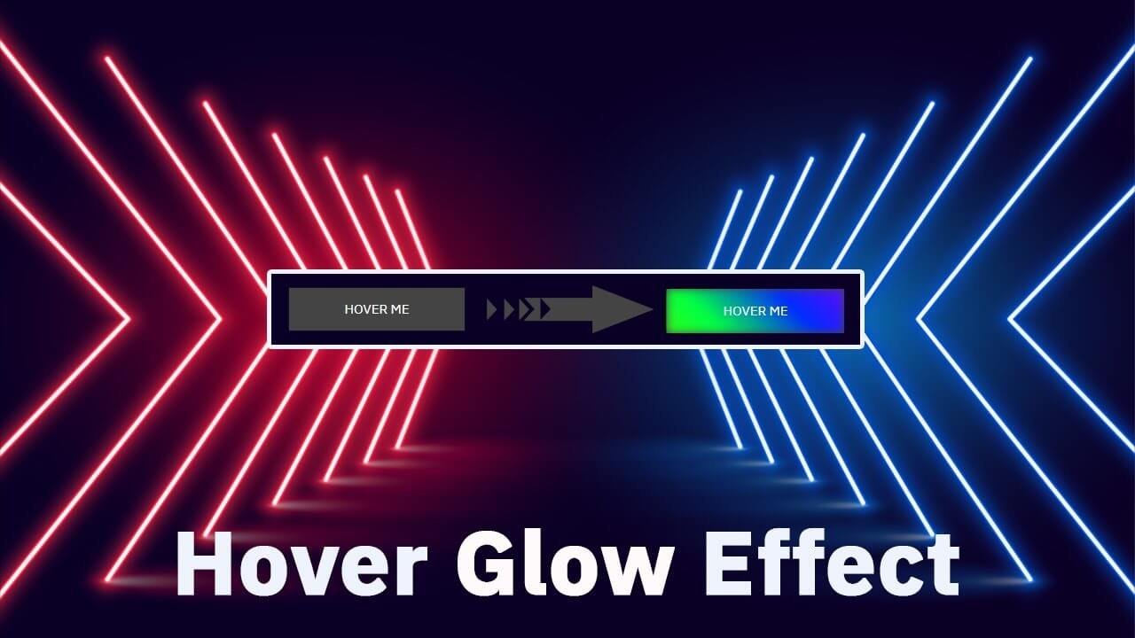
Hello guys in this tutorial we will create animated hover effect using HTML & CSS
First we need to create two files index.html and style.css then we need to do code for it.
Step:1
Add below code inside index.html
<!DOCTYPE html>
<html lang="en">
  <head>
    <meta charset="UTF-8" />
    <title>Hover Glow Effect</title>
    <meta name="viewport" content="width=device-width, initial-scale=1.0" />
    <meta https-equiv="X-UA-Compatible" content="ie=edge" />
    <link rel="stylesheet" href="style.css" />
    <link href="https://fonts.googleapis.com/css2?family=IBM+Plex+Sans&display=swap" rel="stylesheet">
  </head>
  <body>
    <div class="btn-outer">
      <button class="glow-hover">Hover Me</button>
    </div>
  </body>
</html>
Step:2
Then we need to add code for style.css which code i provide in below screen.
* {
    padding: 0;
    margin: 0;
    font-family: 'IBM Plex Sans', sans-serif;
}
body {
    display: flex;
    align-items: center;
    justify-content: center;
    height: 100vh;
    background: #000;
}
.glow-hover {
    width: 200px;
    height: 50px;
    border: 0;
    outline: 0;
    color: #fff;
    background: #444;
    font-size: 15px;
    text-transform: uppercase;
    cursor: pointer;
    position: relative;
     z-index: 0;
}
.glow-hover:before {
    content: "";
    position: absolute;
    top: 0;
    left: 0;
    background: linear-gradient(45deg, #ff0000, #ff7300,
                                       #fffb00, #48ff00, #00ff45,
                                       #002bff, #7a00ff, #ff00c8, #ff0000);
    background-size: 400%;
    z-index: -1;
    filter: blur(5px);
    width: 100%;
    height: 100%;
    opacity: 0;
    animation: glow 20s linear infinite;
    transition: opacity 0.3s ease-in-out;
}
.glow-hover:hover:before {
    opacity: 1;
}
@keyframes glow{
    0% { background-position: 0 0; }
    50% { background-position: 400% 0; }
    100% { background-position: 0 0; }
}