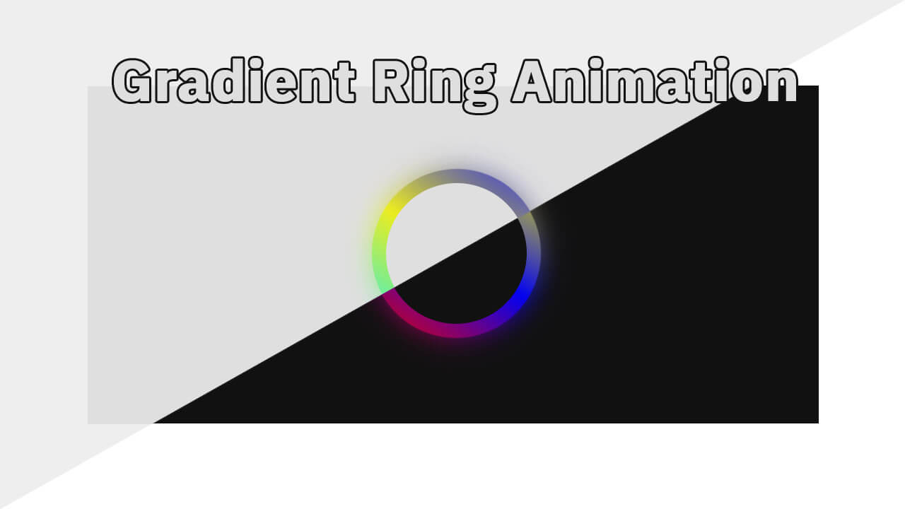
Hello guys in this tutorial we will create gradient ring animation using Html & Css
First we need to create two files index.html and style.css then we need to do code for it.
Step:1
Add below code inside index.html
<!DOCTYPE html>
<html lang="en">
  <head>
    <meta charset="UTF-8" />
    <title>Gradient Ring Animation</title>
    <meta name="viewport" content="width=device-width, initial-scale=1.0" />
    <meta https-equiv="X-UA-Compatible" content="ie=edge" />
    <link rel="stylesheet" href="style.css" />
  </head>
  <body>
  	<div class="ring-outer">
		<div class="ring"></div>
  	</div>
  </body>
</html>
Step:2
Then we need to add code for style.css which code i provide in below screen.
body {
    padding: 0;
    margin: 0;
    background: #111;
}
.ring-outer {
    display: flex;
    align-items: center;
    justify-content: center;
    height: 100vh;
}
.ring {
    width: 200px;
    height: 200px;
    background: #111;
    position: relative;
    border-radius: 50%;
}
.ring:before,.ring:after {
    content: "";
    position: absolute;
    left: 0;
    top: 0;
    width: 200px;
    height: 200px;
    border-radius: 50%;
    background: linear-gradient(45deg, rgb(255 0 0/85%),rgb(0 0 255/85%),rgb(255 255 0/85%) );
    transform: scale(1.2);
    z-index: -1;
    animation: animate 3s linear infinite;
}
.ring:after {
	filter: blur(15px);
	z-index: -2;
}

@keyframes animate {
	0% {
		transform: rotate(0) scale(1.2);
	}
	100% {
		transform: rotate(360deg) scale(1.2);
	}
}