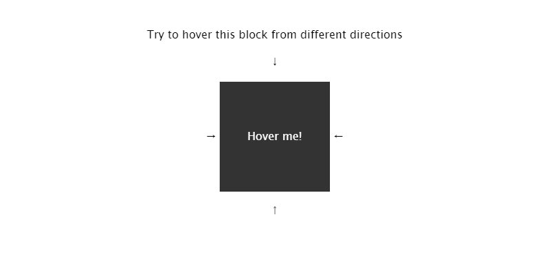
Hello guys, today I am going to show you how to create an direction aware hover effect using Html css, in this article you will learn how do you create an awesome hover effect using css only.
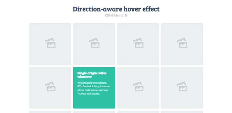
Basically, direction-aware hover means it moves in the mouse direction. when we will move mouse right to left then the hover effect will reveal or move from right to left
Direction Aware Effect step by step
Step 1 — Creating a New Project
In this step, we need to create a new project folder and files(index.html, style.css) for creating a direction aware hover animation. In the next step, you will start creating the structure of the webpage.
You may like these also:
Step 2 — Setting Up the basic structure
In this step, we will add the HTML code to create the basic structure of the project.
<!doctype html>
<html>

<head>
  <title>Direction Aware Hover Effects</title>
  <link rel="stylesheet" type="text/css" href="style.css">
  <link rel="preconnect" href="https://fonts.gstatic.com">
  <link href="https://fonts.googleapis.com/css2?family=IBM+Plex+Sans:wght@100;200;400;500&display=swap" rel="stylesheet">
</head>

<body>

</body>

</html>
This is the base structure of most web pages that use HTML.
Add the following code inside the <body> tag:
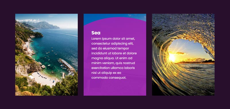
<div class="container">
    <div class="row">
      <div class="col">
        <div class="photo-container" style="background-image:url(img-1.jpg);"></div>
        <h2>Heading 1 </h2>
        <div class="slide">
          <p>Lorem Ipsum is simply dummy text of the printing and typesetting industry. Lorem Ipsum has been the industry's standard dummy text ever since the 1500s, when an unknown printer took a galley of type and scrambled it to make a type specimen book.</p>
        </div>
      </div>
      <div class="col">
        <div class="photo-container" style="background-image:url(img-2.jpg);"></div>
        <h2>Heading 2 </h2>
        <div class="slide">
          <p>Lorem Ipsum is simply dummy text of the printing and typesetting industry. Lorem Ipsum has been the industry's standard dummy text ever since the 1500s, when an unknown printer took a galley of type and scrambled it to make a type specimen book.</p>
        </div>
      </div>
      <div class="col">
        <div class="photo-container" style="background-image:url(img-3.jpg);"></div>
        <h2>Heading 3 </h2>
        <div class="slide">
          <p>Lorem Ipsum is simply dummy text of the printing and typesetting industry. Lorem Ipsum has been the industry's standard dummy text ever since the 1500s, when an unknown printer took a galley of type and scrambled it to make a type specimen book.</p>
        </div>
      </div>
      <div class="col">
        <div class="photo-container" style="background-image:url(img-4.jpg);"></div>
        <h2>Heading 4 </h2>
        <div class="slide">
          <p>Lorem Ipsum is simply dummy text of the printing and typesetting industry. Lorem Ipsum has been the industry's standard dummy text ever since the 1500s, when an unknown printer took a galley of type and scrambled it to make a type specimen book.</p>
        </div>
      </div>
    </div>
  </div>
Step 3 — Adding Styles for the Classes
In this step, we will add styles to the section class Inside style.css file
* {
    padding: 0;
    margin: 0;
    font-family: 'IBM Plex Sans', sans-serif;
}
body {
  display: flex;
  align-items: center;
  justify-content: center;
  width: 100vw;
  height: 100vh;
}
.container {
  width: 90%;
  max-width: 1200px;
  margin: auto;
}
.row {
  display: flex;
}

.col {
  color: #fff;
  flex: 1 1 auto;
  min-height: 250px;
  position: relative;
  overflow: hidden;
}
.col h2 {
  font-weight: 300;
  font-size: 20px;
  line-height: 30px;
  margin: 0;
  position: absolute;
  bottom: 15px;
  right: 15px;
  z-index: 0;
}
.slide {
  position: absolute;
  top: 0;
  right: 0;
  bottom: 0;
  left: 0;
  transition: all 0.275s ease-in-out, visibility 0s 0.275s;
  visibility: hidden;
  will-change: transform;
  transform: translateY(100%);
  background: #4b00ff;
  padding: 20px;
}
.photo-container {
  background: #0f0523 50% 50%/cover;
  position: absolute;
  top: 0;
  right: 0;
  bottom: 0;
  left: 0;
  transition: 1s;
  transform-origin: bottom right;
}
.photo-container::before {
  background: linear-gradient(transparent, rgb(28 0 93 / 66%), #4b00ff73);
  content: "";
  position: absolute;
  top: 0;
  right: 0;
  bottom: 0;
  left: 0;
}
.row:hover ~ .row .slide {
  transform: translateY(-100%);
}
.row:hover .slide {
  transform: translateX(100%);
}
.row:hover .col:hover ~ .col .slide {
  transform: translateX(-100%);
}
.row:hover .col:hover .slide {
  transform: none;
  visibility: visible;
  transition-delay: 0s;
}
.col:hover .photo-container {
  transform: scale(1.25);
}
#Final Result
If you want source code you can download it from the below button
Best Direction Aware Hover Effect on Codepen
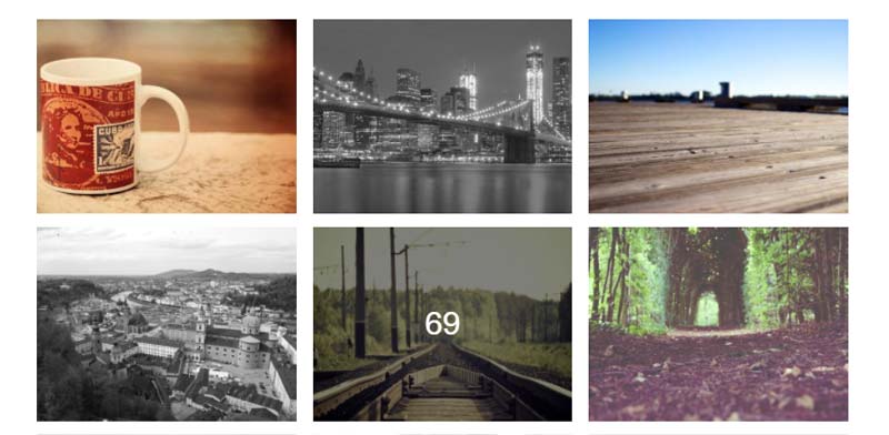
#1 3D Direction-aware hover effect
3D Direction-aware hover effect using HTML(Haml) CSS (SCSS) and JavaScript, which was developed by Noel Delgado. Moreover, you can customize it according to your wish and need.
| Author: | Noel Delgado |
| Created on: | July 8, 2013 |
| Made with: | HTML(Haml) CSS (SCSS) and JavaScript |
| Demo Link: | Source Code / Demo |
| Tags: | 3D Direction-aware hover effect |
#2 Direction-Aware Hover Effect for Full Page Navigation

Direction-Aware Hover Effect for Full Page Navigation using HTML and CSS which was developed by Paulina Hetman. Moreover, you can customize it according to your wish and need.
| Author: | Paulina Hetman |
| Created on: | January 16, 2020 |
| Made with: | HTML and CSS |
| Demo Link: | Source Code / Demo |
| Tags: | direction hover on navigation |
#3 jQuery Direction Aware Hover
jQuery Direction Aware Hover which was developed by Naoya. Moreover, you can customize it according to your wish and need.
| Author: | Naoya |
| Created on: | November 8, 2017 |
| Made with: | HTML, CSS and jQuery |
| Demo Link: | Source Code / Demo |
| Tags: | jQuery Direction Aware Hover |
#4 Multi Direction Hover Effect
Multi Direction Hover Effect which was developed by Pankaj Parashar. Moreover, you can customize it according to your wish and need.
| Author: | Pankaj Parashar |
| Created on: | February 27, 2013 |
| Made with: | HTML and CSS |
| Demo Link: | Source Code / Demo |
| Tags: | Multi Direction Hover |
#5 Direction hover effect with translating
Direction hover effect with translating which was developed by Jamal Hasuev. Moreover, you can customize it according to your wish and need.
| Author: | Jamal Hasuev |
| Created on: | March 18, 2018 |
| Made with: | HTML, CSS(SCSS) & JS |
| Demo Link: | Source Code / Demo |
| Tags: | Direction hover animation |
#6 Awesome direction hover on card
Awesome direction hover on card which was developed by IRY. Moreover, you can customize it according to your wish and need.
| Author: | IRY |
| Created on: | August 19, 2021 |
| Made with: | HTML, CSS & JS |
| Demo Link: | Source Code / Demo |
| Tags: | Awesome direction hover |
#7 Cool direction hover animation on circle
Cool direction hover animation on circle which was developed by Craig Edmond. Moreover, you can customize it according to your wish and need.
| Author: | Craig Edmond |
| Created on: | August 19, 2021 |
| Made with: | HTML, CSS & JS |
| Demo Link: | Source Code / Demo |
| Tags: | Cool direction hover animation |
#8 360 Text Filling Animation

360 Text Filling Animation which was developed by Rahul jangid. Moreover, you can customize it according to your wish and need.
| Author: | Rahul jangid |
| Created on: | April 30, 2021 |
| Made with: | HTML & CSS |
| Demo Link: | Source Code / Demo |
| Tags: | 360 Text Filling Animation |
#9 3D Card direction hover animation

3D Card direction hover animation which was developed by Lee Magbanua. Moreover, you can customize it according to your wish and need.
| Author: | Lee Magbanua |
| Created on: | June 12, 2017 |
| Made with: | HTML, CSS & JS |
| Demo Link: | Source Code / Demo |
| Tags: | 3D Card direction hover |
#10 Pure CSS Direction Aware Tiles using clip-path
Pure CSS Direction Aware Tiles using clip-path which was developed by Elmer Balbin. Moreover, you can customize it according to your wish and need.
| Author: | Elmer Balbin |
| Created on: | July 26, 2017 |
| Made with: | HTML(Haml), CSS(SCSS) |
| Demo Link: | Source Code / Demo |
| Tags: | Pure CSS Direction Aware effect |
If you liked this article Direction Aware Hover Animation examples, you should check out this one Best Particle Animation examples.


![25+ Creative CSS Button Hover Animation – [ Updated ]](https://blog.stackfindover.com/wp-content/uploads/2021/08/button-hover-effect-examples-1024x576.jpg)