Hello, guys today we will learn how to use CSS variable.
Variables in CSS must be declared within a CSS selector that defines its scope. For global scope, you can use either: root or body selector. The variable name must start with two dashes (- -) and is case sensitive!
How var() Works
First of all: CSS variables can have a global or local scope.
Global variables will be accessed/used through the whole document, while local variables can be used only inside the selector where it’s declared.
To create a variable with global scope, declare it inside the: root selector. The: root selector matches the document’s root element.
To create a variable with local scope, declare it inside the selector that’s going to use it. First, we declare two global variables (–blue and –white). Then, we use the var() function to insert the value of the variables later within the style sheet:
:root {
  --blue: #1e90ff;
  --white: #ffffff;
}
body { background-color: var(--blue); }
h2 { border-bottom: 2px solid var(--blue); }

.container {
  color: var(--blue);
  background-color: var(--white);
}
We can use CSS Variables as the example above.
USE of CSS variable Step By Step
Step #1: Creating a New Project
The first thing we’ll do is create a folder that will contain all of the files that make up the project. Create an empty folder on your devices and name it “as you want”.
Open up Visual Studio Code or any Text editor which is you liked, and create files(index.html, style.css) inside the folder which you have created for HTML Code[ index.html ]. In the next step, we will start creating the basic structure of the webpage.
Step #2: Setting Up the basic structure
In this step, we will add the HTML code to create the basic structure of the project.
<!DOCTYPE html>
<html>
<head>
    <title>Responsive Grid With Css Variable</title>
    <link rel="stylesheet" type="text/css" href="style.css">
    <link href="https://fonts.googleapis.com/css2?family=IBM+Plex+Sans:wght@500&display=swap" rel="stylesheet">
</head>
<body>

</body>
</html>
This is the base structure of most web pages that use HTML.
Add the following code inside the <body> tag:
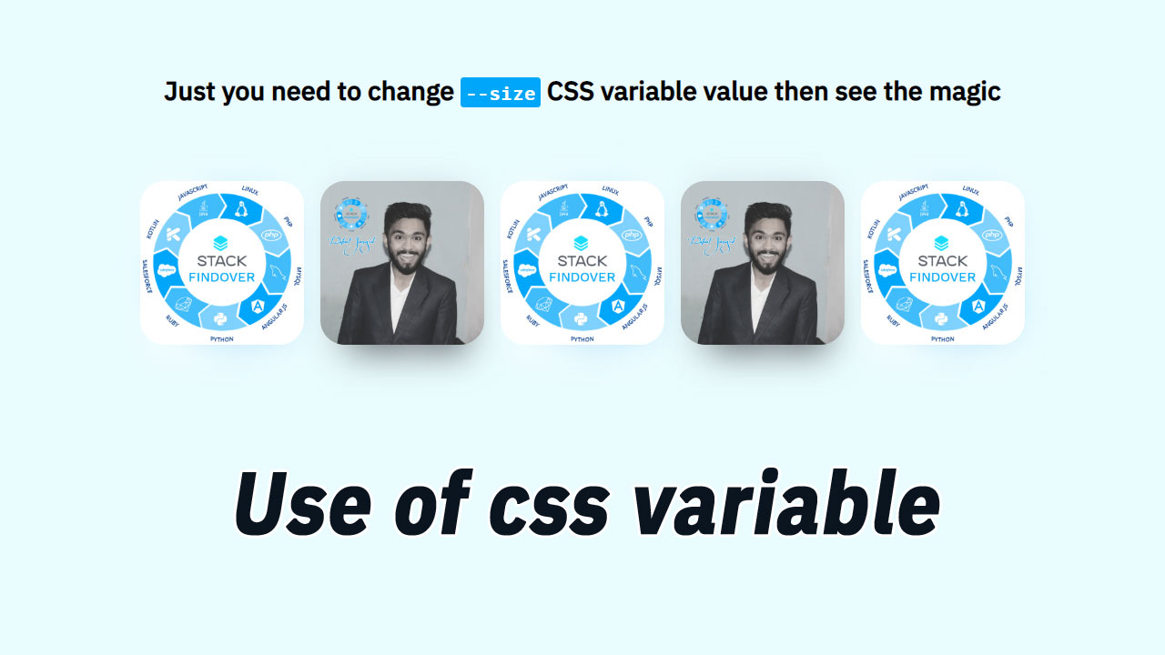
<div class="cssvariablegridouter">
    <h1>Just you need to change <code>--size</code> CSS variable value then see the magic</h1>

    <div class="sqrscolouter">
      <div class="sqrcol" style="--img: url(logo-stack.jpg);"></div>
      <div class="sqrcol" style="--img: url(rahul.jpg)"></div>
      <div class="sqrcol" style="--img: url(logo-stack.jpg)"></div>
      <div class="sqrcol" style="--img: url(rahul.jpg)"></div>
      <div class="sqrcol" style="--img: url(logo-stack.jpg)"></div>
    </div>
</div>
Step #3: Adding Styles for the Classes
In this step, we will add CSS code for style our html elements.
body {
  margin: 0;
  font-family: 'IBM Plex Sans', sans-serif;
  height: 100vh;
  text-align: center;
  justify-content: center;
  align-items: center;
  flex-direction: column;
  display: flex;
  background-color: #eafcff;
  grid-template-rows: 100px auto;
}

.sqrcol {
  --size: 200px;
  height: var(--size);
  width: var(--size);
  border-radius: calc(var(--size) * 0.15);
  background-image: var(--img);
  background-size: cover;
  background-repeat: no-repeat;
  position: relative;
}
.sqrcol::after {
  content: "";
  position: absolute;
  width: calc(var(--size) * 0.8);
  height: 100%;
  top: calc(var(--size) * 0.05);
  left: 50%;
  transform: translateX(-50%);
  background-image: var(--img);
  background-size: cover;
  background-repeat: no-repeat;
  z-index: -1;
  filter: blur(20px) opacity(70%);
}
h1 { margin-bottom: 80px; }
code {
    background-color: #00a6fa;
    color: #fff;
    padding: 3px 6px;
    border-radius: 4px;
}
.sqrscolouter {
  display: flex;
  flex-flow: row wrap;
  justify-items: center;
  align-items: center;
  justify-content: center;
}
.sqrcol { margin: 10px; }