Hello, guys in this tutorial we will create an Responsive Image Grid Layout using HTML & CSS, and also i have listed best photo grid examples which is are available in codepen.
How To Create a Responsive Image Grid
Step #1: Creating a New Project
The first thing we’ll do is create a folder that will contain all of the files that make up the project. Create an empty folder on your devices and name it “as you want”.
Open up Visual Studio Code or any Text editor which is you liked, and create files(index.html, style.css) inside the folder which you have created for Image grid. In the next step, we will start creating the basic structure of the webpage.
Step #2: Setting Up the basic structure
In this step, we will add the HTML code to create the basic structure of the project.
<!DOCTYPE html>
<html lang="en">
  <head>
    <meta charset="UTF-8" />
    <title>Responsive Grid Css</title>
    <meta name="viewport" content="width=device-width, initial-scale=1.0" />
    <meta https-equiv="X-UA-Compatible" content="ie=edge" />
    <link rel="stylesheet" href="style.css" />
    <link href="https://fonts.googleapis.com/css2?family=IBM+Plex+Sans&display=swap" rel="stylesheet">
  </head>
  <body>

  </body>
</html>
This is the base structure of most web pages that use HTML.
Add the following code inside the <body> tag:
<div class="row-outer">
  <div class="container">
    <div class="grid-wrapper">
      <div class="box">Box</div>
      <div class="box">Box</div>
      <div class="box">Box</div>
      <div class="box">Box</div>
      <div class="box">Box</div>
      <div class="box">Box</div>
      <div class="box">Box</div>
      <div class="box">Box</div>
    </div>
  </div>
</div>
Step #3: Adding Styles for the Classes
In this step, we will add CSS code for style our html elements.
* {
padding: 0;
margin: 0;
font-family: 'IBM Plex Sans', sans-serif;
}
body {
background: #f1f2f3;
}
.container {
width: 95%;
max-width: 1160px;
margin: auto;
}
.grid-wrapper {
display: grid;
grid-template-columns: repeat(auto-fit, minmax(250px,1fr));
grid-gap: 20px;
}
.box {
height: 250px;
background: #fff;
display: flex;
align-items: center;
justify-content: center;
border: 2px solid #4b00ff;
}
.row-outer {
padding: 50px 0;
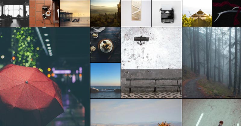
}#Final Result:
Best Collection of CSS Photo Grids
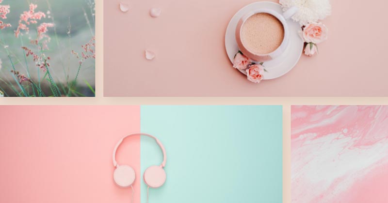
#1 Galley style Image Grid
Galley style Image Grid, which was developed by Ashley. Moreover, you can customize it according to your wish and need.
| Author: | Ashley |
| Created on: | July 18, 2019 |
| Made with: | HTML & CSS(SCSS) |
| Demo Link: | Source Code / Demo |
| Tags: | Galley style Image Grid |
#2 responsive css grid with no media-queries
responsive css grid with no media-queries, which was developed by Nirjan Khadka. Moreover, you can customize it according to your wish and need.
| Author: | Nirjan Khadka |
| Created on: | January 26, 2020 |
| Made with: | HTML & CSS(SCSS) |
| Demo Link: | Source Code / Demo |
| Tags: | responsive css photo grid |
#3 Semantic Image Grid with Object-Fit
Semantic Image Grid with Object-Fit, which was developed by Jonathan Harrell. Moreover, you can customize it according to your wish and need.
| Author: | Jonathan Harrell |
| Created on: | September 29, 2018 |
| Made with: | HTML & CSS |
| Demo Link: | Source Code / Demo |
| Tags: | Semantic Image Grid |
#4 flexbox image grid
flexbox image grid, which was developed by beecave00. Moreover, you can customize it according to your wish and need.
| Author: | beecave00 |
| Created on: | March 25, 2020 |
| Made with: | HTML & CSS |
| Demo Link: | Source Code / Demo |
| Tags: | flexbox image grid |
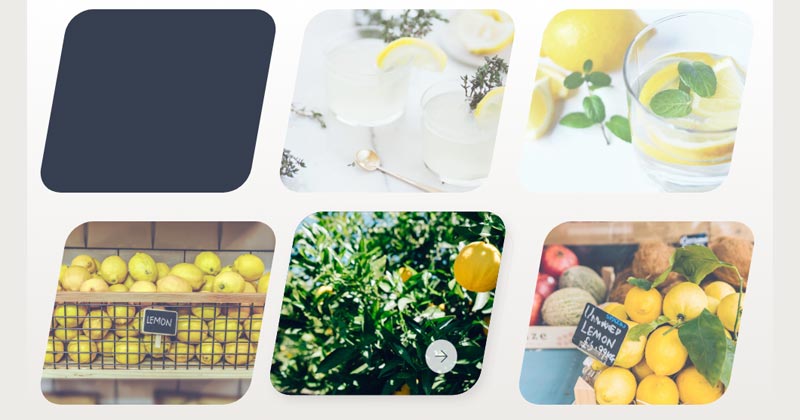
#5 Rhombus image grid [CSS Grid + Flexbox]
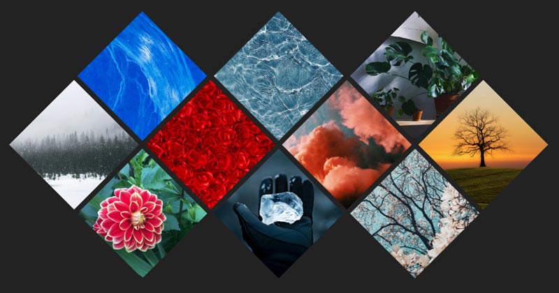
Rhombus image grid, which was developed by PixelsPencil. Moreover, you can customize it according to your wish and need.
| Author: | PixelsPencil |
| Created on: | January 1, 2020 |
| Made with: | HTML & CSS |
| Demo Link: | Source Code / Demo |
| Tags: | Rhombus image grid |
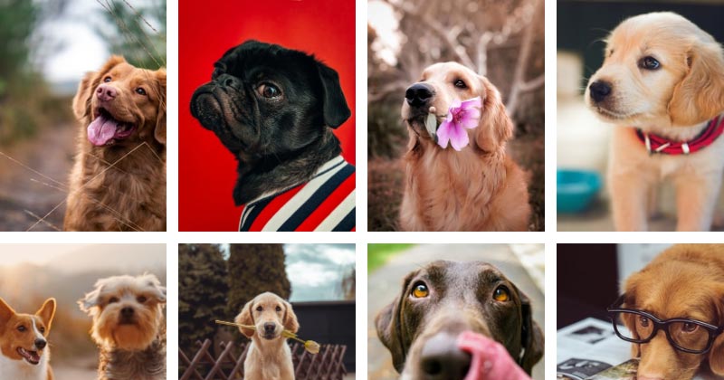
#6 Simple Responsive Image Grid
Simple Responsive Image Grid, which was developed by Richard. Moreover, you can customize it according to your wish and need.
| Author: | Richard |
| Created on: | July 28, 2014 |
| Made with: | HTML & CSS |
| Demo Link: | Source Code / Demo |
| Tags: | Responsive photo Grid |
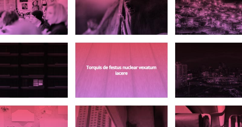
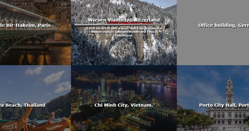
#7 Responsive Image Grids with Transitional Effects
Responsive Image Grids with Transitional Effects, which was developed by Trung Vo. Moreover, you can customize it according to your wish and need.
| Author: | Trung Vo |
| Created on: | June 27, 2016 |
| Made with: | HTML & CSS(SCSS) |
| Demo Link: | Source Code / Demo |
| Tags: | image Grids with Transitional Effects |
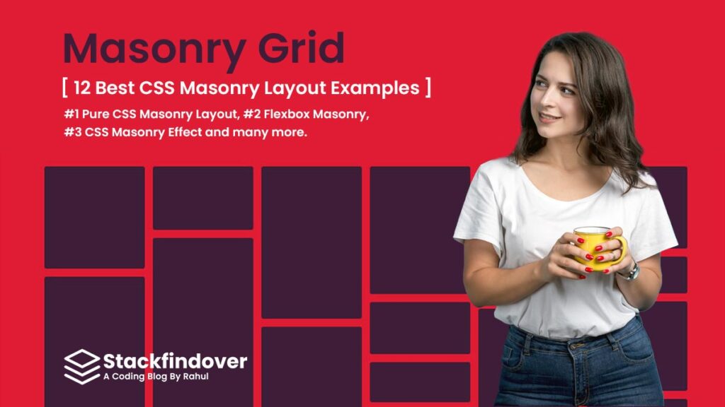
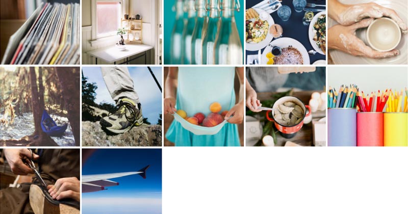
Best CSS Masonry Layout Examples
Hello friends In this collection, I have listed Best CSS Masonry Grid Layout examples Check out these Awesome Masonry Layout Design like: #1 Pure CSS Masonry Layout, #2 Flexbox Masonry, #3 CSS Masonry Effect and many more.
#8 image grid html css

image grid html css, which was developed by Envato Tuts+. Moreover, you can customize it according to your wish and need.
| Author: | Envato Tuts+ |
| Created on: | August 29, 2016 |
| Made with: | HTML & CSS |
| Demo Link: | Source Code / Demo |
| Tags: | image grid html css |
#9 CSS Image Grid with Hover
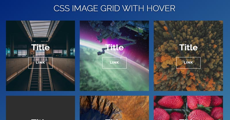
CSS Image Grid with Hover, which was developed by Jordan. Moreover, you can customize it according to your wish and need.
| Author: | Jordan |
| Created on: | May 18, 2017 |
| Made with: | HTML & CSS |
| Demo Link: | Source Code / Demo |
| Tags: | CSS photo Grid with Hover |
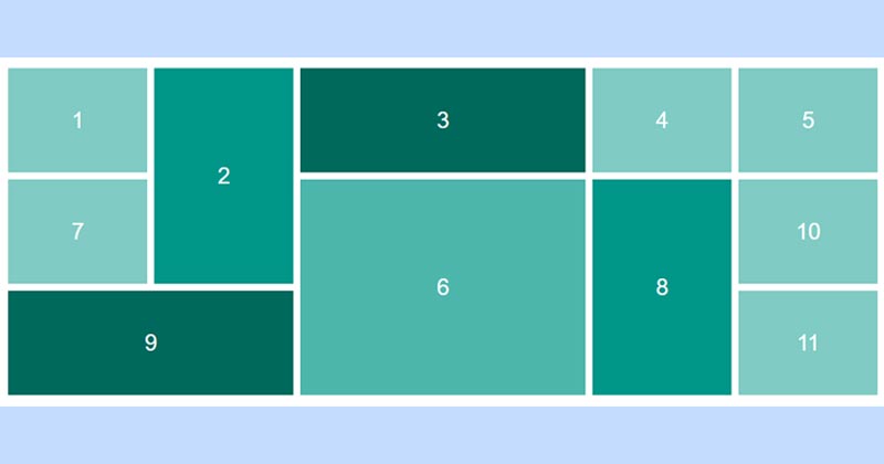
#10 Image Mosaic Effect with CSS Grids & Blend Modes
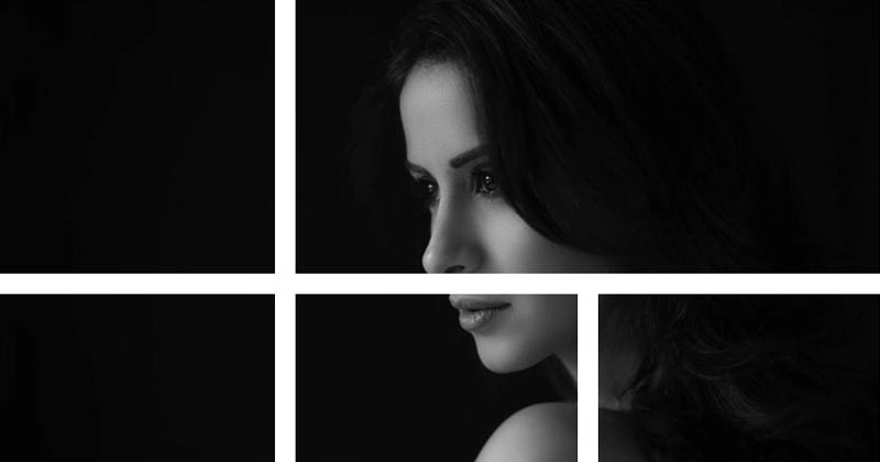
Image Mosaic Effect, which was developed by Dudley Storey. Moreover, you can customize it according to your wish and need.
| Author: | Dudley Storey |
| Created on: | March 11, 2018 |
| Made with: | HTML & CSS(SCSS) |
| Demo Link: | Source Code / Demo |
| Tags: | Image Mosaic Grid Effect |
#11 Rotated image grid
Rotated image grid, which was developed by Max. Moreover, you can customize it according to your wish and need.
| Author: | Max |
| Created on: | March 20, 2019 |
| Made with: | HTML & CSS |
| Demo Link: | Source Code / Demo |
| Tags: | Rotated image grid |
#12 Skew Image Grid with hover effect
Skew Image Grid with hover effect, which was developed by Collin Smith. Moreover, you can customize it according to your wish and need.
| Author: | Collin Smith |
| Created on: | April 13, 2018 |
| Made with: | HTML(Pug) & CSS(Stylus) |
| Demo Link: | Source Code / Demo |
| Tags: | Skew Image Grid |
#13 Simple and Responsive CSS Image Grid
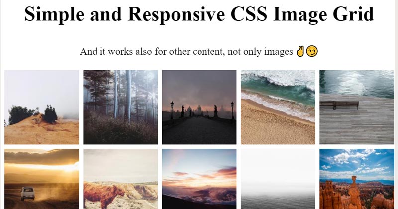
Simple and Responsive CSS Image Grid, which was developed by Helmut Wandl. Moreover, you can customize it according to your wish and need.
| Author: | Helmut Wandl |
| Created on: | April 30, 2020 |
| Made with: | HTML & CSS |
| Demo Link: | Source Code / Demo |
| Tags: | Simple image grid layout |
#14 Hexagon Image Grid CSS
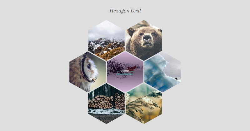
Hexagon Photo Grid CSS, which was developed by Tiffany Stoik. Moreover, you can customize it according to your wish and need.
| Author: | Tiffany Stoik |
| Created on: | February 29, 2016 |
| Made with: | HTML(HAML) & CSS(SCSS) |
| Demo Link: | Source Code / Demo |
| Tags: | Hexagon Photo Grid CSS |
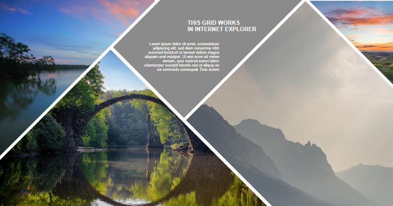
#15 Pure CSS Responsive Grid
Pure CSS Responsive Grid, which was developed by Saif Ali. Moreover, you can customize it according to your wish and need.
| Author: | Saif Ali |
| Created on: | July 25, 2018 |
| Made with: | HTML & CSS |
| Demo Link: | Source Code / Demo |
| Tags: | CSS Responsive Grid |
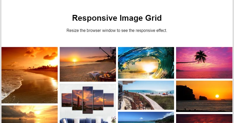
#16 Auto responsive photo grid
Auto responsive photo grid, which was developed by Mike. Moreover, you can customize it according to your wish and need.
| Author: | Mike |
| Created on: | August 18, 2017 |
| Made with: | HTML(Pug) & CSS(SCSS) |
| Demo Link: | Source Code / Demo |
| Tags: | Auto responsive photo grid |
If you liked this article 15+ CSS Image Grids [ 2022 Version ], you should check out this one 15 Best Responsive Image Gallery Layout

![Html Share Button [ 2022 Updated Version ] with examples](https://blog.stackfindover.com/wp-content/uploads/2020/12/Share-Element-thumb-1024x576.jpg)