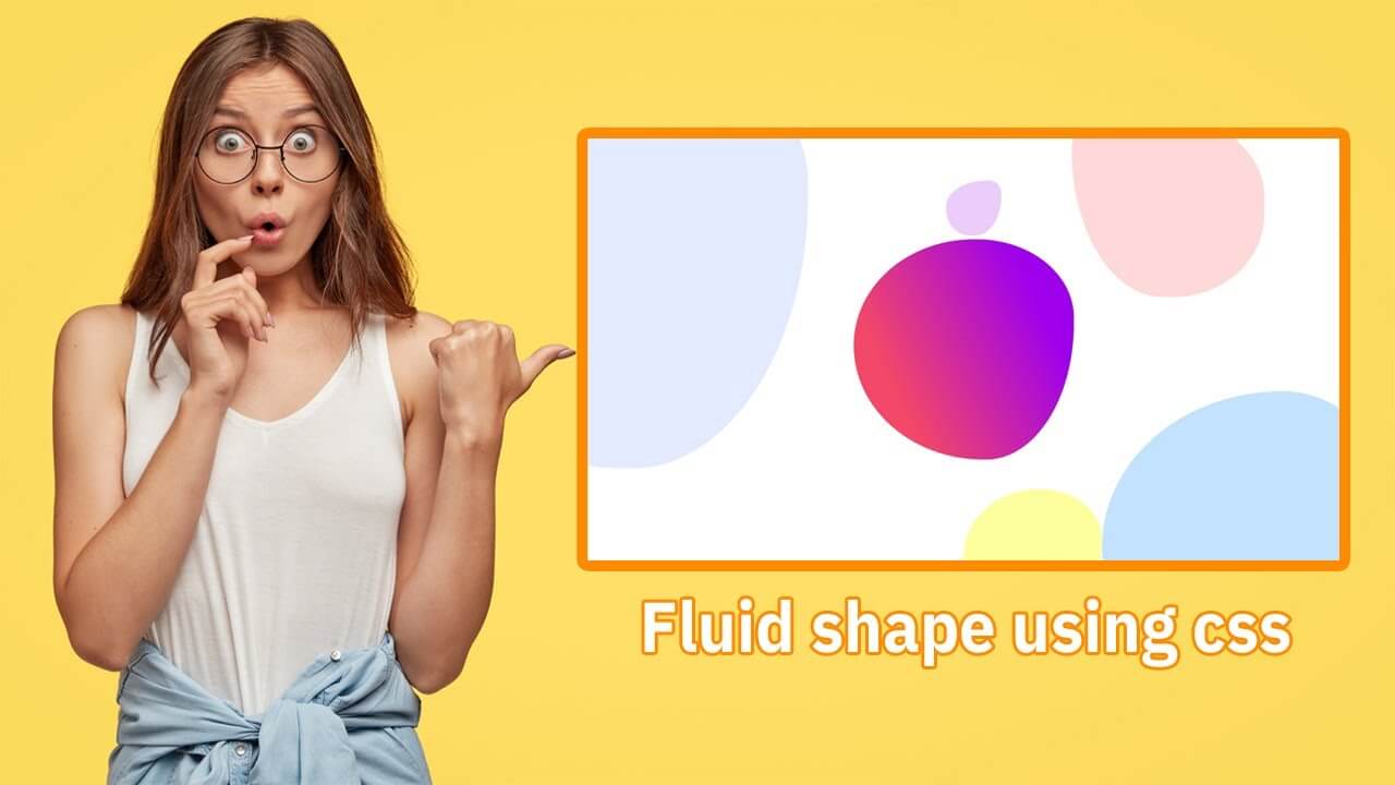
Hello guys in this tutorial we will add blob radius animation effects using Html And Css
First we need to create two files index.html and style.css then we need to do code for it.
Step:1
Add below code inside index.html
<!DOCTYPE html>
<html lang="en">
  <head>
    <meta charset="UTF-8" />
    <title>Fluid shape using css</title>
    <meta name="viewport" content="width=device-width, initial-scale=1.0" />
    <meta https-equiv="X-UA-Compatible" content="ie=edge" />
    <link rel="stylesheet" href="style.css" />
  </head>
  <body>
   <h1>How to create fluid shape using css</h1>
    <div class="row-outer">
      <div class="wrapper">
        <span class="shape"></span>
        <span class="shape"></span>
        <span class="shape"></span>
        <span class="shape"></span>
        <span class="shape"></span>
        <span class="shape"></span>
      </div>
    </div>
  </body>
</html>
Step:2
Then we need to add code for style.css which code i provide in below screen.
@import url("https://fonts.googleapis.com/css?family=Lato:300,400|PT+Sans:400,700");
* {
  padding: 0;
  margin: 0;
  font-family: 'Lato', sans-serif;
}
body {
    background: #fff;
    overflow: hidden;
}
h1 {
    text-align: center;
    color: #4b00ff;
    padding: 50px 0;
}
.wrapper {
    display: flex;
    align-items: center;
    justify-content: center;
    width: 100%;
    height: 100vh;
}

.shape:nth-of-type(1) {
    width: 400px;
    height: 400px;
    background: linear-gradient(64deg, #f34868 23%, #f24768 23%,#9e00ec 80% );
    animation: wave 8s ease-in-out infinite;
}
.shape:nth-of-type(2) {
    width: 800px;
    height: 800px;
    background: #7998ff;
    position: absolute;
    top: -200px;
    left: -400px;
    opacity: .2;
    z-index: -1;
    animation: wave 5s ease-in-out infinite;
}
.shape:nth-of-type(3) {
    width: 500px;
    height: 500px;
    background: #379eff;
    position: absolute;
    bottom: -25%;
    right: -5%;
    opacity: .3;
    z-index: -1;
    animation: wave 12s ease-in-out infinite;
}
.shape:nth-of-type(4) {
    width: 250px;
    height: 250px;
    background: #fbff0d;
    position: absolute;
    bottom: -120px;
    left: 50%;
    opacity: .4;
    z-index: -1;
    animation: wave 6s ease-in-out infinite;
}
.shape:nth-of-type(5) {
    width: 350px;
    height: 350px;
    background: #ff4343;
    position: absolute;
    top: -8%;
    right: 10%;
    opacity: .2;
    z-index: -1;
    animation: wave 15s ease-in-out infinite;
}
.shape:nth-of-type(6) {
    width: 100px;
    height: 100px;
    position: absolute;
    top: 40%;
    right: 25%;
    opacity: .5;
    z-index: -1;
    transform: rotate(90deg);
    animation: wave 15s ease-in-out infinite;
}
@keyframes wave {
    0%, 100% {
        border-radius: 66% 34% 37% 63% / 57% 31% 69% 43%;
    }
    50%{
        border-radius: 26% 74% 51% 49% / 22% 53% 47% 78%;
    }
}