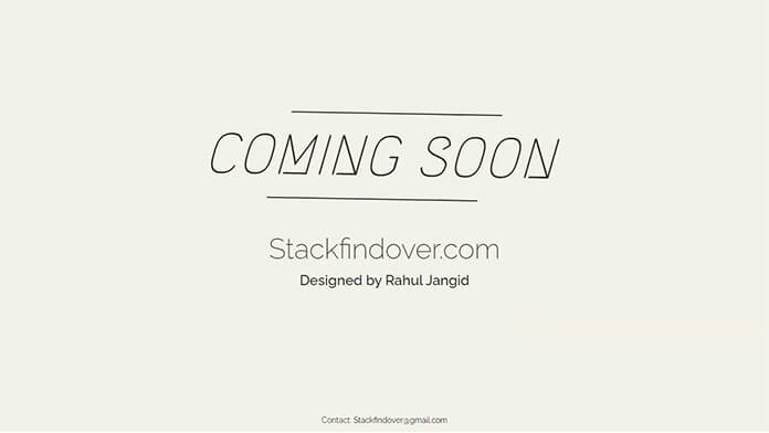
Hello, guys in this tutorial we will create a Coming Soon Page Design using HTML & CSS.
Best way to create a simple coming soon page template, this template you can use before publishing your site.
First, we need to create two files index.html and style.css then we need to do code for it.
Coming Soon Page Design Step:1
Add below code inside index.html
<!DOCTYPE html>
<html>
      <head>
         <meta charset="utf-8">
         <meta https-equiv="X-UA-Compatible" content="IE=edge">
         <meta name="viewport" content="width=device-width, initial-scale=1">
         <meta name="robots" content="nofollow" />
         <title>Coming Soon Page Design</title>
         <link rel="stylesheet" type="text/css" href="https://fonts.googleapis.com/css?family=Megrim">
         <link href='https://fonts.googleapis.com/css?family=Raleway:400,100,200,300,500,600,700,800' rel='stylesheet' type='text/css'>
         <link rel="stylesheet" type="text/css" href="style.css">
      </head>
   <body>
      <div class="content">
         <div class="twisted">
            <h1 class="heading">Coming Soon</h1>
         </div>
         <div class="site-name">
            <h2>Stackfindover.com</h2>
            <strong>Designed By Rahul</strong>
         </div>
         <div class="footer">
            <p class="contact"> Contact:
               <a href="mailto:stackfindover@gmail.com">stackfindover@gmail.com</a>
            </p>
         </div>
      </div>
   </body>
</html>
Coming Soon Page Design Step:2
Then we need to add code for style.css which code i provide in below screen.
* {
   padding: 0;
   margin: 0;
   color: #262626;
}
body {
    display: flex;
    align-items: center;
    justify-content: center;
    height: 100vh;
    background: #f2f2e8;
}
.footer {
    position: fixed;
    left: 0;
    right: 0;
    bottom: 0;
    text-align: center;
}
.heading {
    position: relative;
    font: 500 100px 'Megrim';
    line-height: 150px;
    text-align: center;
    letter-spacing: 1px;
    text-transform: uppercase;
    transform: skew(-16deg, 1deg);
    margin: 50px 0;
}
.heading:before {
    content: "";
    display: block;
    width: 70%;
    margin: auto;
    background: #262626;
    height: 2px;
    animation: lineanim 0.5s ease-in-out;
}
.heading:after {
    content: "";
    display: block;
    width: 70%;
    margin: auto;
    background: #262626;
    height: 2px;
    animation: lineanim 0.5s ease-in-out;
}
@keyframes lineanim {
  0% {
    width: 0;
  }
  50% {
    width: 100%;
  }
  100% {
    width: 70%;
  }
}
.site-name > * {
    text-align: center;
    display: block;
    font-family: "Raleway";
    margin: 10px 0;
}
.site-name > h2 {
    color: #262626;
    font-size: 50px;
    font-weight: 200;
}
.site-name {
  margin: 20px 0;
}
strong {
    font-size: 25px;
    font-weight: 500;
}
.contact > a {
    text-decoration: 0;
    color: #000;
}
.contact {
  font-family: "Raleway";
  font-size: 15px;
}

@media (max-width: 600px) {
  .heading {
    font: 500 45px 'Megrim';
    line-height: 70px;
  }
  .site-name > h2 {
      font-size: 30px;
  }
  strong {
      font-size: 20px;
  }
}

@media screen and (max-width: 767px) and (min-width: 601px) {
  .heading {
    font: 500 60px 'Megrim';
    line-height: 80px;
  }
  .site-name > h2 {
      font-size: 35px;
  }
  strong {
      font-size: 25px;
  }
}
![CSS Pricing Table [ 15+ Pricing Table Examples ]](https://blog.stackfindover.com/wp-content/uploads/2021/11/CSS-Pricing-Table-Examples-1024x576.jpg)
![How to install WordPress on localhost [ Installation guide ]](https://blog.stackfindover.com/wp-content/uploads/2020/06/how-to-install-wordpress-1024x576.jpg)
