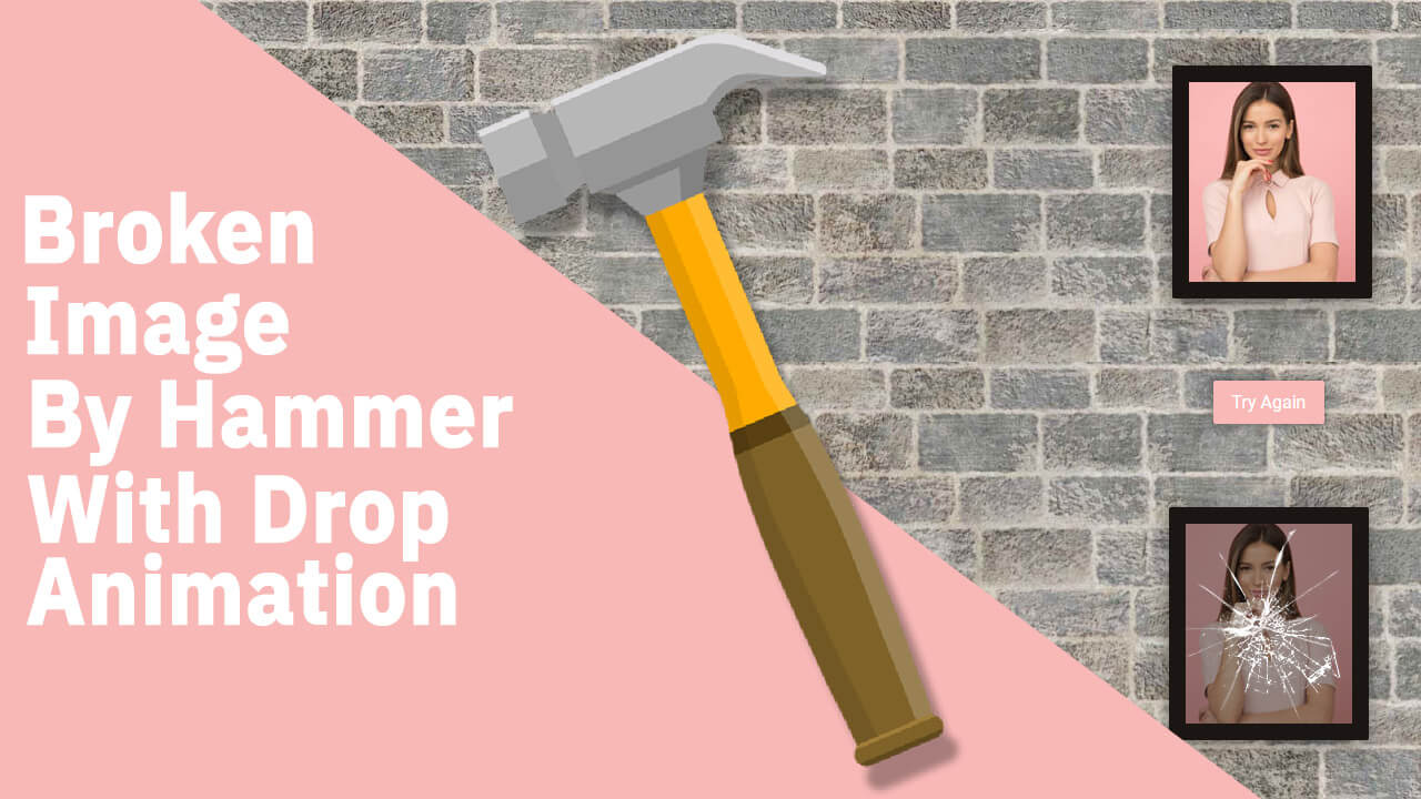
Hello guys in this tutorial we will create Broken Image animation by hammer using html css and jQuery
First we need to create two files index.html and style.css then we need to do code for it.
Step:1
Add below code inside index.html
<!DOCTYPE html>
<html>
<head>
	<meta charset="utf-8">
	<title>Image Drop Animation</title>
	<meta name="viewport" content="width=device-width, initial-scale=1.0">
	<link rel="stylesheet" type="text/css" href="style.css">
    <link href="https://fonts.googleapis.com/css2?family=Roboto:wght@400;500&display=swap" rel="stylesheet">
	<script src="https://ajax.googleapis.com/ajax/libs/jquery/3.5.1/jquery.min.js"></script>
</head>
<body>
	<div class="try-again"></div><div class="frame cursor-hammer"><img src="01.jpg"></div>
	<script type="text/javascript">
		$(document).ready(function(){
			$(".cursor-hammer").click(function(){
				$(this).addClass("drop");
				$(".try-again").text("Try Again");
			});$(".try-again").click(function(){
				$(".cursor-hammer").removeClass("drop");
				$(".try-again").text("");
			});
		});
	</script>
</body>
</html>Step:2
Then we need to add code for style.css which code i provide in below screen.
* {
padding: 0; margin: 0;
font-family: 'Roboto', sans-serif;
}
body {
display: flex; align-items: center;
justify-content: center; height: 100vh;
background: url(bg.jpg) no-repeat center/cover;
}
.frame {
width: 150px; height: 180px;
background: #dcd4c0;
border: 15px solid #1a1512;
border-radius: 2px;
filter: drop-shadow(0px 5px 10px #1a151280);
}
.cursor-hammer { cursor: url(hammer.png), auto; }
.drop {
animation: drop 1.2s forwards;
position: relative;
overflow: hidden;
}
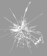
.drop:before {
content: url(broken.png);
position: absolute; width: 100%;
}
.try-again {
position: fixed;
width: 100px;
background: #f9b9b7;
text-align: center;
color: #fff;
padding: 10px 0;
border-radius: 2px;
box-shadow: 0px 0px 10px rgba(0,0,0,0.5);
cursor: pointer;
}
@keyframes drop {
0% {
transform-origin: center;
opacity: 1;
}
20% {
transform: translate3d(0, 20px, 0) rotate3d(0,0,1,-10deg);
}
40%,45% {
transform: translate3d(0, -20px, 0) rotate3d(0,0,1,10deg);
}
to {
transform: translate3d(0, 200px, 0) rotate3d(0,0,0,0deg);
}
}


