Hello guys in this tutorial i have added Top 10 Tailwind Select Box code examples which are available on Codepen and other resources.
Best Collection of Tailwind Select Box examples
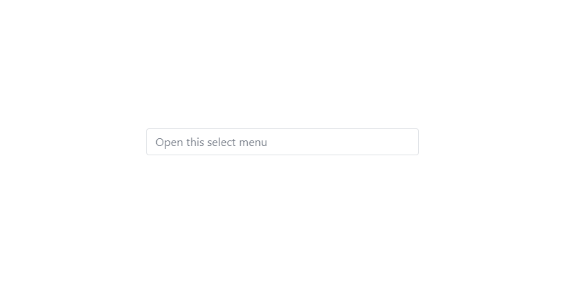
#01 Basic Tailwind Select
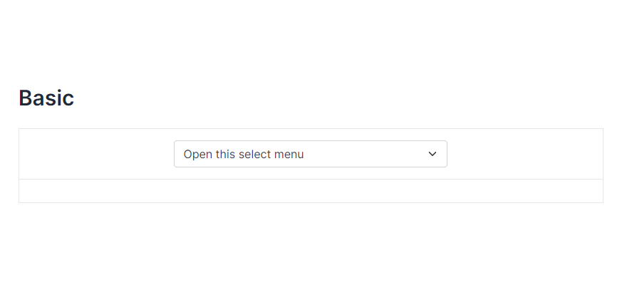
Basic Tailwind Select, which was developed by tailwind-elements. Moreover, you can customize it according to your wish and need.
<div class="flex justify-center">
  <div class="mb-3 xl:w-96">
    <select class="form-select appearance-none
      block
      w-full
      px-3
      py-1.5
      text-base
      font-normal
      text-gray-700
      bg-white bg-clip-padding bg-no-repeat
      border border-solid border-gray-300
      rounded
      transition
      ease-in-out
      m-0
      focus:text-gray-700 focus:bg-white focus:border-blue-600 focus:outline-none" aria-label="Default select example">
        <option selected>Open this select menu</option>
        <option value="1">One</option>
        <option value="2">Two</option>
        <option value="3">Three</option>
    </select>
  </div>
</div>| Author: | tailwind-elements |
| Made with: | HTML & Tailwind CSS |
| Demo Link: | Source Code / Demo |
| Tags: | Basic Tailwind Select |
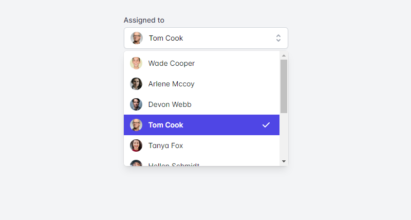
#02 Tailwind Select Component With icon
Tailwind Select Component With icon, which was developed by tailwindui. Moreover, you can customize it according to your wish and need.
<!-- This example requires Tailwind CSS v2.0+ -->
<div>
  <label id="listbox-label" class="block text-sm font-medium text-gray-700"> Assigned to </label>
  <div class="mt-1 relative">
    <button type="button" class="relative w-full bg-white border border-gray-300 rounded-md shadow-sm pl-3 pr-10 py-2 text-left cursor-default focus:outline-none focus:ring-1 focus:ring-indigo-500 focus:border-indigo-500 sm:text-sm" aria-haspopup="listbox" aria-expanded="true" aria-labelledby="listbox-label">
      <span class="flex items-center">
        <img src="https://images.unsplash.com/photo-1472099645785-5658abf4ff4e?ixlib=rb-1.2.1&ixid=eyJhcHBfaWQiOjEyMDd9&auto=format&fit=facearea&facepad=2&w=256&h=256&q=80" alt="" class="flex-shrink-0 h-6 w-6 rounded-full">
        <span class="ml-3 block truncate"> Tom Cook </span>
      </span>
      <span class="ml-3 absolute inset-y-0 right-0 flex items-center pr-2 pointer-events-none">
        <!-- Heroicon name: solid/selector -->
        <svg class="h-5 w-5 text-gray-400" xmlns="http://www.w3.org/2000/svg" viewBox="0 0 20 20" fill="currentColor" aria-hidden="true">
          <path fill-rule="evenodd" d="M10 3a1 1 0 01.707.293l3 3a1 1 0 01-1.414 1.414L10 5.414 7.707 7.707a1 1 0 01-1.414-1.414l3-3A1 1 0 0110 3zm-3.707 9.293a1 1 0 011.414 0L10 14.586l2.293-2.293a1 1 0 011.414 1.414l-3 3a1 1 0 01-1.414 0l-3-3a1 1 0 010-1.414z" clip-rule="evenodd" />
        </svg>
      </span>
    </button>

    <!--
      Select popover, show/hide based on select state.

      Entering: ""
        From: ""
        To: ""
      Leaving: "transition ease-in duration-100"
        From: "opacity-100"
        To: "opacity-0"
    -->
    <ul class="absolute z-10 mt-1 w-full bg-white shadow-lg max-h-56 rounded-md py-1 text-base ring-1 ring-black ring-opacity-5 overflow-auto focus:outline-none sm:text-sm" tabindex="-1" role="listbox" aria-labelledby="listbox-label" aria-activedescendant="listbox-option-3">
      <!--
        Select option, manage highlight styles based on mouseenter/mouseleave and keyboard navigation.

        Highlighted: "text-white bg-indigo-600", Not Highlighted: "text-gray-900"
      -->
      <li class="text-gray-900 cursor-default select-none relative py-2 pl-3 pr-9" id="listbox-option-0" role="option">
        <div class="flex items-center">
          <img src="https://images.unsplash.com/photo-1491528323818-fdd1faba62cc?ixlib=rb-1.2.1&ixid=eyJhcHBfaWQiOjEyMDd9&auto=format&fit=facearea&facepad=2&w=256&h=256&q=80" alt="" class="flex-shrink-0 h-6 w-6 rounded-full">
          <!-- Selected: "font-semibold", Not Selected: "font-normal" -->
          <span class="font-normal ml-3 block truncate"> Wade Cooper </span>
        </div>

        <!--
          Checkmark, only display for selected option.

          Highlighted: "text-white", Not Highlighted: "text-indigo-600"
        -->
        <span class="text-indigo-600 absolute inset-y-0 right-0 flex items-center pr-4">
          <!-- Heroicon name: solid/check -->
          <svg class="h-5 w-5" xmlns="http://www.w3.org/2000/svg" viewBox="0 0 20 20" fill="currentColor" aria-hidden="true">
            <path fill-rule="evenodd" d="M16.707 5.293a1 1 0 010 1.414l-8 8a1 1 0 01-1.414 0l-4-4a1 1 0 011.414-1.414L8 12.586l7.293-7.293a1 1 0 011.414 0z" clip-rule="evenodd" />
          </svg>
        </span>
      </li>

      <!-- More items... -->
    </ul>
  </div>
</div>| Author: | tailwindui |
| Made with: | HTML & Tailwind CSS |
| Demo Link: | Source Code / Demo |
| Tags: | Tailwind Select Component With icon |
#03 Tailwind Multi Select Component
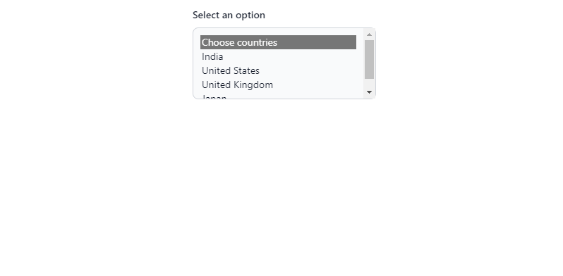
Tailwind Multi Select Component, which was developed by Rahul. Moreover, you can customize it according to your wish and need.
<label for="countries_multiple" class="block mb-2 text-sm font-medium text-gray-900 dark:text-gray-400">Select an option</label>
<select multiple="" id="countries" class="bg-gray-50 border border-gray-300 text-gray-900 text-sm rounded-lg focus:ring-blue-500 focus:border-blue-500 block w-full p-2.5 dark:bg-gray-700 dark:border-gray-600 dark:placeholder-gray-400 dark:text-white dark:focus:ring-blue-500 dark:focus:border-blue-500">
  <option selected="">Choose countries</option>
  <option value="IN">India</option>
  <option value="US">United States</option>
  <option value="UK">United Kingdom</option>
  <option value="japan">Japan</option>
</select>
| Author: | Rahul |
| Made with: | HTML & Tailwind CSS |
| Demo Link: | Source Code / Demo |
| Tags: | Tailwind Multi Select Component |
#04 Multi select with chips
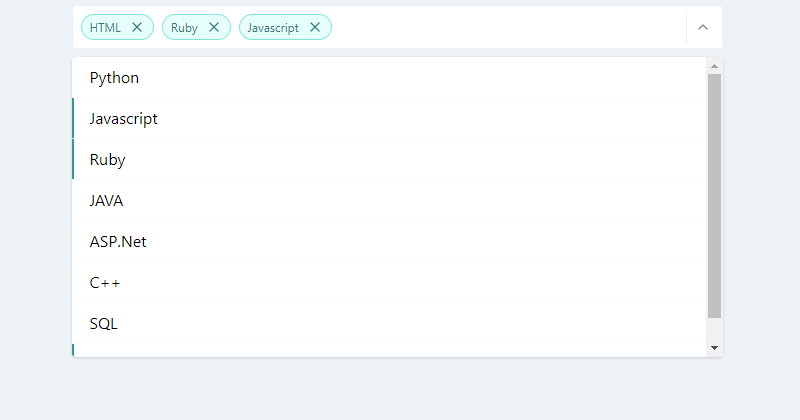
Multi select with chips, which was developed by haynajjar. Moreover, you can customize it according to your wish and need.
<style>
    .top-100 {top: 100%}
    .bottom-100 {bottom: 100%}
    .max-h-select {
        max-height: 300px;
    }
</style>

<div class="w-full md:w-1/2 flex flex-col items-center h-64 mx-auto">
    <div class="w-full px-4">
        <div class="flex flex-col items-center relative">
            <div class="w-full  svelte-1l8159u">
                <div class="my-2 p-1 flex border border-gray-200 bg-white rounded svelte-1l8159u">
                    <div class="flex flex-auto flex-wrap">
                        <div class="flex justify-center items-center m-1 font-medium py-1 px-2 bg-white rounded-full text-teal-700 bg-teal-100 border border-teal-300 ">
                            <div class="text-xs font-normal leading-none max-w-full flex-initial">HTML</div>
                            <div class="flex flex-auto flex-row-reverse">
                                <div>
                                    <svg xmlns="http://www.w3.org/2000/svg" width="100%" height="100%" fill="none" viewBox="0 0 24 24" stroke="currentColor" stroke-width="2" stroke-linecap="round" stroke-linejoin="round" class="feather feather-x cursor-pointer hover:text-teal-400 rounded-full w-4 h-4 ml-2">
                                        <line x1="18" y1="6" x2="6" y2="18"></line>
                                        <line x1="6" y1="6" x2="18" y2="18"></line>
                                    </svg>
                                </div>
                            </div>
                        </div>
                        <div class="flex justify-center items-center m-1 font-medium py-1 px-2 bg-white rounded-full text-teal-700 bg-teal-100 border border-teal-300 ">
                            <div class="text-xs font-normal leading-none max-w-full flex-initial">Ruby</div>
                            <div class="flex flex-auto flex-row-reverse">
                                <div>
                                    <svg xmlns="http://www.w3.org/2000/svg" width="100%" height="100%" fill="none" viewBox="0 0 24 24" stroke="currentColor" stroke-width="2" stroke-linecap="round" stroke-linejoin="round" class="feather feather-x cursor-pointer hover:text-teal-400 rounded-full w-4 h-4 ml-2">
                                        <line x1="18" y1="6" x2="6" y2="18"></line>
                                        <line x1="6" y1="6" x2="18" y2="18"></line>
                                    </svg>
                                </div>
                            </div>
                        </div>
                        <div class="flex justify-center items-center m-1 font-medium py-1 px-2 bg-white rounded-full text-teal-700 bg-teal-100 border border-teal-300 ">
                            <div class="text-xs font-normal leading-none max-w-full flex-initial">Javascript</div>
                            <div class="flex flex-auto flex-row-reverse">
                                <div>
                                    <svg xmlns="http://www.w3.org/2000/svg" width="100%" height="100%" fill="none" viewBox="0 0 24 24" stroke="currentColor" stroke-width="2" stroke-linecap="round" stroke-linejoin="round" class="feather feather-x cursor-pointer hover:text-teal-400 rounded-full w-4 h-4 ml-2">
                                        <line x1="18" y1="6" x2="6" y2="18"></line>
                                        <line x1="6" y1="6" x2="18" y2="18"></line>
                                    </svg>
                                </div>
                            </div>
                        </div>
                        <div class="flex-1">
                            <input placeholder="" class="bg-transparent p-1 px-2 appearance-none outline-none h-full w-full text-gray-800">
                        </div>
                    </div>
                    <div class="text-gray-300 w-8 py-1 pl-2 pr-1 border-l flex items-center border-gray-200 svelte-1l8159u">
                        <button class="cursor-pointer w-6 h-6 text-gray-600 outline-none focus:outline-none">
                            <svg xmlns="http://www.w3.org/2000/svg" width="100%" height="100%" fill="none" viewBox="0 0 24 24" stroke="currentColor" stroke-width="2" stroke-linecap="round" stroke-linejoin="round" class="feather feather-chevron-up w-4 h-4">
                                <polyline points="18 15 12 9 6 15"></polyline>
                            </svg>
                        </button>
                    </div>
                </div>
            </div>
            <div class="absolute shadow top-100 bg-white z-40 w-full lef-0 rounded max-h-select overflow-y-auto svelte-5uyqqj">
                <div class="flex flex-col w-full">
                    <div class="cursor-pointer w-full border-gray-100 rounded-t border-b hover:bg-teal-100">
                        <div class="flex w-full items-center p-2 pl-2 border-transparent border-l-2 relative hover:border-teal-100">
                            <div class="w-full items-center flex">
                                <div class="mx-2 leading-6  ">Python </div>
                            </div>
                        </div>
                    </div>
                    <div class="cursor-pointer w-full border-gray-100 border-b hover:bg-teal-100">
                        <div class="flex w-full items-center p-2 pl-2 border-transparent border-l-2 relative border-teal-600">
                            <div class="w-full items-center flex">
                                <div class="mx-2 leading-6  ">Javascript </div>
                            </div>
                        </div>
                    </div>
                    <div class="cursor-pointer w-full border-gray-100 border-b hover:bg-teal-100">
                        <div class="flex w-full items-center p-2 pl-2 border-transparent border-l-2 relative border-teal-600">
                            <div class="w-full items-center flex">
                                <div class="mx-2 leading-6  ">Ruby </div>
                            </div>
                        </div>
                    </div>
                    <div class="cursor-pointer w-full border-gray-100 border-b hover:bg-teal-100">
                        <div class="flex w-full items-center p-2 pl-2 border-transparent border-l-2 relative hover:border-teal-100">
                            <div class="w-full items-center flex">
                                <div class="mx-2 leading-6  ">JAVA </div>
                            </div>
                        </div>
                    </div>
                    <div class="cursor-pointer w-full border-gray-100 border-b hover:bg-teal-100">
                        <div class="flex w-full items-center p-2 pl-2 border-transparent border-l-2 relative hover:border-teal-100">
                            <div class="w-full items-center flex">
                                <div class="mx-2 leading-6  ">ASP.Net </div>
                            </div>
                        </div>
                    </div>
                    <div class="cursor-pointer w-full border-gray-100 border-b hover:bg-teal-100">
                        <div class="flex w-full items-center p-2 pl-2 border-transparent border-l-2 relative hover:border-teal-100">
                            <div class="w-full items-center flex">
                                <div class="mx-2 leading-6  ">C++ </div>
                            </div>
                        </div>
                    </div>
                    <div class="cursor-pointer w-full border-gray-100 border-b hover:bg-teal-100">
                        <div class="flex w-full items-center p-2 pl-2 border-transparent border-l-2 relative hover:border-teal-100">
                            <div class="w-full items-center flex">
                                <div class="mx-2 leading-6  ">SQL </div>
                            </div>
                        </div>
                    </div>
                    <div class="cursor-pointer w-full border-gray-100 rounded-b hover:bg-teal-100">
                        <div class="flex w-full items-center p-2 pl-2 border-transparent border-l-2 relative border-teal-600">
                            <div class="w-full items-center flex">
                                <div class="mx-2 leading-6  ">HTML </div>
                            </div>
                        </div>
                    </div>
                </div>
            </div>
        </div>
    </div>
</div>| Author: | haynajjar |
| Made with: | HTML & Tailwind CSS |
| Demo Link: | Source Code / Demo |
| Tags: | Multi select with chips |
#05 Tailwind CSS Select – React
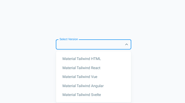
Tailwind CSS Select – React, which was developed by material-tailwind. Moreover, you can customize it according to your wish and need.
import { Select, Option } from "@material-tailwind/react";

export default function Example() {
  return (
    <div className="w-72">
      <Select label="Select Version">
        <Option>Material Tailwind HTML</Option>
        <Option>Material Tailwind React</Option>
        <Option>Material Tailwind Vue</Option>
        <Option>Material Tailwind Angular</Option>
        <Option>Material Tailwind Svelte</Option>
      </Select>
    </div>
  );
}| Author: | material-tailwind |
| Made with: | React & Tailwind CSS |
| Demo Link: | Source Code / Demo |
| Tags: | Tailwind CSS Select – React |

Top 10 Tailwind CSS Notification Examples
Hello guys in this tutorial i have added Top 10 Tailwind CSS notification code examples which are available on Codepen and other resources.
#06 Select with search
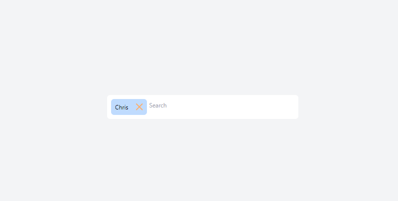
Select with search, which was developed by josegustavo. Moreover, you can customize it according to your wish and need.
<!-- component -->
<script defer src="https://unpkg.com/alpinejs@3.x.x/dist/cdn.min.js"></script>

<div class="relative max-w-sm mx-auto text-xs"
     x-data="{
            search: '',
            showSelector: false,
            selected: {1:'Chris'},
            options: [],
            clearOpts() {
                this.search = '';
                this.showSelector = false;
                this.options = []
            },
            select(id, name) {
                this.selected[id] = name;
                this.clearOpts();
                $dispatch('selected', Object.keys(this.selected));
            },
            remove(id) {
                delete this.selected[id]
                $dispatch('selected', Object.keys(this.selected));
            },
            goSearch() {
                if (this.search) {
                    this.options = {5: 'Carl', 6: 'Alex', 7: 'Bryan'};
                    this.showSelector = true;
                } else {
                    this.showSelector = false;
                }
            },
        }">
    <div class="bg-white rounded-md p-2 flex gap-1 flex-wrap" @click="$refs.search_input.focus()"
         @click.outside="showSelector=false">
        <template x-for="(name, id) in selected">
            <div class="bg-blue-200 rounded-md flex items-center">
                <div class="p-2" x-text="name"></div>
                <div @click="remove(id)"
                     class="p-2 select-none rounded-r-md cursor-pointer hover:bg-magma-orange-clear">
                    <svg width="14" height="14" viewBox="0 0 14 14" fill="none" xmlns="http://www.w3.org/2000/svg">
                        <path d="M12.5745 1L1 12.5745" stroke="#FEAD69" stroke-width="2" stroke-linecap="round"/>
                        <path d="M1.00024 1L12.5747 12.5745" stroke="#FEAD69" stroke-width="2" stroke-linecap="round"/>
                    </svg>
                </div>
            </div>
        </template>
        <div class="flex-1">
            <input type="text" x-model="search" x-ref="search_input"
                   @input.debounce.400ms="goSearch();" placeholder="Search"
                   class="w-full border-0 focus:border-0 focus:outline-none focus:ring-0 py-1 px-0">
            <div x-show="showSelector" class="absolute left-0 bg-white z-30 w-full rounded-b-md font-medium">
                <div class="p-2 space-y-1">
                    <template x-for="(name, id) in options">
                        <div>
                            <template x-if="!selected[id]">
                                <div @click="select(id, name)"
                                     class="bg-blue-200 border-2 border-blue-200 cursor-pointer rounded-md p-2 hover:border-light-blue-1"
                                     x-text="name"></div>
                            </template>
                        </div>
                    </template>
                    <template x-if="options.length === 0">
                        <div class="text-gray-500">
                            No result
                        </div>
                    </template>
                </div>
            </div>
        </div>
    </div>
</div>| Author: | josegustavo |
| Made with: | HTML & Tailwind CSS |
| Demo Link: | Source Code / Demo |
| Tags: | Select with search |
#07 Select with custom list
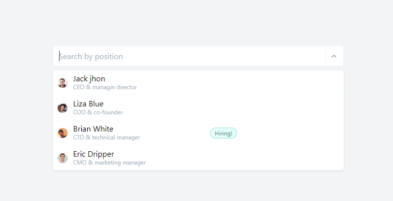
Select with custom list, which was developed by tailwindcomponents. Moreover, you can customize it according to your wish and need.
<style>
.top-100 {top: 100%}
.bottom-100 {bottom: 100%}
.max-h-select {
max-height: 300px;
}
</style>
<div class="flex flex-col items-center">
<div class="w-full md:w-1/2 flex flex-col items-center h-64">
<div class="w-full px-4">
<div class="flex flex-col items-center relative">
<div class="w-full">
<div class="my-2 p-1 bg-white flex border border-gray-200 rounded">
<div class="flex flex-auto flex-wrap"></div>
<input placeholder="Search by position" class="p-1 px-2 appearance-none outline-none w-full text-gray-800">
<div class="text-gray-300 w-8 py-1 pl-2 pr-1 border-l flex items-center border-gray-200">
<button class="cursor-pointer w-6 h-6 text-gray-600 outline-none focus:outline-none">
<svg xmlns="http://www.w3.org/2000/svg" width="100%" height="100%" fill="none" viewBox="0 0 24 24" stroke="currentColor" stroke-width="2" stroke-linecap="round" stroke-linejoin="round" class="feather feather-chevron-up w-4 h-4">
<polyline points="18 15 12 9 6 15"></polyline>
</svg>
</button>
</div>
</div>
</div>
<div class="absolute shadow bg-white top-100 z-40 w-full lef-0 rounded max-h-select overflow-y-auto svelte-5uyqqj">
<div class="flex flex-col w-full">
<div class="cursor-pointer w-full border-gray-100 rounded-t border-b hover:bg-teal-100">
<div class="flex w-full items-center p-2 pl-2 border-transparent border-l-2 relative hover:border-teal-100">
<div class="w-6 flex flex-col items-center">
<div class="flex relative w-5 h-5 bg-orange-500 justify-center items-center m-1 mr-2 w-4 h-4 mt-1 rounded-full "><img class="rounded-full" alt="A" src="https://randomuser.me/api/portraits/men/62.jpg"> </div>
</div>
<div class="w-full items-center flex">
<div class="mx-2 -mt-1 ">Jack jhon
<div class="text-xs truncate w-full normal-case font-normal -mt-1 text-gray-500">CEO & managin director</div>
</div>
</div>
</div>
</div>
<div class="cursor-pointer w-full border-gray-100 border-b hover:bg-teal-100">
<div class="flex w-full items-center p-2 pl-2 border-transparent border-l-2 relative hover:border-teal-100">
<div class="w-6 flex flex-col items-center">
<div class="flex relative w-5 h-5 bg-orange-500 justify-center items-center m-1 mr-2 w-4 h-4 mt-1 rounded-full "><img class="rounded-full" alt="A" src="https://randomuser.me/api/portraits/women/62.jpg"> </div>
</div>
<div class="w-full items-center flex">
<div class="mx-2 -mt-1 ">Liza Blue
<div class="text-xs truncate w-full normal-case font-normal -mt-1 text-gray-500">COO & co-founder</div>
</div>
</div>
</div>
</div>
<div class="cursor-pointer w-full border-gray-100 border-b hover:bg-teal-100">
<div class="flex w-full items-center p-2 pl-2 border-transparent border-l-2 relative hover:border-teal-100">
<div class="w-6 flex flex-col items-center">
<div class="flex relative w-5 h-5 bg-orange-500 justify-center items-center m-1 mr-2 w-4 h-4 mt-1 rounded-full "><img class="rounded-full" alt="A" src="https://randomuser.me/api/portraits/men/65.jpg"> </div>
</div>
<div class="w-full items-center flex">
<div class="mx-2 -mt-1 w-1/2 ">Brian White
<div class="text-xs truncate w-full normal-case font-normal -mt-1 text-gray-500">CTO & technical manager</div>
</div>
<div class="w-1/2 flex">
<div class="flex justify-center items-center m-1 font-medium py-1 px-2 bg-white rounded-full text-teal-700 bg-teal-100 border border-teal-300 ">
<div class="text-xs font-normal leading-none max-w-full flex-initial">Hiring!</div>
</div>
</div>
</div>
</div>
</div>
<div class="cursor-pointer w-full border-gray-100 rounded-b hover:bg-teal-100">
<div class="flex w-full items-center p-2 pl-2 border-transparent border-l-2 relative hover:border-teal-100">
<div class="w-6 flex flex-col items-center">
<div class="flex relative w-5 h-5 bg-orange-500 justify-center items-center m-1 mr-2 w-4 h-4 mt-1 rounded-full "><img class="rounded-full" alt="A" src="https://randomuser.me/api/portraits/men/85.jpg"> </div>
</div>
<div class="w-full items-center flex">
<div class="mx-2 -mt-1 ">Eric Dripper
<div class="text-xs truncate w-full normal-case font-normal -mt-1 text-gray-500">CMO & marketing manager</div>
</div>
</div>
</div>
</div>
</div>
</div>
</div>
</div>
</div>
</div>| Author: | tailwindcomponents |
| Made with: | HTML & Tailwind CSS |
| Demo Link: | Source Code / Demo |
| Tags: | Select with custom list |
#08 Disabled CSS Select Box
Disabled CSS Select Box, which was developed by Rahul. Moreover, you can customize it according to your wish and need.
 <div class="flex justify-center">
  <div class="mb-3 xl:w-96">
    <select class="form-select
      appearance-none
      block
      w-full
      px-3
      py-1.5
      text-base
      font-normal
      text-gray-700
      bg-white bg-clip-padding bg-no-repeat
      border border-solid border-gray-300
      rounded
      transition
      ease-in-out
      m-0
      focus:text-gray-700 focus:bg-white focus:border-blue-600 focus:outline-none" aria-label="Disabled select example" disabled>
        <option selected>Open this select menu</option>
        <option value="1">One</option>
        <option value="2">Two</option>
        <option value="3">Three</option>
    </select>
  </div>
</div>| Author: | Rahul |
| Made with: | HTML & Tailwind CSS |
| Demo Link: | Source Code / Demo |
| Tags: | Disabled CSS Select Box |
#09 Pretty Multiselect Dropdown with tom-select
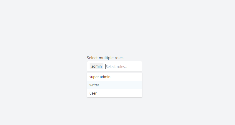
Pretty Multiselect Dropdown with tom-select, which was developed by tailwindcomponents. Moreover, you can customize it according to your wish and need.
<!-- component -->
<!DOCTYPE html>
<html lang="en">
  <head>
    <meta charset="UTF-8" />
    <meta http-equiv="X-UA-Compatible" content="IE=edge" />
    <meta name="viewport" content="width=device-width, initial-scale=1.0" />
    <title>Tailwind Multiselect with tom-select</title>
    <script src="https://cdn.tailwindcss.com"></script>
    <link
      href="https://cdn.jsdelivr.net/npm/tom-select/dist/css/tom-select.css"
      rel="stylesheet"
    />
  </head>
    <div class="w-full">
      <label class="inline-block text-sm text-gray-600" for="Multiselect"
        >Select multiple roles</label
      >
      <div class="relative flex w-full">
        <select
          id="select-role"
          name="roles[]"
          multiple
          placeholder="Select roles..."
          autocomplete="off"
          class="block w-full rounded-sm cursor-pointer focus:outline-none"
          multiple
        >
          <option value="1">super admin</option>
          <option value="2">admin</option>
          <option value="3">writer</option>
          <option value="4">user</option>
        </select>
      </div>
    </div>
    <script src="https://cdn.jsdelivr.net/npm/tom-select/dist/js/tom-select.complete.min.js"></script>
    <script>
      new TomSelect('#select-role', {
        maxItems: 3,
      });
    </script>
  </body>
</html>| Author: | tailwindcomponents |
| Made with: | HTML & Tailwind CSS & JS |
| Demo Link: | Source Code / Demo |
| Tags: | Pretty Multiselect Dropdown |
#10 Pricing section checkbox select
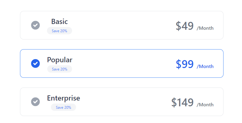
Pricing section checkbox select, which was developed by khatabwedaa. Moreover, you can customize it according to your wish and need.
<!-- component -->
<div class="bg-white dark:bg-gray-900">
            <div class="container px-6 py-8 mx-auto">
                <p class="text-xl text-center text-gray-500 dark:text-gray-300">
                    Choose your plan
                </p>

                <h1 class="mt-4 text-3xl font-semibold text-center text-gray-800 capitalize lg:text-4xl dark:text-white">Pricing Plan</h1>


                <div class="mt-6 space-y-8 xl:mt-12">
                    <div class="flex items-center justify-between max-w-2xl px-8 py-4 mx-auto border cursor-pointer rounded-xl dark:border-gray-700">
                        <div class="flex items-center">
                            <svg xmlns="http://www.w3.org/2000/svg" class="w-5 h-5 text-gray-400 sm:h-9 sm:w-9" viewBox="0 0 20 20" fill="currentColor">
                                <path fill-rule="evenodd" d="M10 18a8 8 0 100-16 8 8 0 000 16zm3.707-9.293a1 1 0 00-1.414-1.414L9 10.586 7.707 9.293a1 1 0 00-1.414 1.414l2 2a1 1 0 001.414 0l4-4z" clip-rule="evenodd" />
                            </svg>

                            <div class="flex flex-col items-center mx-5 space-y-1">
                                <h2 class="text-lg font-medium text-gray-700 sm:text-2xl dark:text-gray-200">Basic</h2>
                                <div class="px-2 text-xs text-blue-500 bg-gray-100 rounded-full sm:px-4 sm:py-1 dark:bg-gray-700 ">
                                    Save 20%
                                </div>
                            </div>
                        </div>

                        <h2 class="text-2xl font-semibold text-gray-500 sm:text-4xl dark:text-gray-300">$49 <span class="text-base font-medium">/Month</span></h2>
                    </div>

                    <div class="flex items-center justify-between max-w-2xl px-8 py-4 mx-auto border border-blue-500 cursor-pointer rounded-xl">
                        <div class="flex items-center">
                            <svg xmlns="http://www.w3.org/2000/svg" class="w-5 h-5 text-blue-600 sm:h-9 sm:w-9" viewBox="0 0 20 20" fill="currentColor">
                                <path fill-rule="evenodd" d="M10 18a8 8 0 100-16 8 8 0 000 16zm3.707-9.293a1 1 0 00-1.414-1.414L9 10.586 7.707 9.293a1 1 0 00-1.414 1.414l2 2a1 1 0 001.414 0l4-4z" clip-rule="evenodd" />
                            </svg>

                            <div class="flex flex-col items-center mx-5 space-y-1">
                                <h2 class="text-lg font-medium text-gray-700 sm:text-2xl dark:text-gray-200">Popular</h2>
                                <div class="px-2 text-xs text-blue-500 bg-gray-100 rounded-full sm:px-4 sm:py-1 dark:bg-gray-700 ">
                                    Save 20%
                                </div>
                            </div>
                        </div>

                        <h2 class="text-2xl font-semibold text-blue-600 sm:text-4xl">$99 <span class="text-base font-medium">/Month</span></h2>
                    </div>

                    <div class="flex items-center justify-between max-w-2xl px-8 py-4 mx-auto border cursor-pointer rounded-xl dark:border-gray-700">
                        <div class="flex items-center">
                            <svg xmlns="http://www.w3.org/2000/svg" class="w-5 h-5 text-gray-400 sm:h-9 sm:w-9" viewBox="0 0 20 20" fill="currentColor">
                                <path fill-rule="evenodd" d="M10 18a8 8 0 100-16 8 8 0 000 16zm3.707-9.293a1 1 0 00-1.414-1.414L9 10.586 7.707 9.293a1 1 0 00-1.414 1.414l2 2a1 1 0 001.414 0l4-4z" clip-rule="evenodd" />
                            </svg>

                            <div class="flex flex-col items-center mx-5 space-y-1">
                                <h2 class="text-lg font-medium text-gray-700 sm:text-2xl dark:text-gray-200">Enterprise</h2>
                                <div class="px-2 text-xs text-blue-500 bg-gray-100 rounded-full sm:px-4 sm:py-1 dark:bg-gray-700 ">
                                    Save 20%
                                </div>
                            </div>
                        </div>

                        <h2 class="text-2xl font-semibold text-gray-500 sm:text-4xl dark:text-gray-300">$149 <span class="text-base font-medium">/Month</span></h2>
                    </div>

                    <div class="flex justify-center">
                        <button class="px-8 py-2 tracking-wide text-white capitalize transition-colors duration-200 transform bg-blue-600 rounded-md hover:bg-blue-500 focus:outline-none focus:bg-blue-500 focus:ring focus:ring-blue-300 focus:ring-opacity-80">
                            Choose Plan
                        </button>
                    </div>
                </div>
            </div>
</div>| Author: | khatabwedaa |
| Made with: | HTML & Tailwind CSS |
| Demo Link: | Source Code / Demo |
| Tags: | Pricing section checkbox select |

![Download Button CSS [ Top 10 Download Button Examples ]](https://blog.stackfindover.com/wp-content/uploads/2021/10/Download-Button-CSS-1024x576.jpg)
![CSS Progress bar [ 25+ Awesome HTML Progress bar]](https://blog.stackfindover.com/wp-content/uploads/2021/09/progress-bar-css-1024x576.jpg)
