
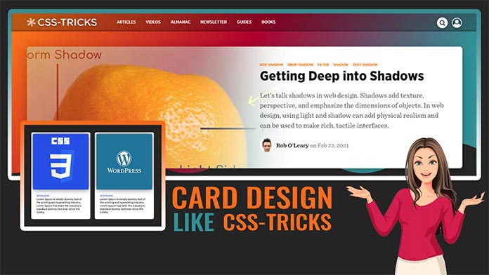
Hello guys today we will create Neumorphism Cards Using HTML & CSS
First we need to create two files index.html and style.css then we need to do code for it.
Step:1
Add below code inside index.html
<!DOCTYPE html>
<html>
<head>
	<meta charset="utf-8">
	<title>Cards</title>
	<link rel="stylesheet" type="text/css" href="style.css">
	<link href="https://fonts.googleapis.com/css2?family=IBM+Plex+Sans:wght@400;500&family=IBM+Plex+Serif:wght@300;400&display=swap" rel="stylesheet">
	<script src="https://ajax.googleapis.com/ajax/libs/jquery/3.5.1/jquery.min.js"></script>
</head>
<body>
    <div class="cards-outer">
        <div class="container">
            <div class="cards-grid">
                <div class="grid-item">
                    <div class="grid-item-inner">
                        <h2>What is Lorem Ipsum?</h2>
                        <p>Lorem Ipsum is simply dummy text of the printing and typesetting industry. Lorem Ipsum has been the industry's standard dummy text ever since the 1500s, when an unknown printer took a galley of type and scrambled it to make a type specimen book.</p>
                        <a class="more-link" href="#">Learn More</a>
                    </div>
                </div>
            </div>
        </div>
    </div>
</body>
</html>
Step:2
Then we need to add code for style.css which code i provide in below screen.
* {
    padding: 0;
    margin: 0;
    font-family: 'IBM Plex Sans', serif;
}
body {
    display: flex;
    align-items: center;
    justify-content: center;
    height: 100vh;
    background: #0f62fe;
}
h2 {
    font-size: 25px;
    line-height: 40px;
}
.container {
    width: 100%;
    max-width: 1160px;
    margin: auto;
}
.cards-grid {
    display: grid;
    grid-template-columns: 31.33% 31.33% 31.33%;
    grid-gap: 3%;
    grid-row-gap: 6%;
    align-items: center;
    justify-content: center;
    transform-style: preserve-3d;
    transform: perspective(1000px) rotateX(30deg);
}
.grid-item {
    min-height: 350px;
    box-shadow: inset 5px 5px 5px rgba(0,0,0,0.2),
                inset -5px -5px 15px rgba(255,255,255,0.1),
                inset 5px 5px 15px rgba(0,0,0,0.3),
                inset -5px -5px 15px rgba(255,255,255,0.1);
    border-radius: 15px;
    display: flex;
    position: relative;
}
.grid-item-inner {
    margin: 20px;
    padding: 20px;
    background: #0f62fe;
    color: #fff;
    border-radius: 20px;
    transition: 1s linear;
}
.grid-item:hover .grid-item-inner {
    background: #0353e9;
    box-shadow: 0px 20px 50px rgba(0,0,0,0.5);
    transform: translateY(-30px);
}
.more-link {
    padding: 5px 10px;
    margin-top: 20px;
    display: inline-block;
    background: #0f62fe;
    color: #fff;
    text-decoration: unset;
    font-weight: 500;
    box-shadow: inset 5px 5px 5px rgba(15,98,254,0.2),
                inset -5px -5px 15px rgba(255,255,255,0.1),
                inset 5px 5px 15px rgba(15,98,254,0.3),
                inset -5px -5px 15px rgba(255,255,255,0.1);
}
.grid-item:nth-child(1):after {
    content: "01";
    position: absolute;
    right: 20px;
    bottom: 0;
    font-size: 100px;
    font-weight: 900;
    color: rgba(0,0,0,0.2);
}
.grid-item:nth-child(2):after {
    content: "02";
    position: absolute;
    right: 20px;
    bottom: 0;
    font-size: 100px;
    font-weight: 900;
    color: rgba(0,0,0,0.2);
}
.grid-item:nth-child(3):after {
    content: "03";
    position: absolute;
    right: 20px;
    bottom: 0;
    font-size: 100px;
    font-weight: 900;
    color: rgba(0,0,0,0.2);
}