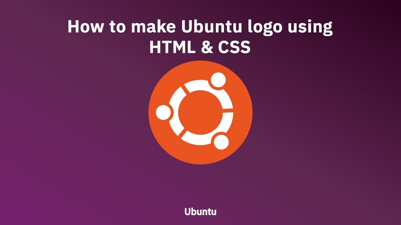
Hello guys today we will learn How to make Ubuntu logo using HTML & CSS
First we need to create two files index.html and style.css then we need to do code for it.
Step:1
Add below code inside index.html
<!DOCTYPE html>
<html>
<head>
	<meta charset="utf-8">
	<title>Ubuntu Logo</title>
	<link rel="stylesheet" type="text/css" href="style.css">
  <link href="https://fonts.googleapis.com/css2?family=IBM+Plex+Sans:wght@400;500&family=IBM+Plex+Serif:wght@300;400&display=swap" rel="stylesheet">
</head>
<body>
	<div class="logo-outer">
  <div class="circle">
    <div class="circle-center">
      <div class="circle-around">
        <div class="circle-middle">
          <div class="line">

          </div>
        </div>
      </div>
    </div>
  </div>
  <div class="title"><h1>Ubuntu</h1></div>
</div>
</body>
</html>
Step:2
Then we need to add code for style.css which code i provide in below screen.
:root {
  --color-orange: #e95420;
  --color-white: #ffffff;
}
* {
  margin: 0;
  font-family: 'IBM Plex Sans',Serif;
}
body {
    width: 100vw;
    height: 100vh;
    background: linear-gradient(30deg, #77216f, #5e2750, #2c001e);
    overflow: hidden;
    display: flex;
    align-items: center;
    justify-content: center;
}

.logo-outer {
  width: 350px;
  height: 350px;
  margin: 100px auto;
  background-color: var(--color-orange);
  border-radius: 50%;
  display: flex;
}

.logo-outer .circle {
  width: 220px;
  height: 220px;
  border-radius: 50%;
  margin: auto;
  display: flex;
  background-color: var(--color-white);
  animation: spin 5s ease-in-out;
}
@keyframes spin {
  0% {
    transform: rotate(0deg);
  }
  50% {
    transform: rotate(360deg);
  }
  100% {
    transform: rotate(0deg);
  }
}
.logo-outer .circle .circle-center {
  width: 150px;
  height: 150px;
  margin: auto;
  border-radius: 50%;
  background-color: var(--color-orange);
}

.logo-outer .circle .circle-center .circle-around {
  width: 70px;
  height: 70px;
  border-radius: 50%;
  position: relative;
  bottom: 70px;
  left: 100px;
  display: flex;
  background-color: var(--color-orange);
}

.logo-outer .circle .circle-center .circle-around .circle-middle {
  width: 50px;
  height: 50px;
  margin: auto;
  border-radius: 50%;
  background-color: var(--color-white);
}

.logo-outer .circle .circle-center .circle-around::after {
  content: "";
  width: 70px;
  height: 70px;
  border-radius: 50%;
  position: absolute;
  top: 110px;
  right: 185px;
  display: flex;
  background-color: var(--color-orange);
}

.logo-outer .circle .circle-center .circle-around .circle-middle::after {
  content: "";
  width: 50px;
  height: 50px;
  margin: auto;
  position: absolute;
  top: 120px;
  right: 195px;
  z-index: 1;
  border-radius: 50%;
  background-color: var(--color-white);
}

.logo-outer .circle .circle-center .circle-around::before {
  content: "";
  width: 70px;
  height: 70px;
  border-radius: 50%;
  position: absolute;
  top: 210px;
  left: 10px;
  display: flex;
  background-color: var(--color-orange);
}

.logo-outer .circle .circle-center .circle-around .circle-middle::before {
  content: "";
  width: 50px;
  height: 50px;
  margin: auto;
  position: absolute;
  top: 220px;
  left: 20px;
  z-index: 1;
  border-radius: 50%;
  background-color: var(--color-white);
}

.logo-outer .line {
  width: 13px;
  height: 50px;
  position: relative;
  top: 30px;
  right: 95px;
  z-index: 1;
  transform: rotate(-35deg);
  background-color: var(--color-orange);
}

.logo-outer .line::before {
  content: "";
  width: 13px;
  height: 50px;
  position: absolute;
  top: 120px;
  right: 95px;
  z-index: 1;
  transform: rotate(75deg);
  background-color: var(--color-orange);
}

.logo-outer .line::after {
  content: "";
  width: 13px;
  height: 50px;
  position: absolute;
  top: 140px;
  left: 71px;
  z-index: 1;
  transform: rotate(-58deg);
  background-color: var(--color-orange);
}

.title {
    position: fixed;
    left: 0;
    right: 0;
    width: 100%;
    text-align: center;
    bottom: 30px;
    color: #fff;
}