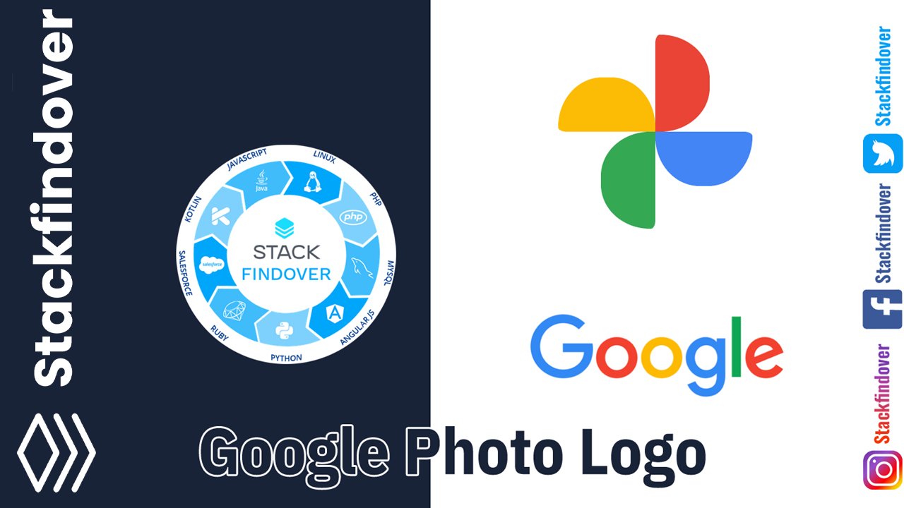
Hello, guys today we will learn how to make a Google Photos icon using HTML and CSS, So let’s get started.
First we need to create two files index.html and Style.css then we need to do code for Google Photos —>
Step:1
Add below code inside index.html
<!DOCTYPE html>
<html>
<head>
    <title>Google Photo Logo</title>
    <link rel="stylesheet" type="text/css" href="style.css">
</head>
<body>
    <div class="google-photo-logo">
        <div class="arch arch--yellow"></div>
        <div class="arch arch--red"></div>
        <div class="arch arch--blue"></div>
        <div class="arch arch--green"></div>
    </div>
</body>
</html>
Step:2
Then we need to add code for style.css which code i provide in below text.
body {
    padding: 0;
    margin: 0;
    display: grid;
    place-items: center;
    height: 100vh;
}
.google-photo-logo {
    --size: 300px;
    height: var(--size);
    width: var(--size);
    position: relative;
    animation: spin 4s ease-in forwards 1s;
}
@keyframes spin {
    from {
        transform: rotate(0deg);
    }
    60% {
        opacity: 0;
    }
    99% {
        opacity: 1;
    }
    to {
        transform: rotate(3600deg);
    }
}
.arch {
    background-color: #000;
    width: calc(var(--size) * 0.5);
    height: calc(var(--size) * 0.28);
    border-radius: 100% 100% 0% 20% / 200% 200% 0% 20%;
    position: absolute;
    margin-top: calc(var(--size)* -0.14);
}
.arch--yellow {
    background: #fcbc05;
    top: 50%;
    left: 0;
    left: 0;
    transform: translateY(-50%);
}
.arch--red {
    background: #e94335;
    top: 25%;
    left: 50%;
    transform: rotate(90deg) translate(-50%, -50%);
    transform-origin: left;
}
.arch--green {
    background: #34a853;
    top: 50%;
    left: 25%;
    transform: rotate(-90deg) translate(-50%, -50%);
}
.arch--blue {
    background: #4385f5;
    top: 50%;
    left: 25%;
    transform: rotate(180deg) translate(-50%, -50%);
}